Free Consultation with no strings attached
Connect Directly to the Designer of your choice
with All Shortlisted Designers
Project by Royston
Cost: $250,000
Having lived in his childhood home for the past 16 years, Royston decided that it was time for a complete revamp. “It was really time for a renovation because everything was getting old,” he shared. “The main idea was to improve the look and overall layout, and to create rooms where it’s possible for everyone to enjoy their own privacy.”
With many family members living in the home, it can sometimes be a little cramped with them bumping into each other at times. “Our goal was to figure out ways on how to divide the house, but still make it feel comfortable enough for a family that’s living together,” He said.
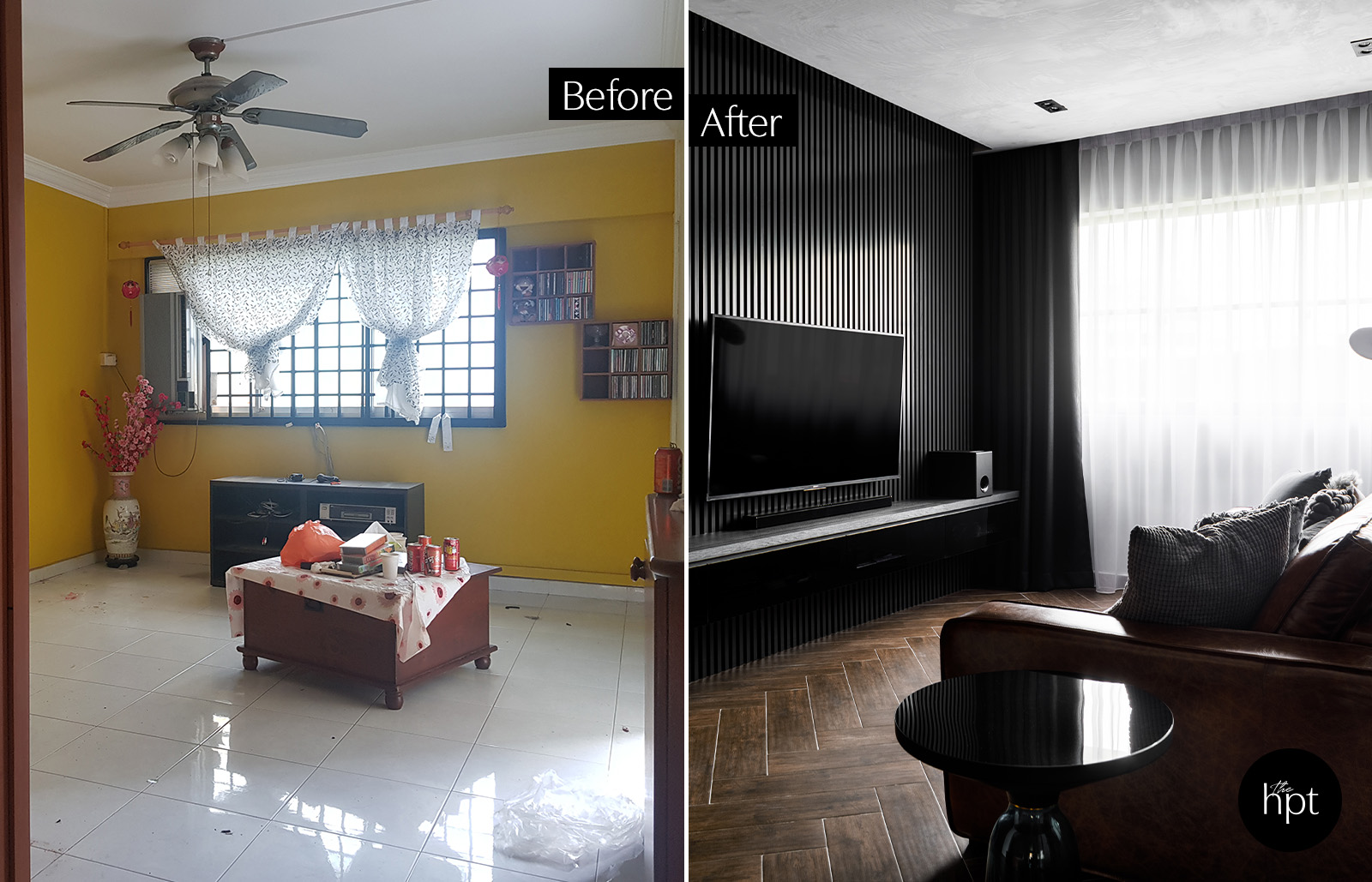
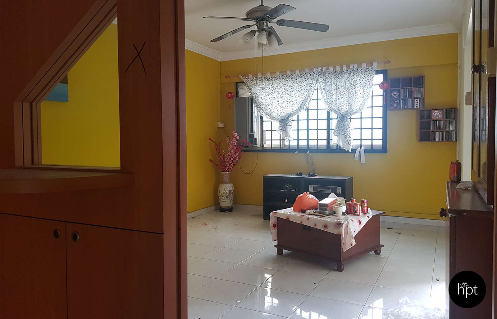
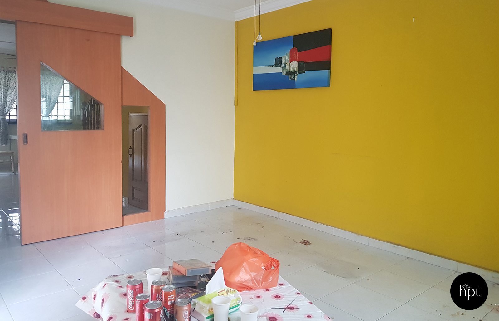
Before – Living Room
After – Living Room
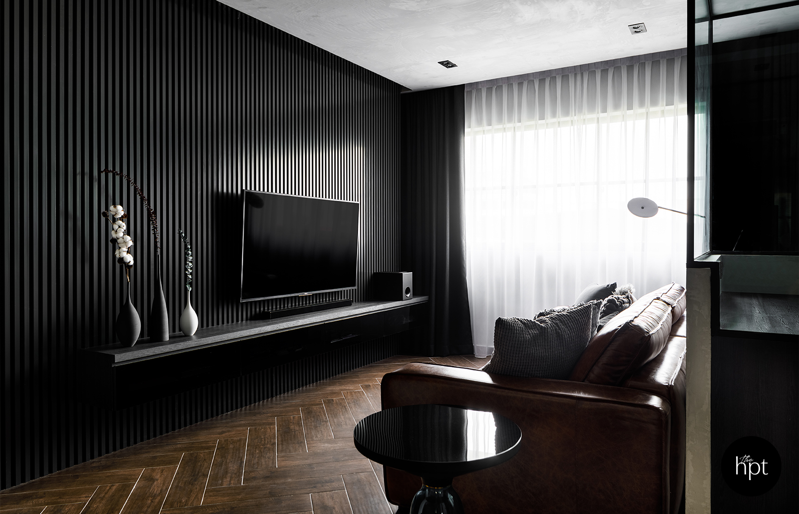
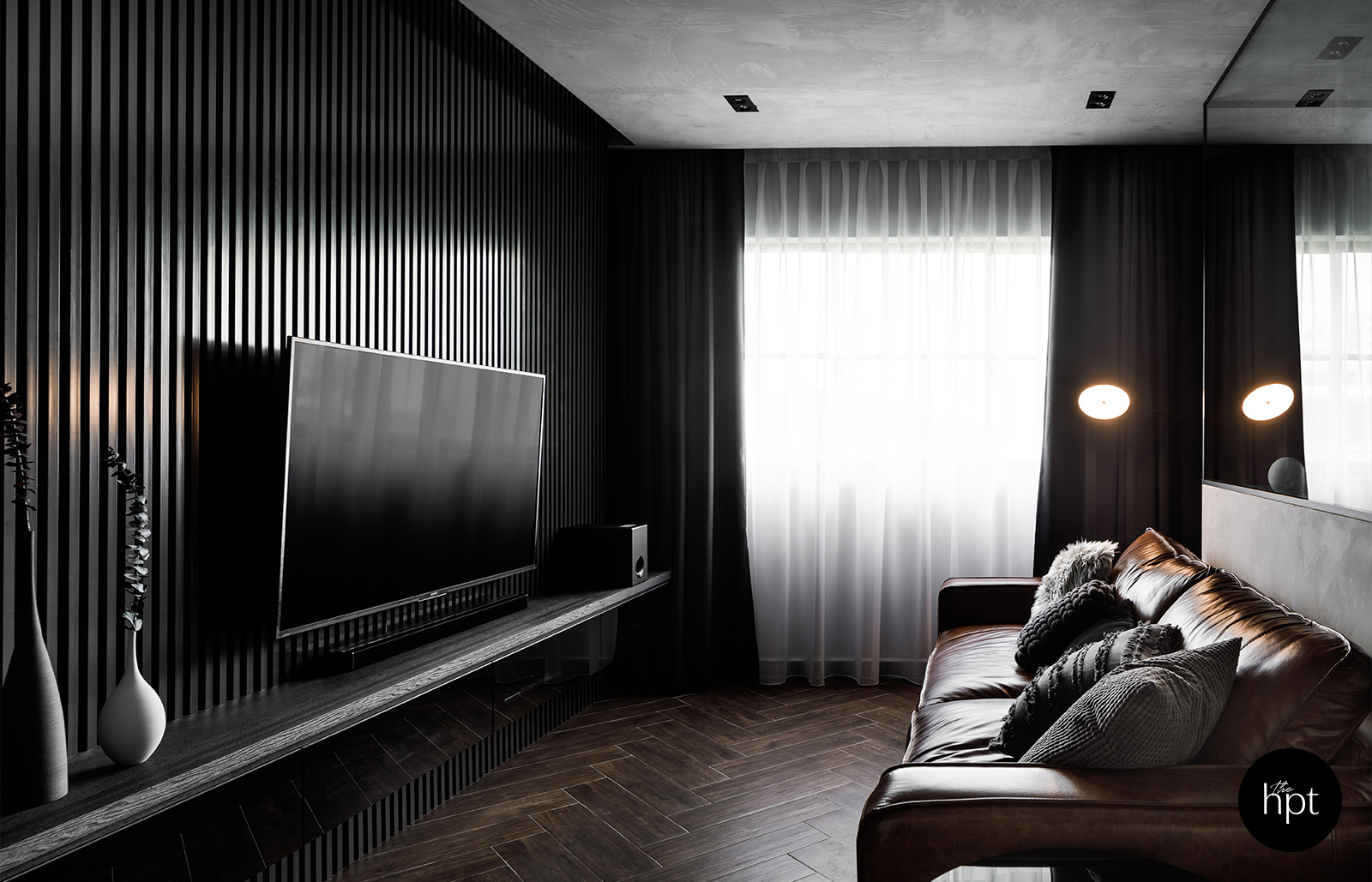
Finer details such as the selection of different textures for sofa cushions were also considered to add visual layers the space and also complement the biggest furniture in the living room
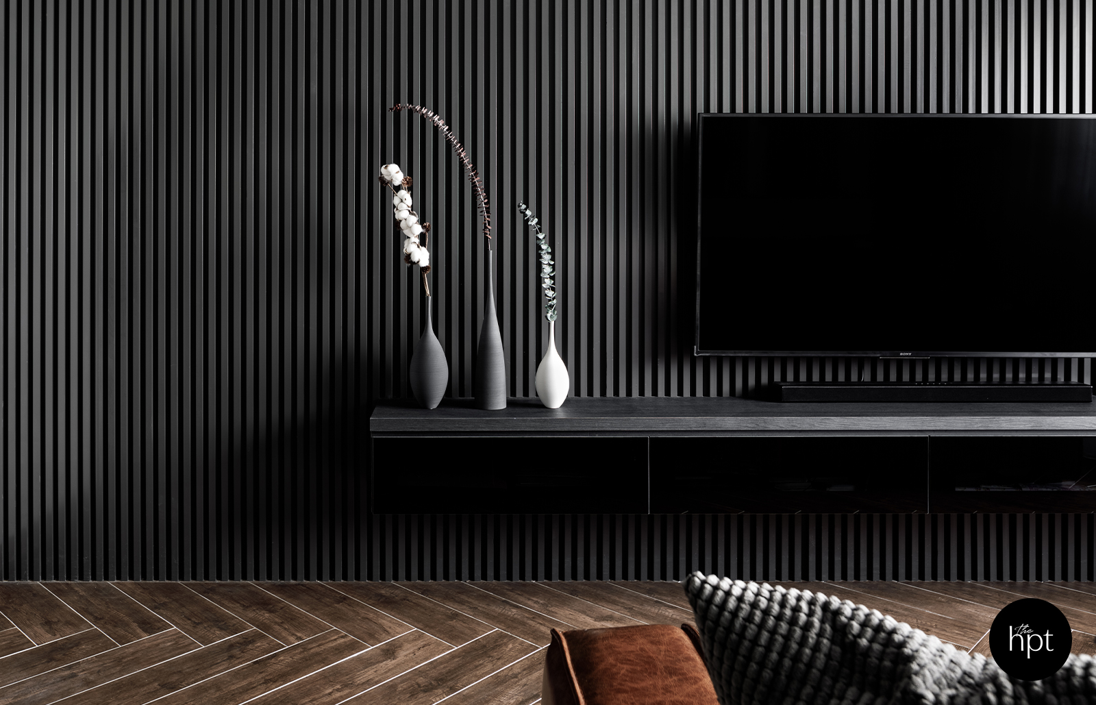
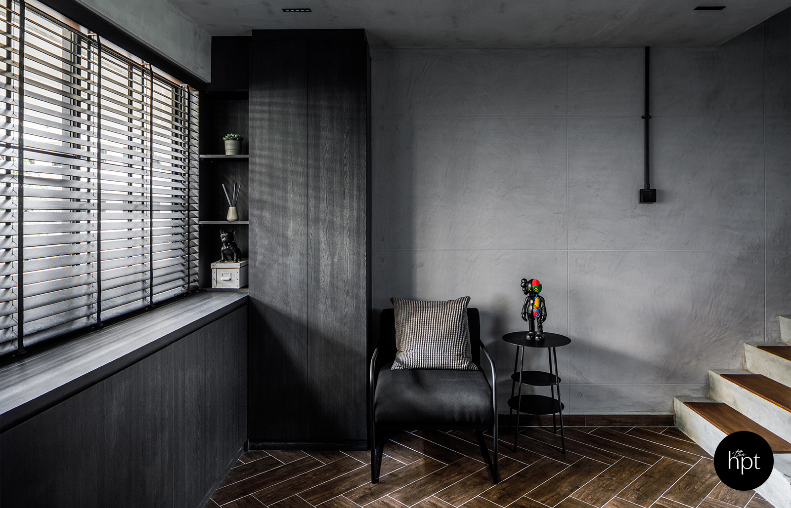
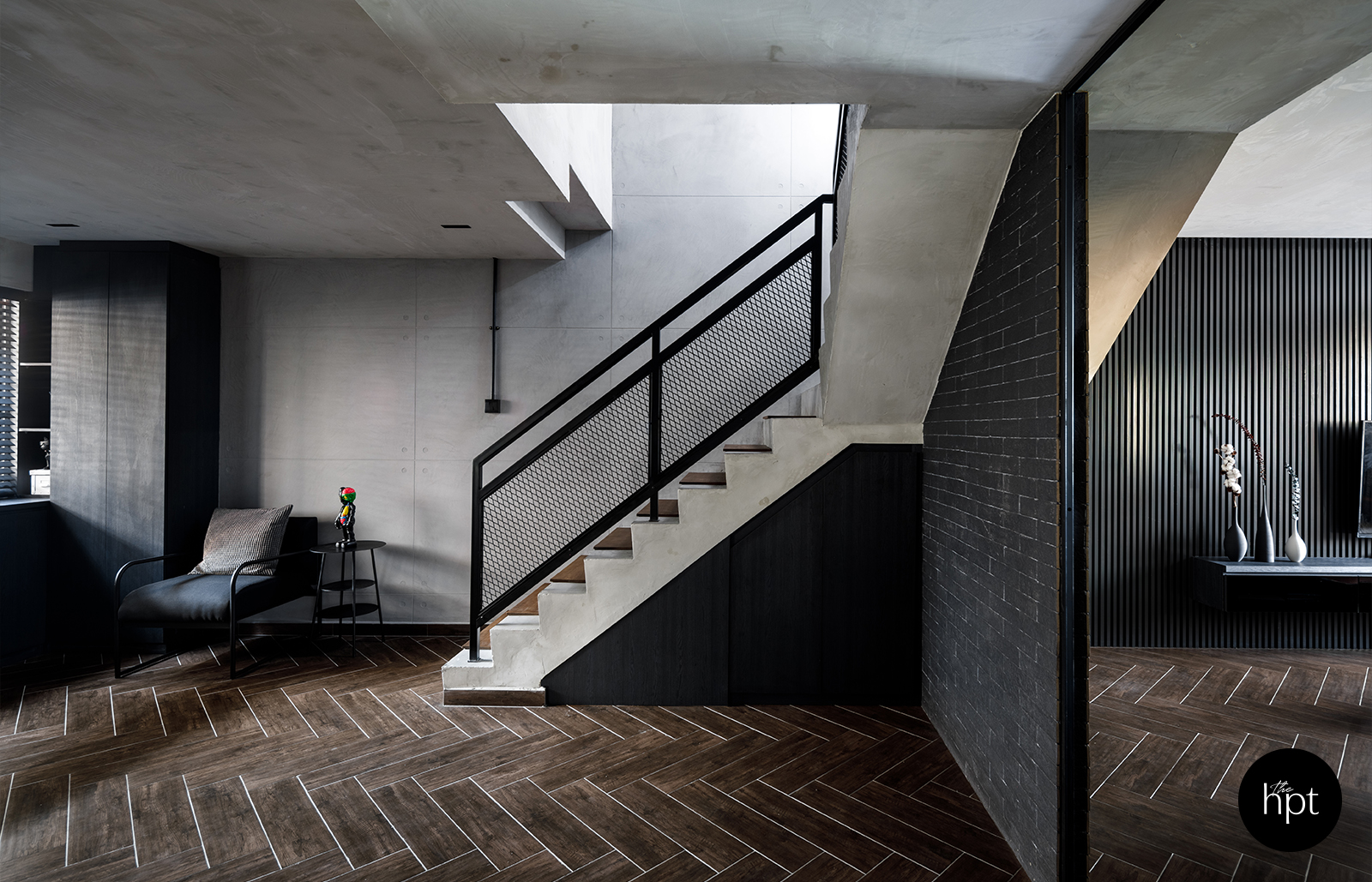
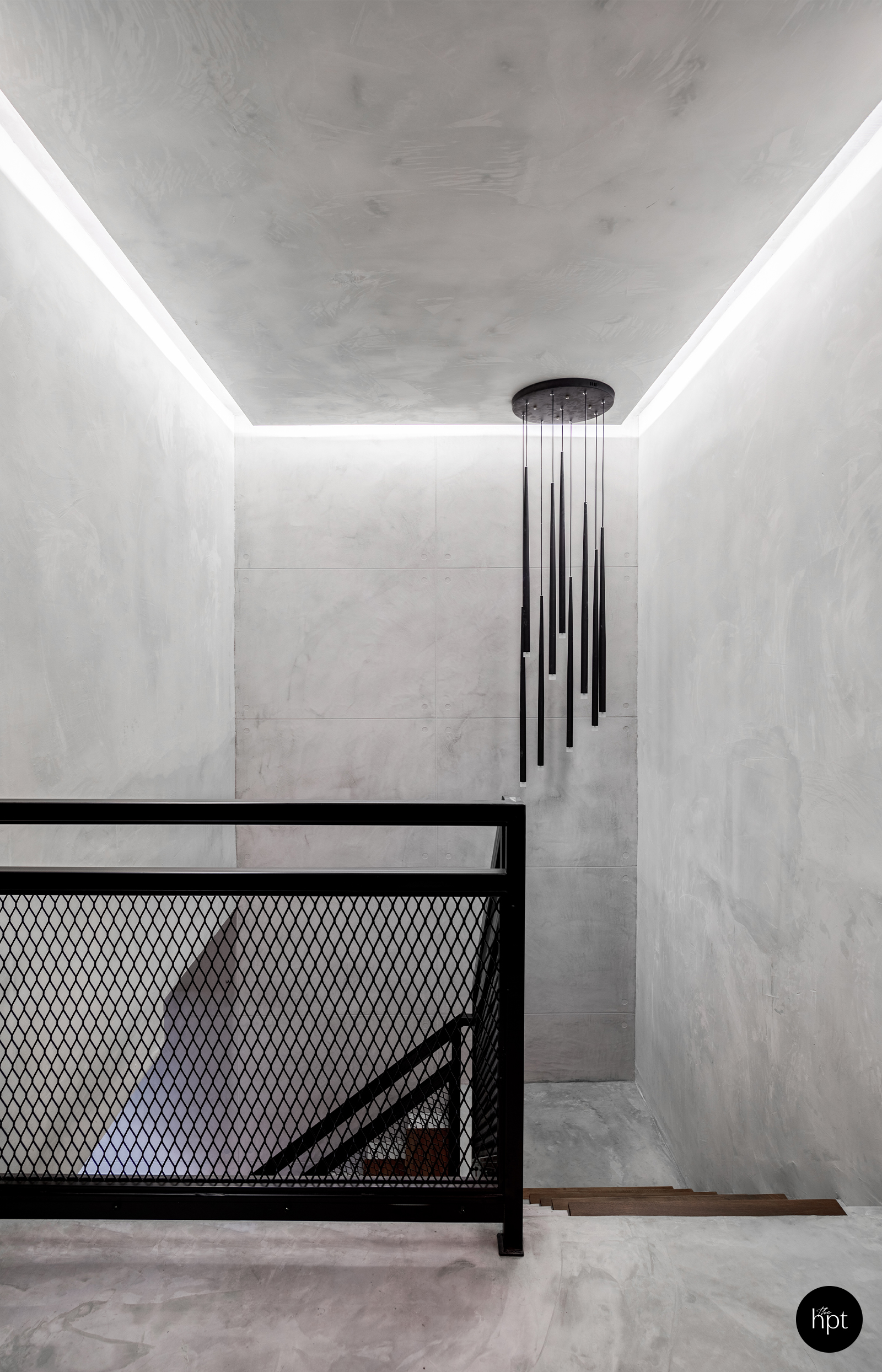
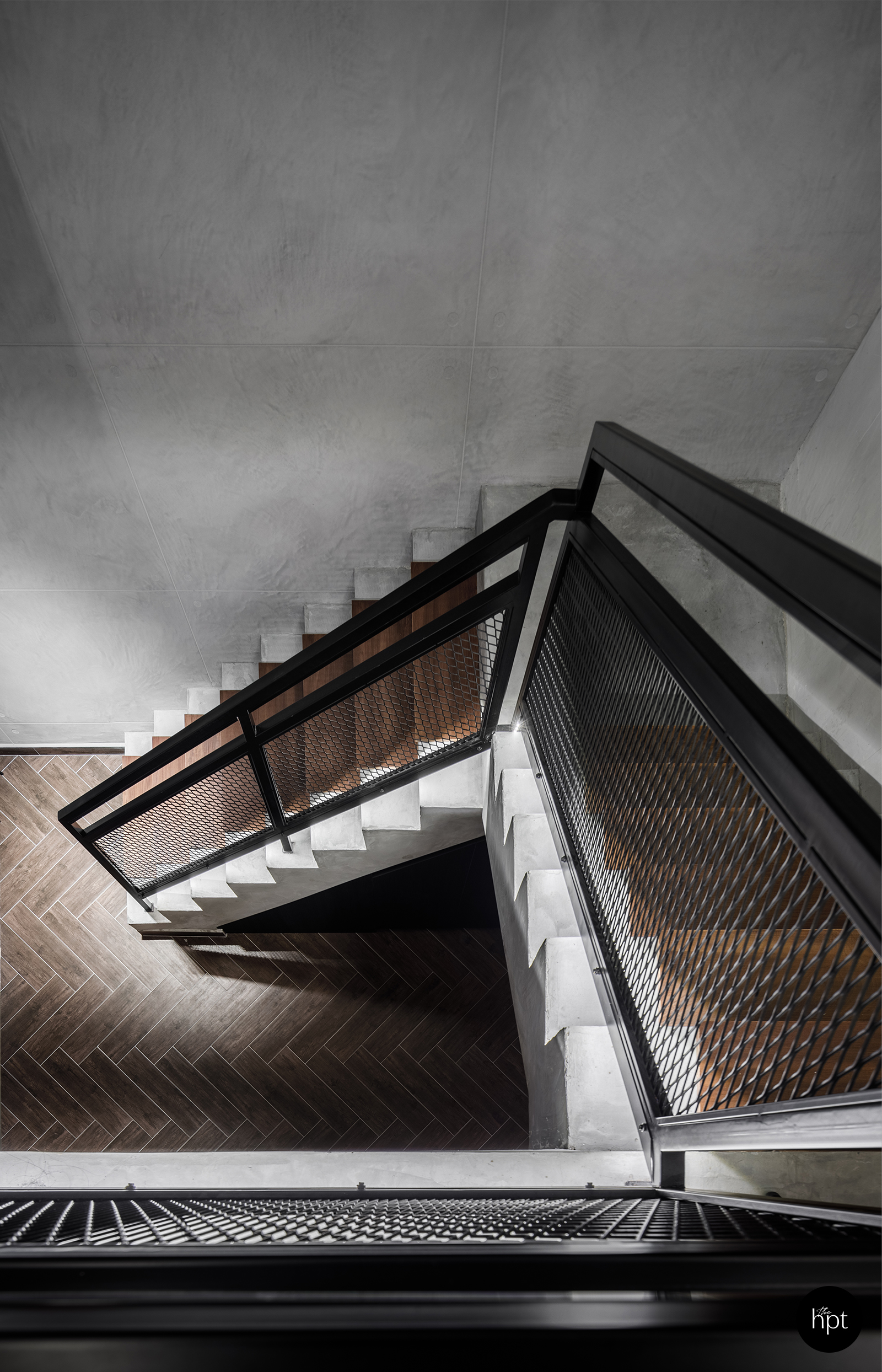
“Brutalism is a style known for its use of raw concrete and steel, celebrating the beauty of rougher textures and honest material finishes,” Royston said. “A major part of adopting this style was the decision not to have any white-washed surfaces in the whole apartment.”
Before – Kitchen
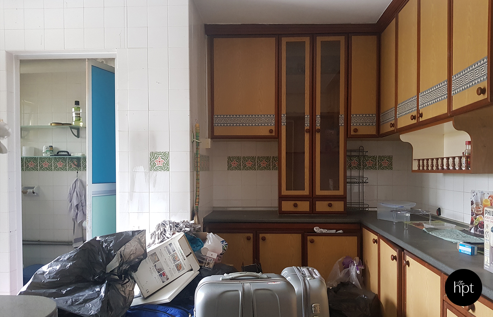
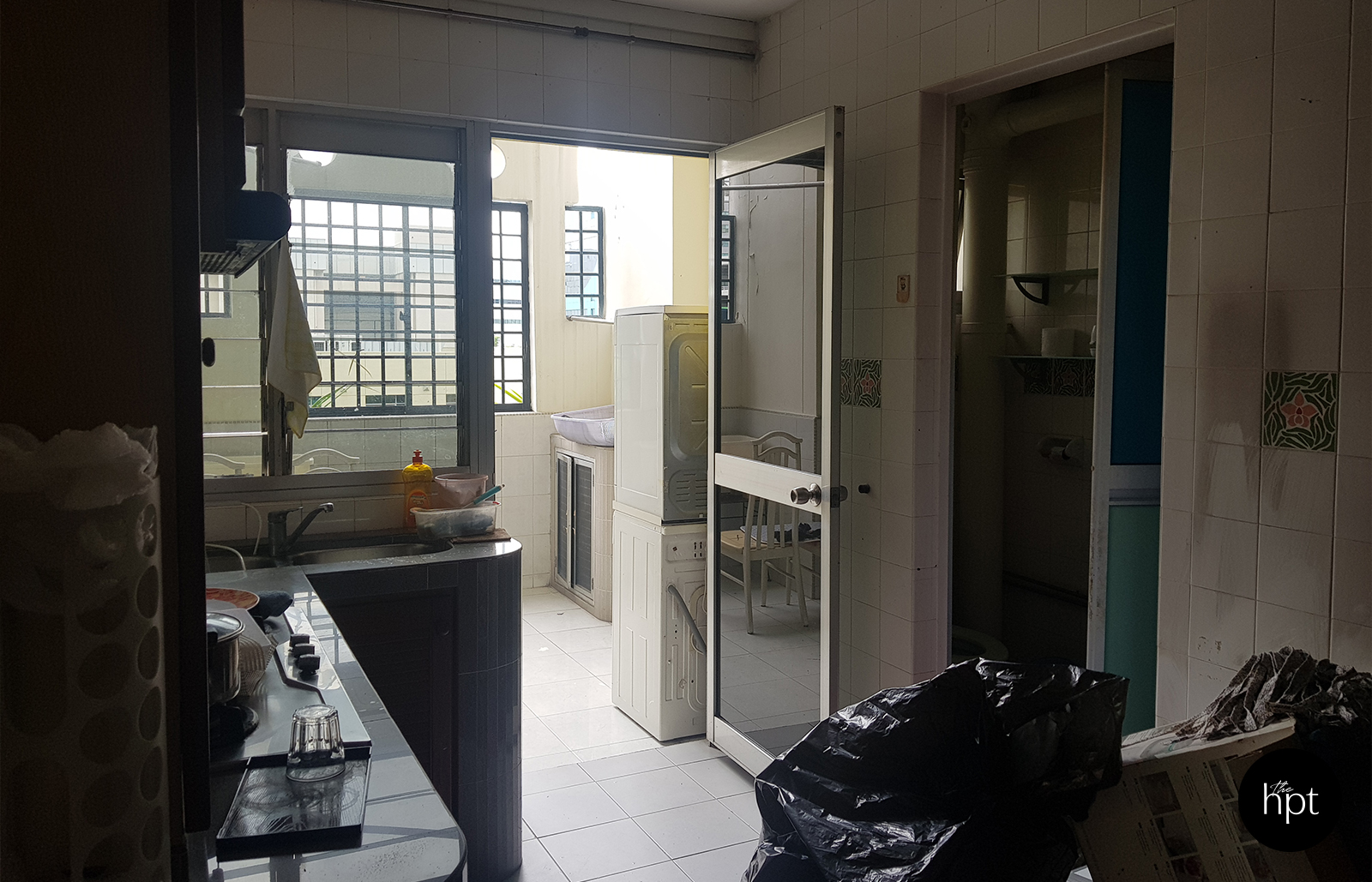
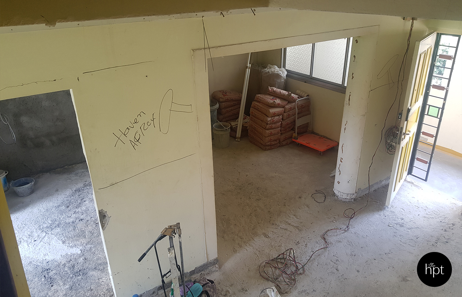
After – Kitchen
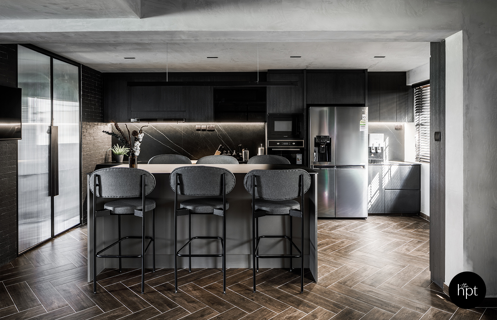
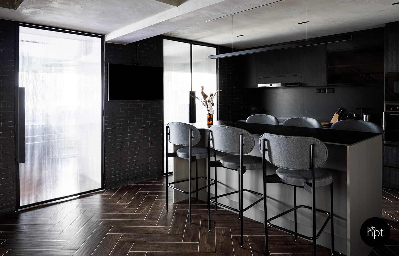
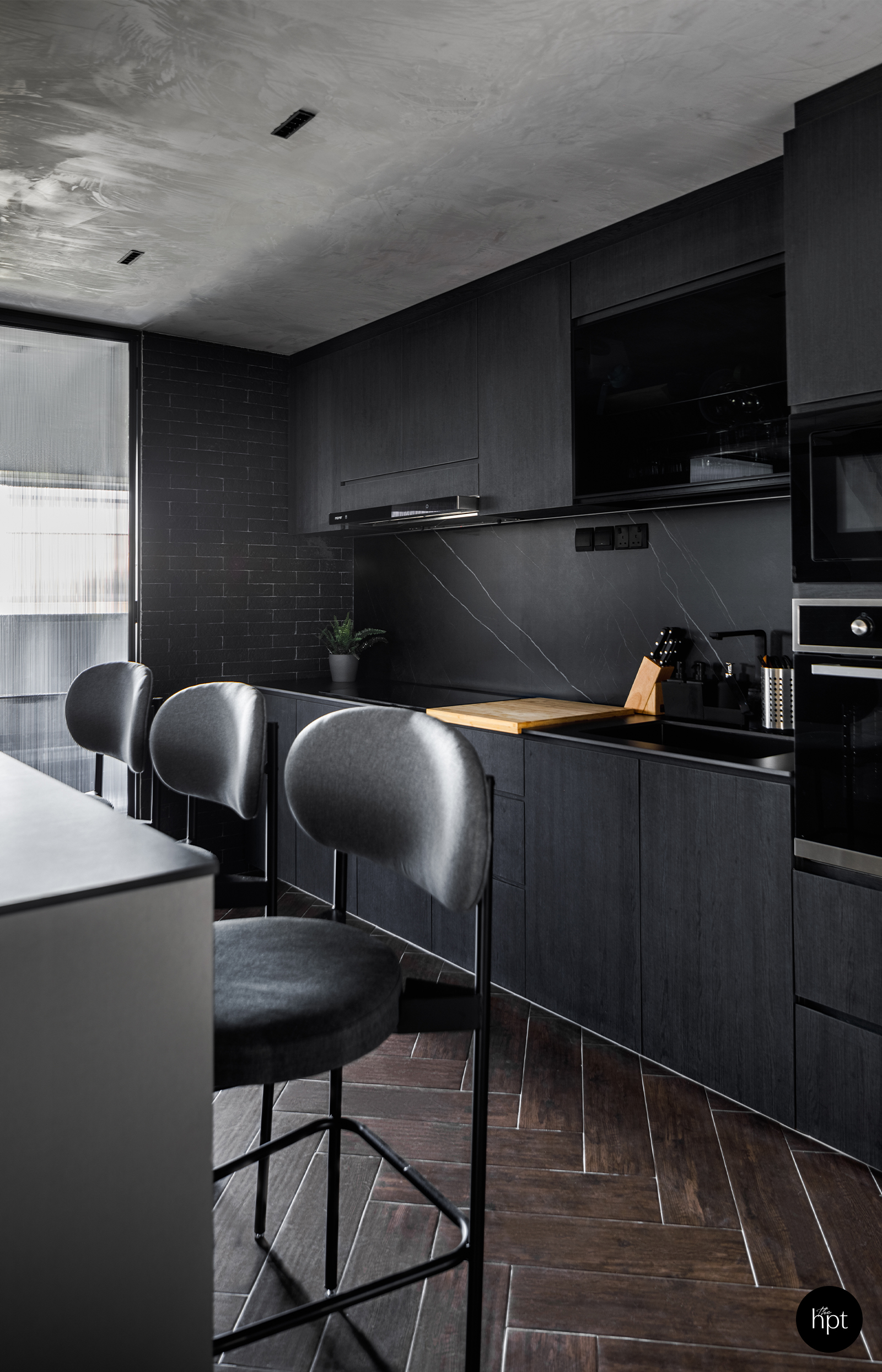
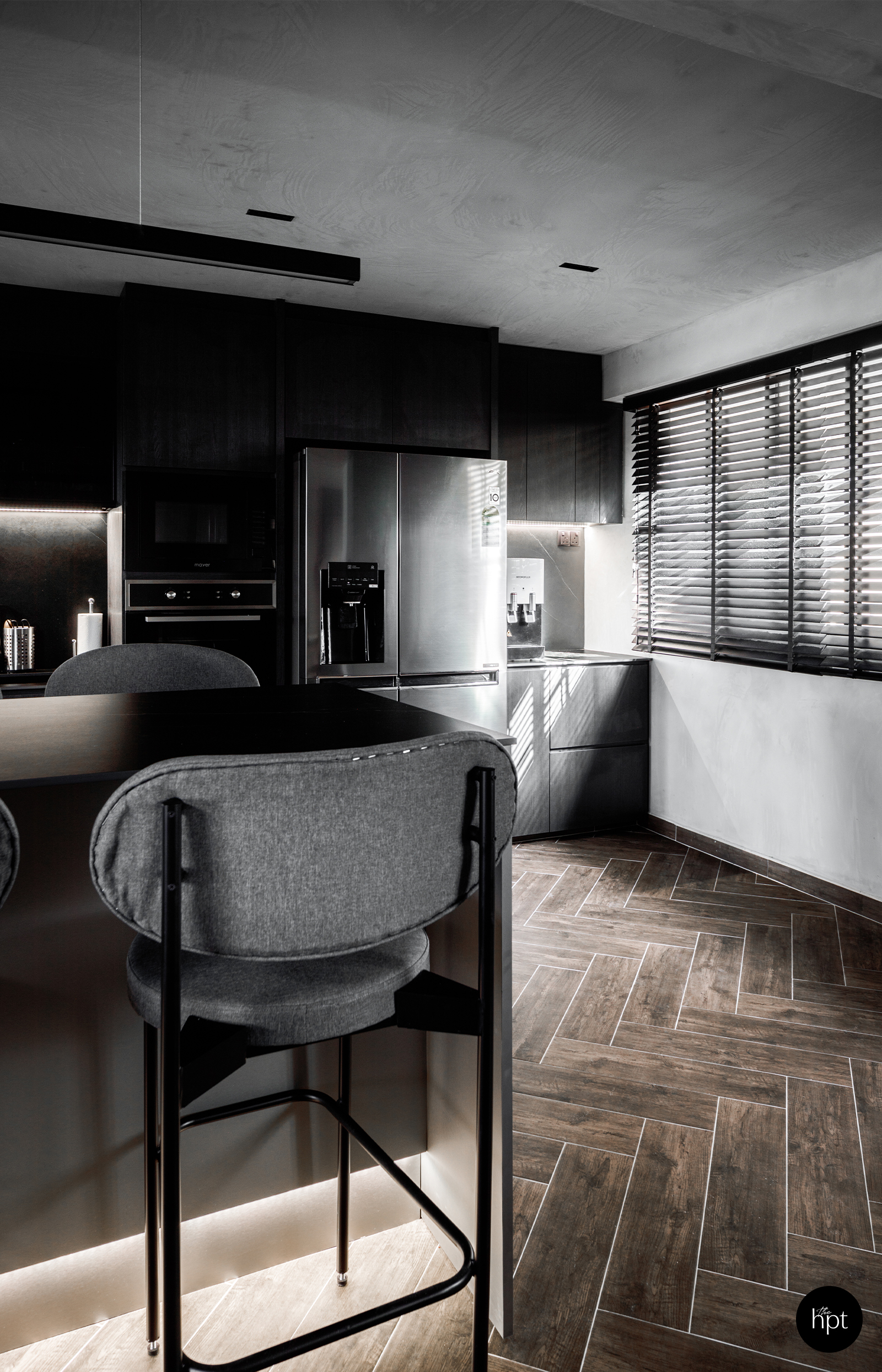
A lengthy 6-seater island now sits in this open space to create a central focal point as opposed to the previous disarray and to also create an illusion of depth as compared to the previously cramped space.
“The multi-functional communal area is now used for client meetings, social gatherings, and weekly family dinners,” Royston shared. “For this, a subtle blend of contemporary and organic appeal was achieved with sculptural earthenware vases.”
Before & After – Master Bedroom
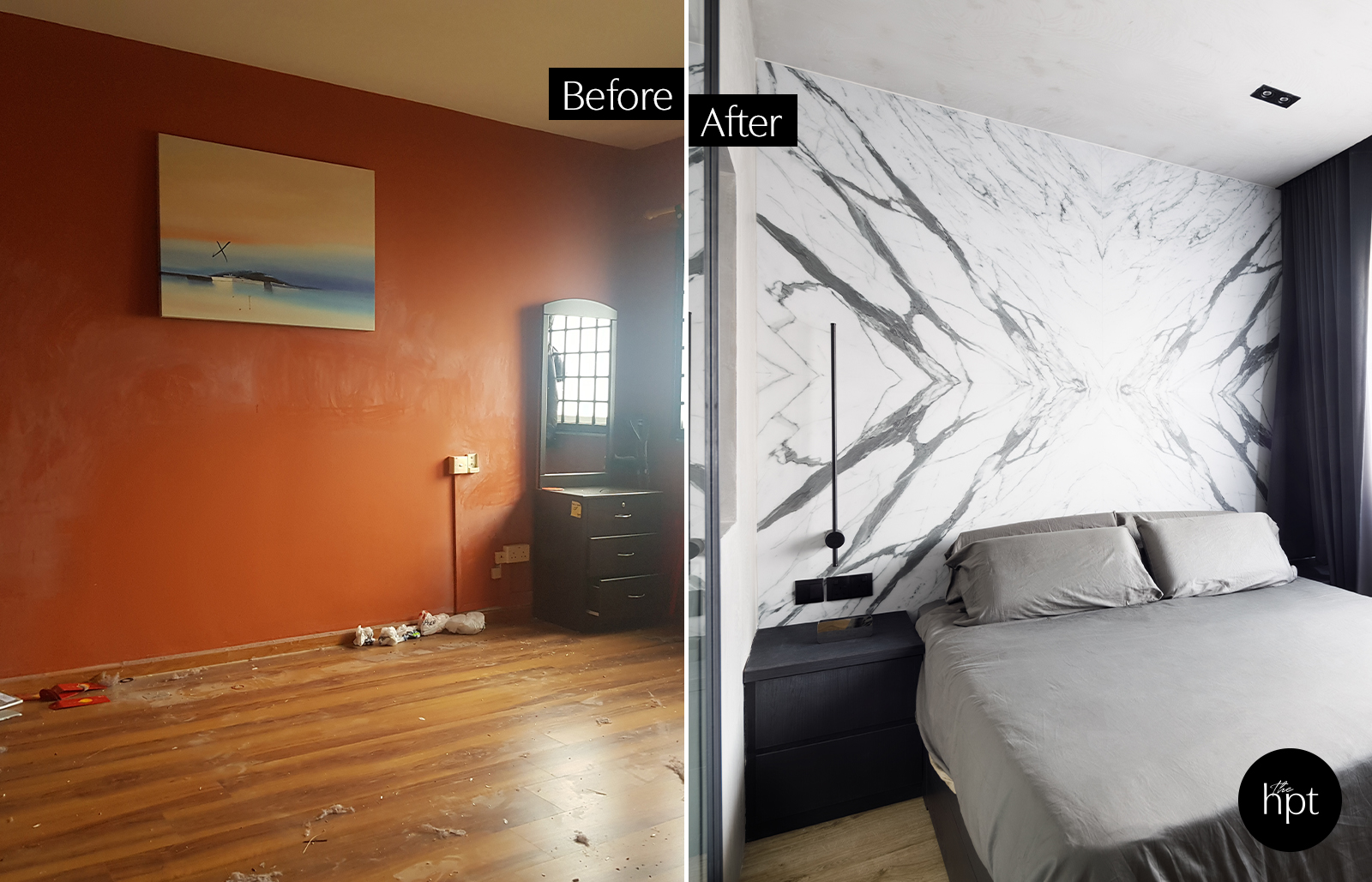
In the master bedroom, Royston had shared that once the doors of the walk-in wardrobe is closed, the occupants of the room would not be able to hear the noise happening outside. “My brother and I can be making a ruckus outside and my parents won’t be affected at all!” he laughed.
Before – Junior Bedroom
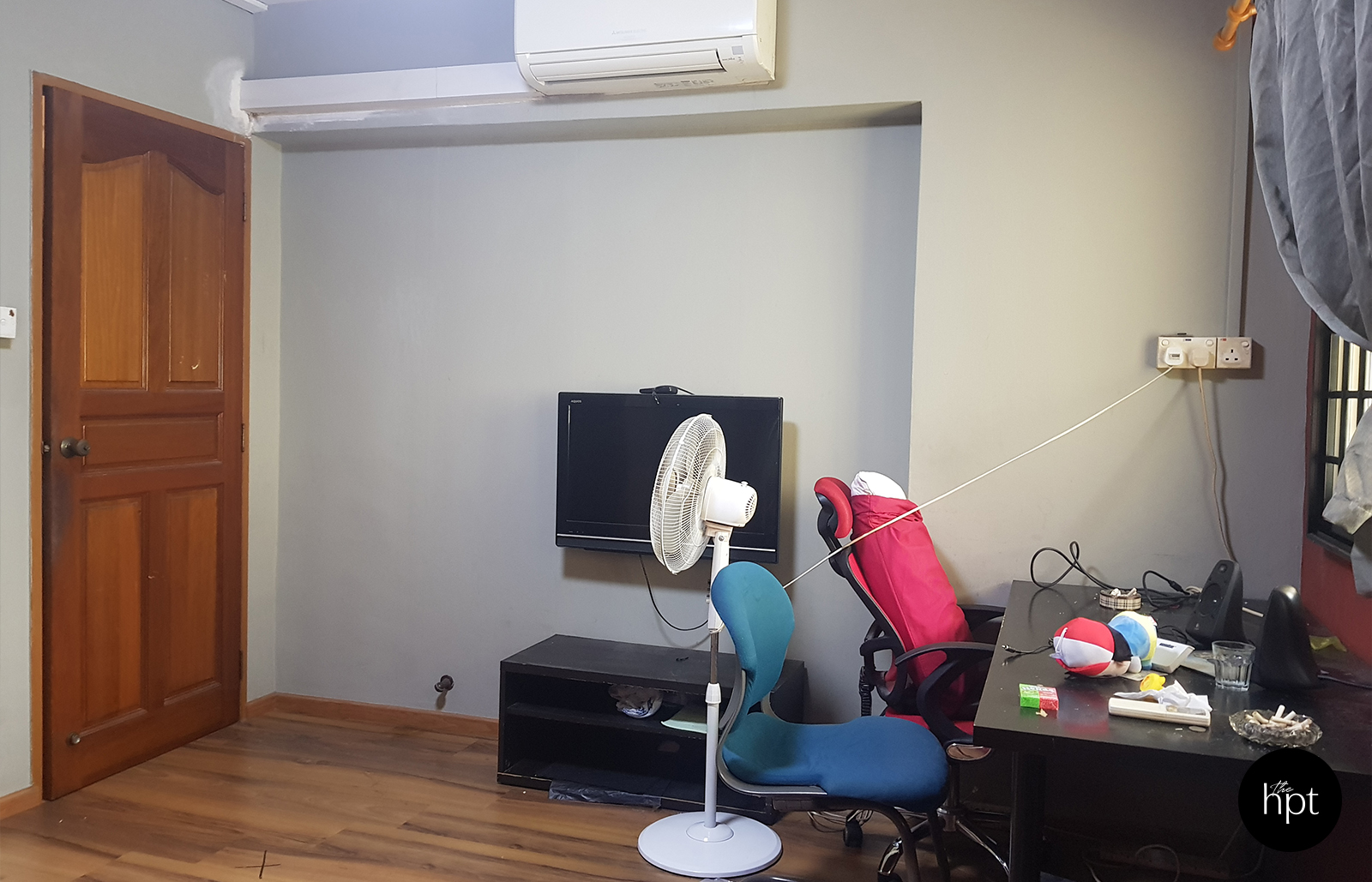
After – Junior Bedroom
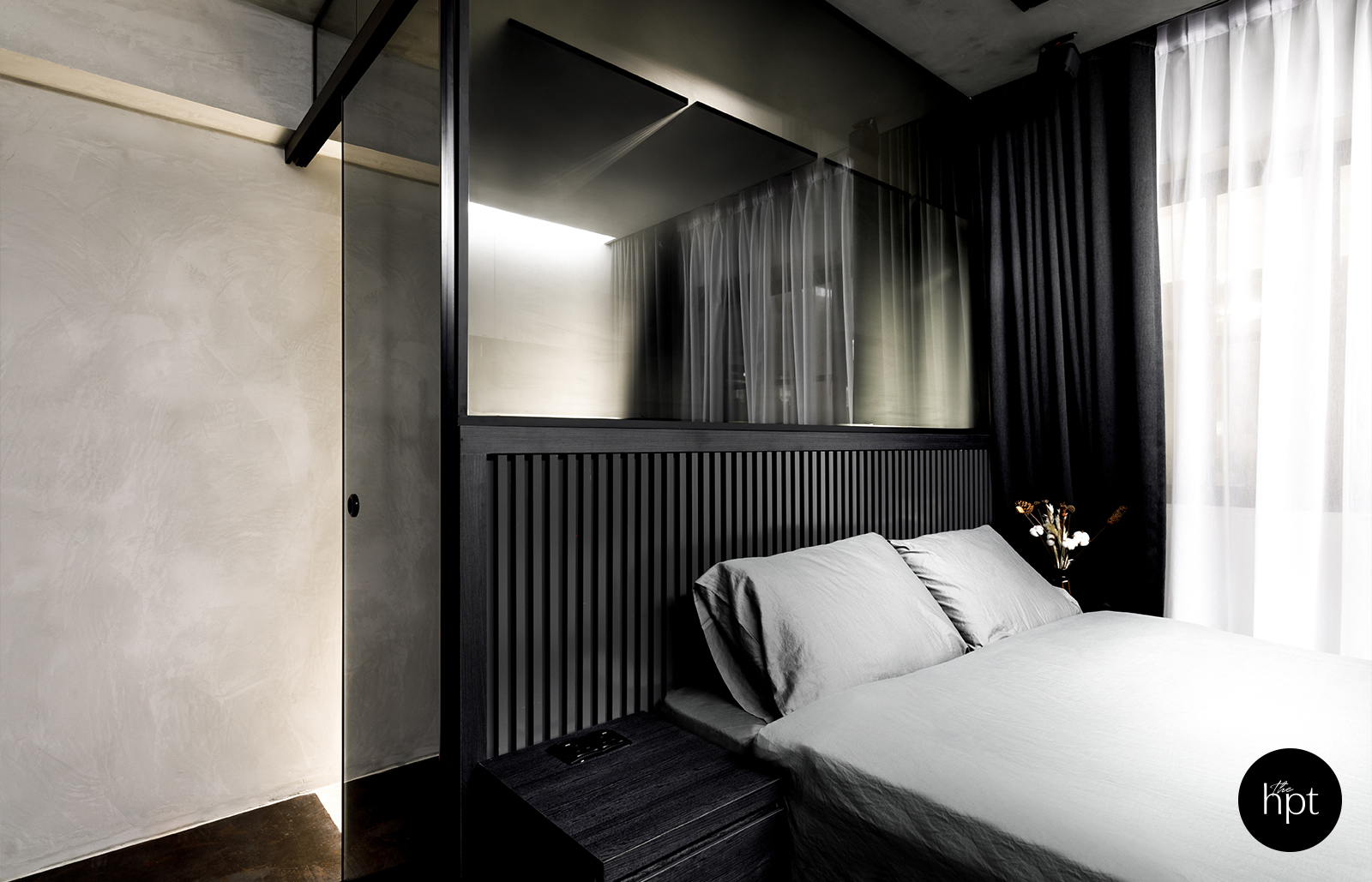
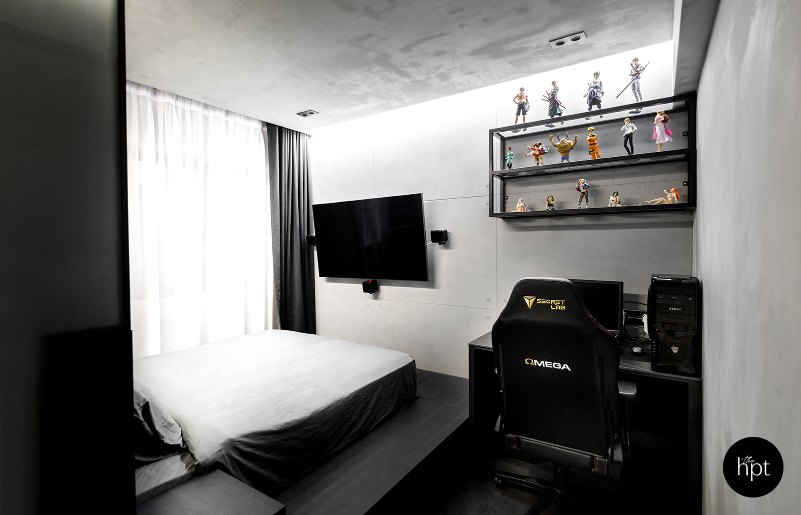
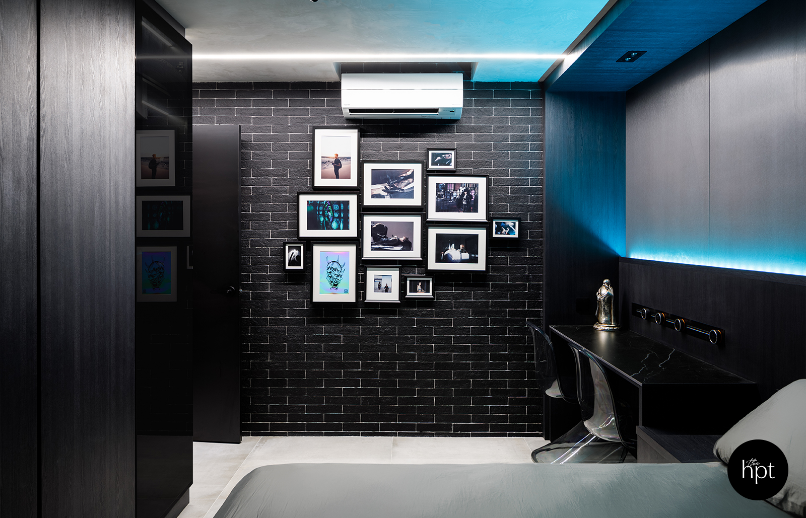
The darker, monochromatic spaces minimises the distractions in the surroundings, allowing us to focus on the ultimate theatre and gaming experience
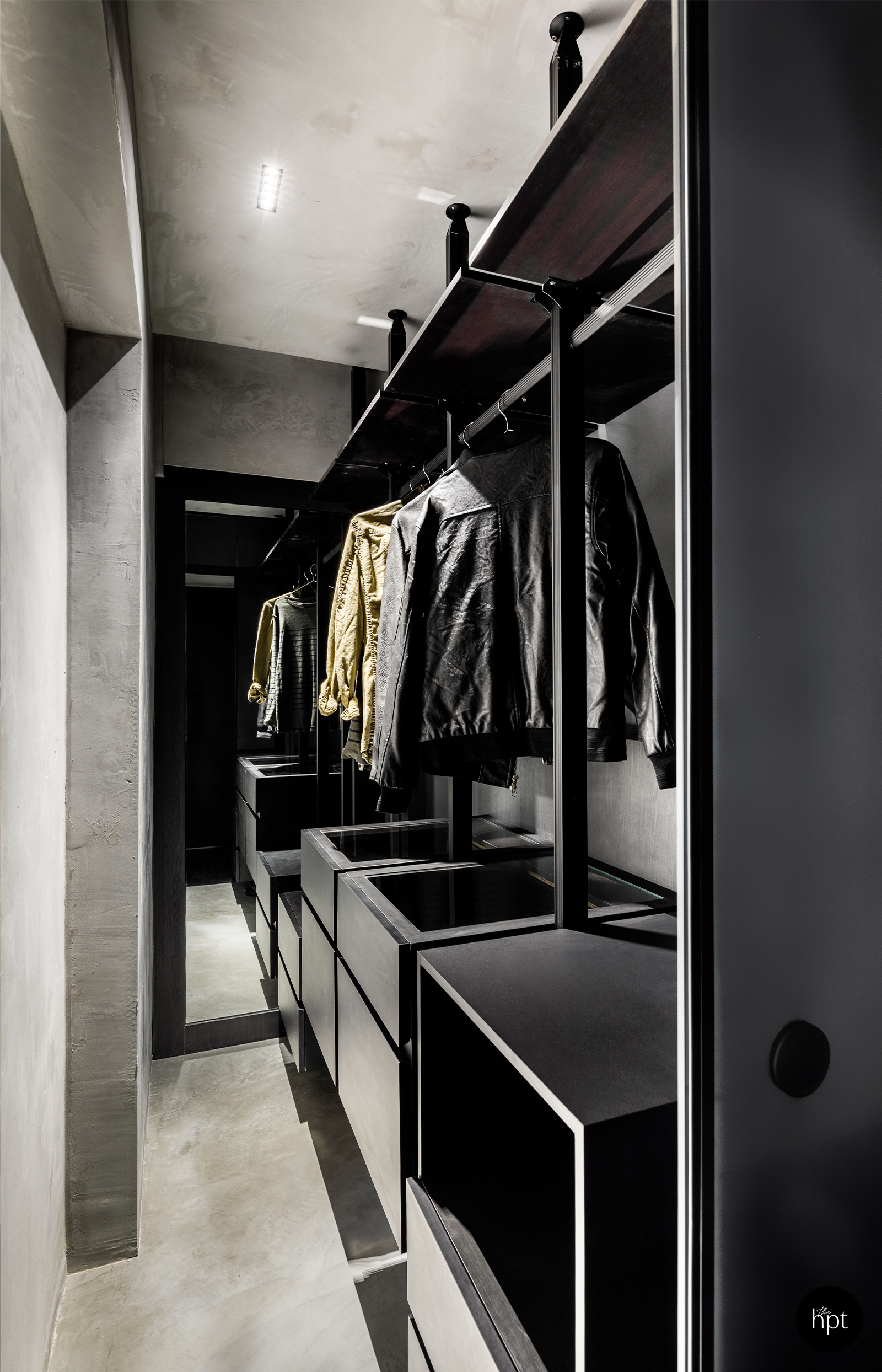
“My brother’s a gamer, so his bedroom was designed with a cool vibe in mind,” Royston said. “One solution that we came up with regarding the soundproofing was to build a walk-in wardrobe behind the platform bed; it kills two birds with one stone both because it’s a good replacement for the shelving system that my brother used to have and it’s an additional buffer that prevents noise from filtering into my room next door.”
Before – Royston’s Bedroom
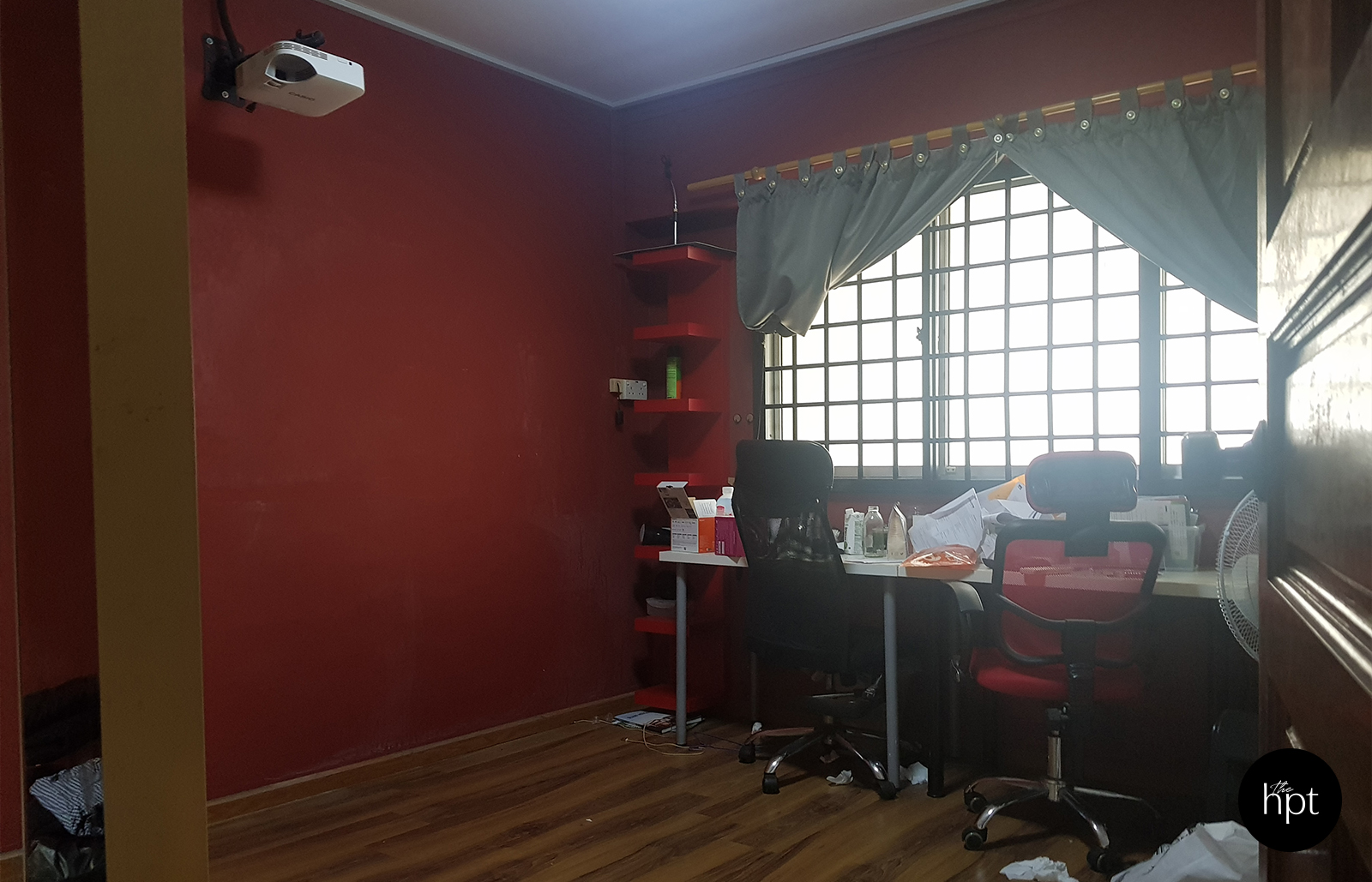
After – Royston’s Bedroom
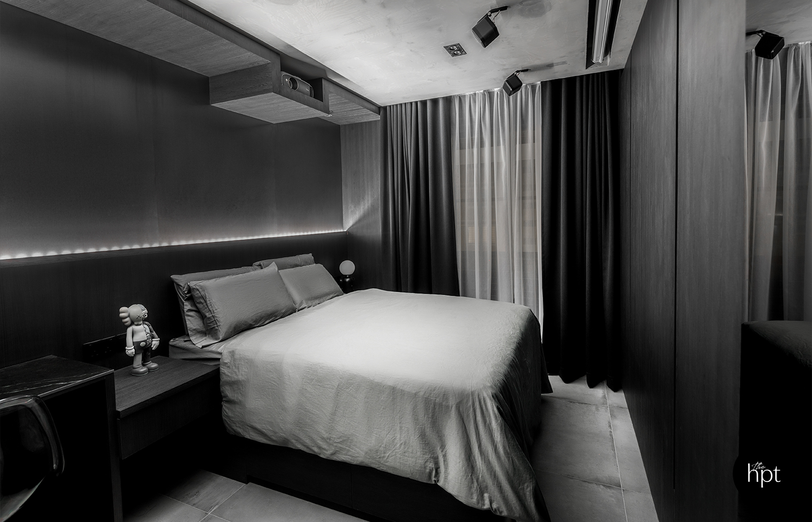
Bed frames/platforms were customised to comfortably align the users’ eye-level to the screens especially at such short-distance.
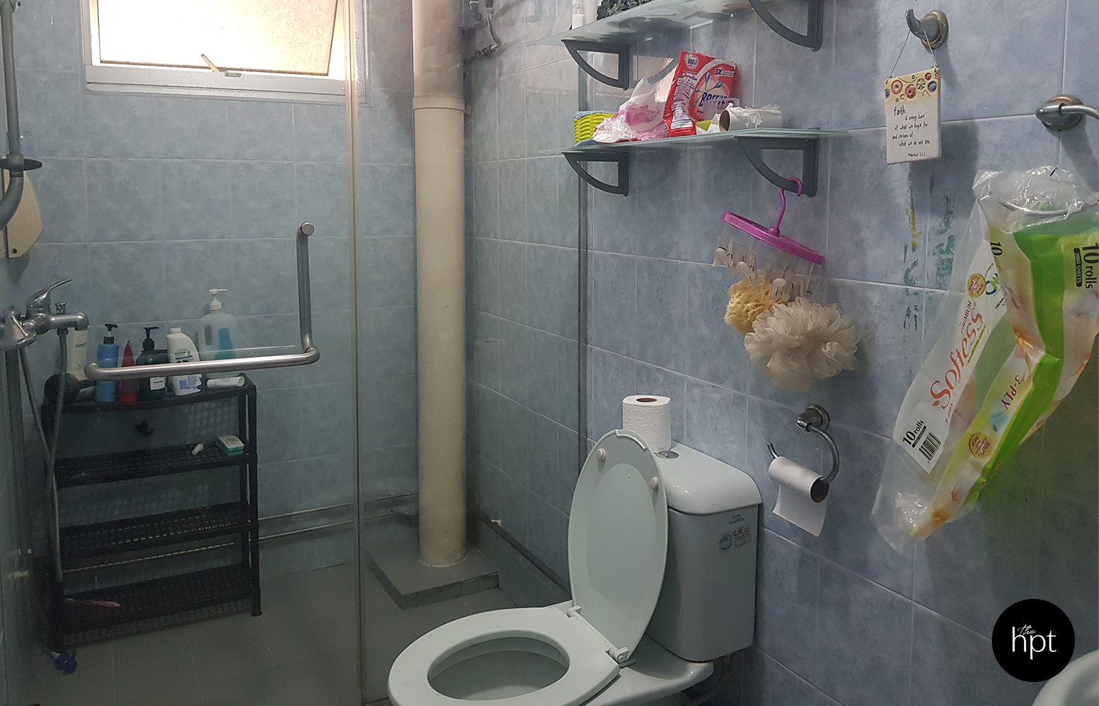
Before – Common Bathroom
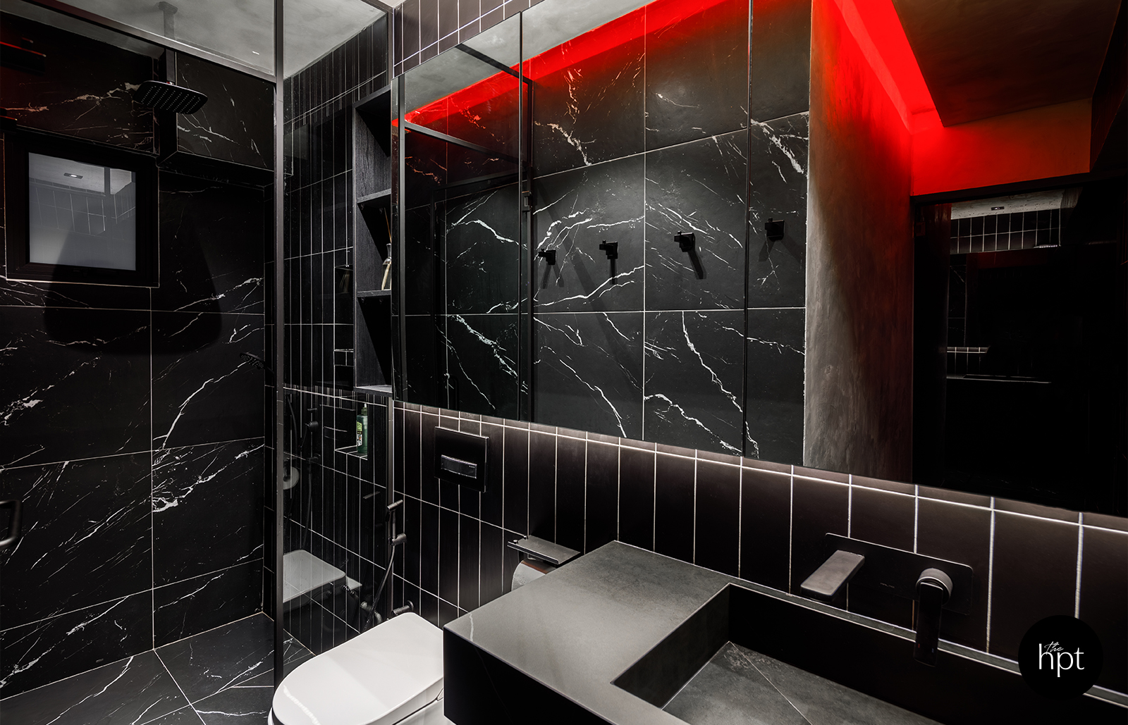
After – Common Bathroom
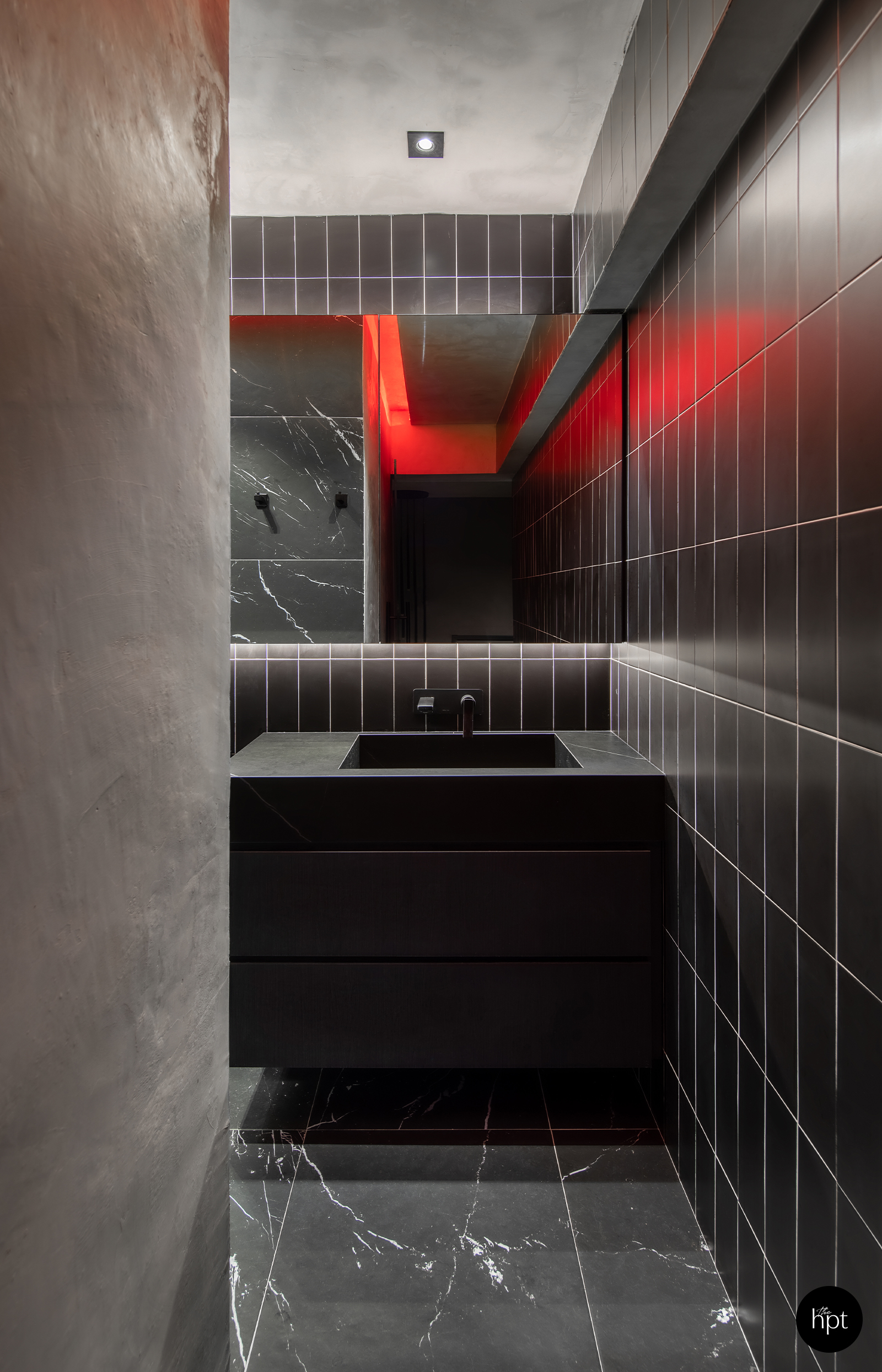
Before – Master Bathroom
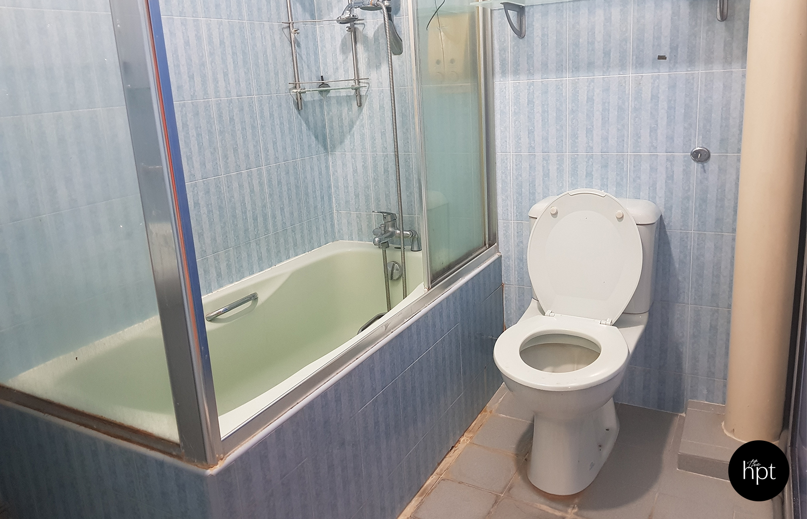
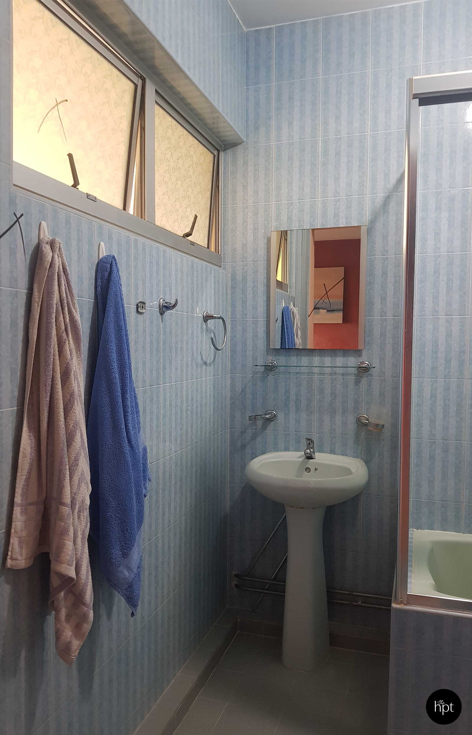
After – Master Bathroom
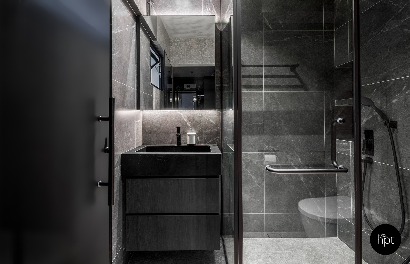
A floor to ceiling shower screen was built as Royston and family felt that it looks better at full height than to end it off at 2 metres.
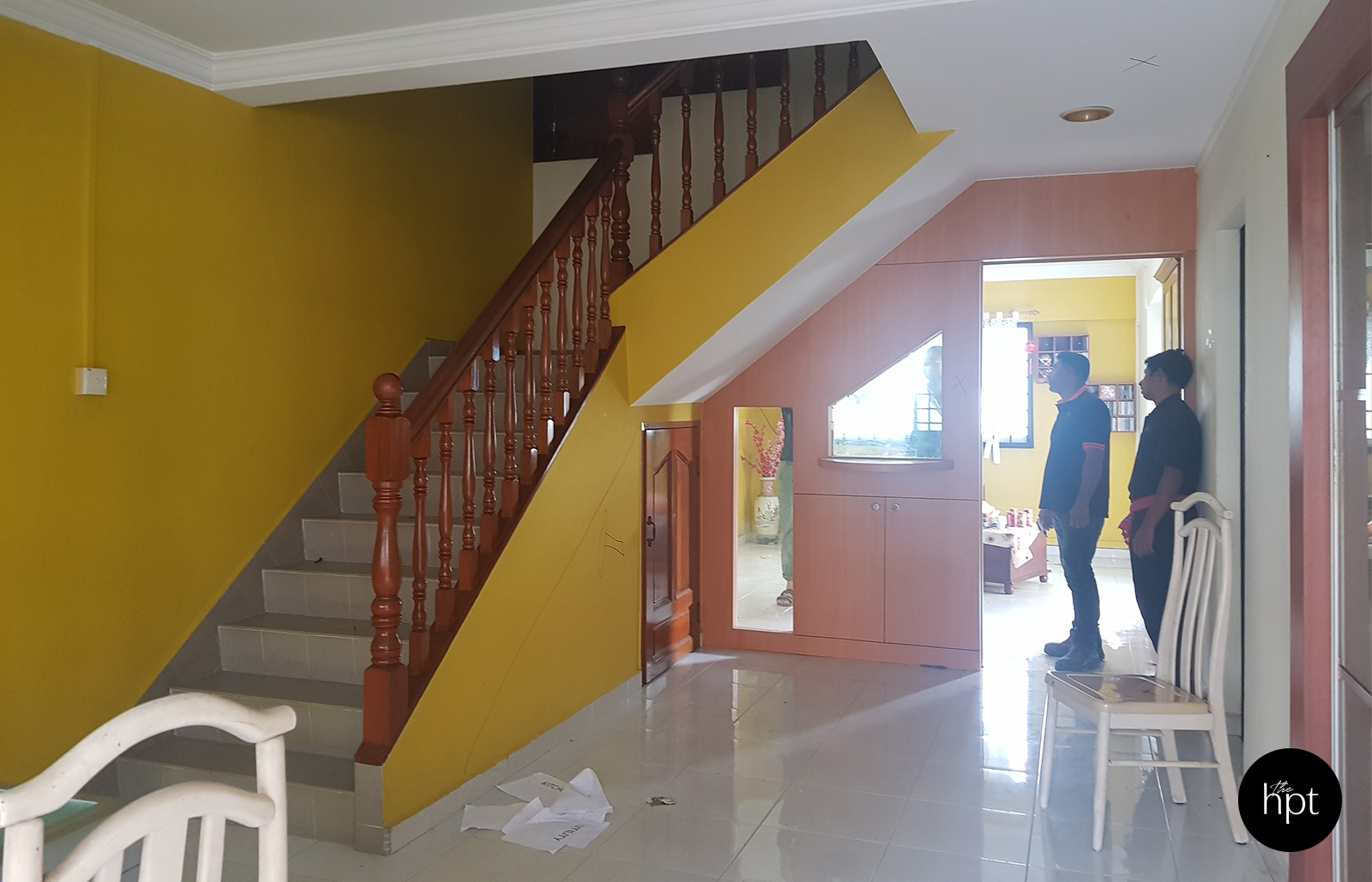
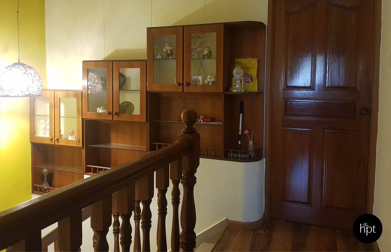
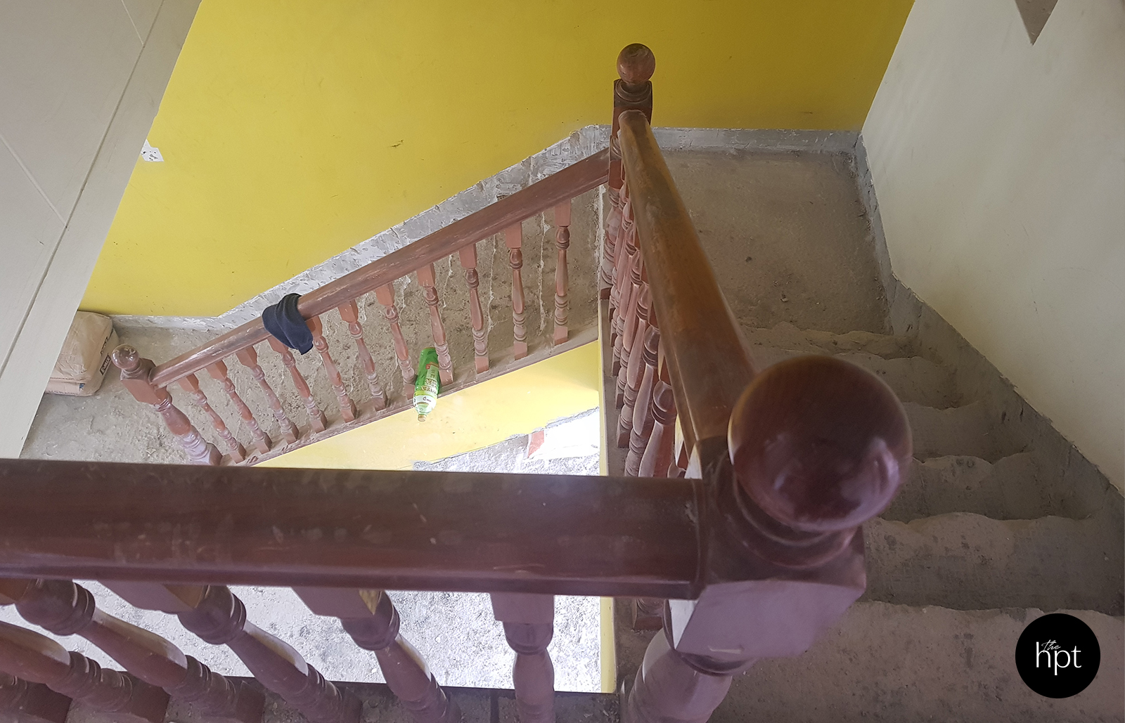
Before – Stairs
After – Stairs
To see more of Royston’s work, visit his profile at The Happitat.
You will receive a personal login only after you have
submitted a designers shortlist.

