Free Consultation with no strings attached
Connect Directly to the Designer of your choice
with All Shortlisted Designers
From the creation of shapes and lines that could either soften the aesthetic or introduce a strong modern character, to evoking a calm and airy atmosphere with light colour palettes or a dramatic effect with moodier tones, geometry and colours are easily one of the most integral parts of the interior design process.
However, with the recent popularity of minimalist, understated, and even white-washed Pinterest interior aesthetics, the creative interplay of geometry and colours seems to have been put on the back burner for most designers.
But not these 4 designers who bucked the trend to ingeniously incorporate these fundamental design elements once more, even in the modern homes that they design.
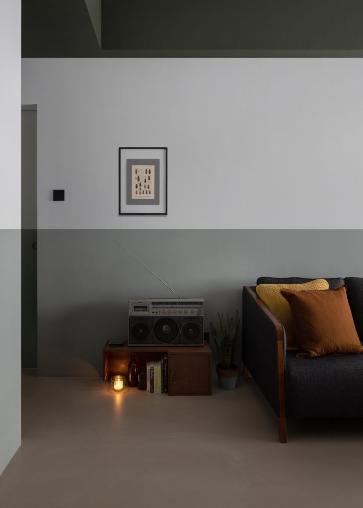
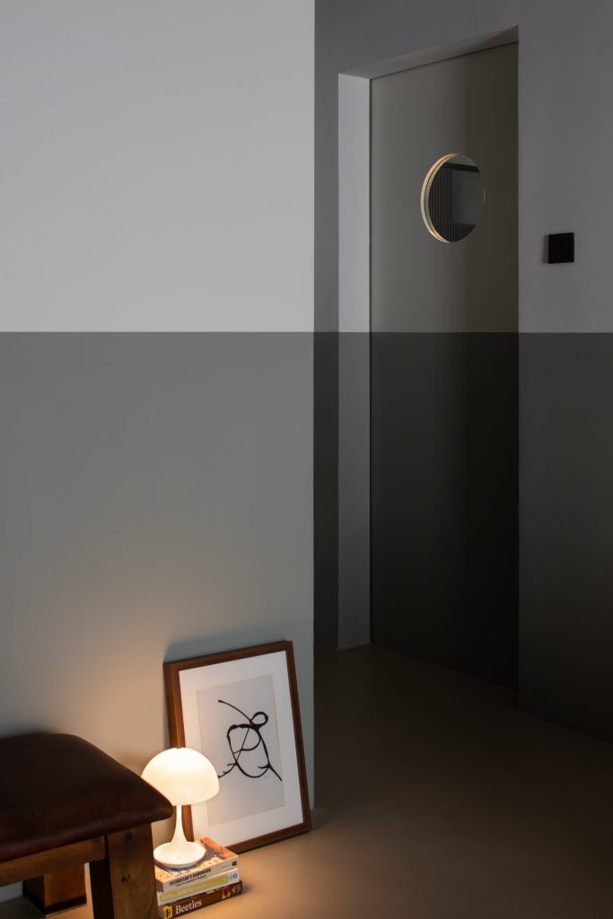
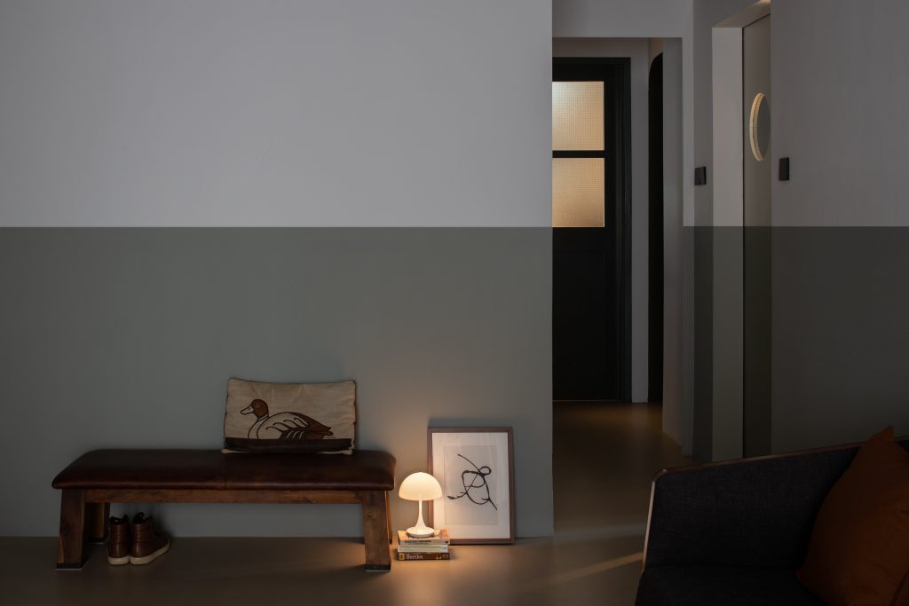
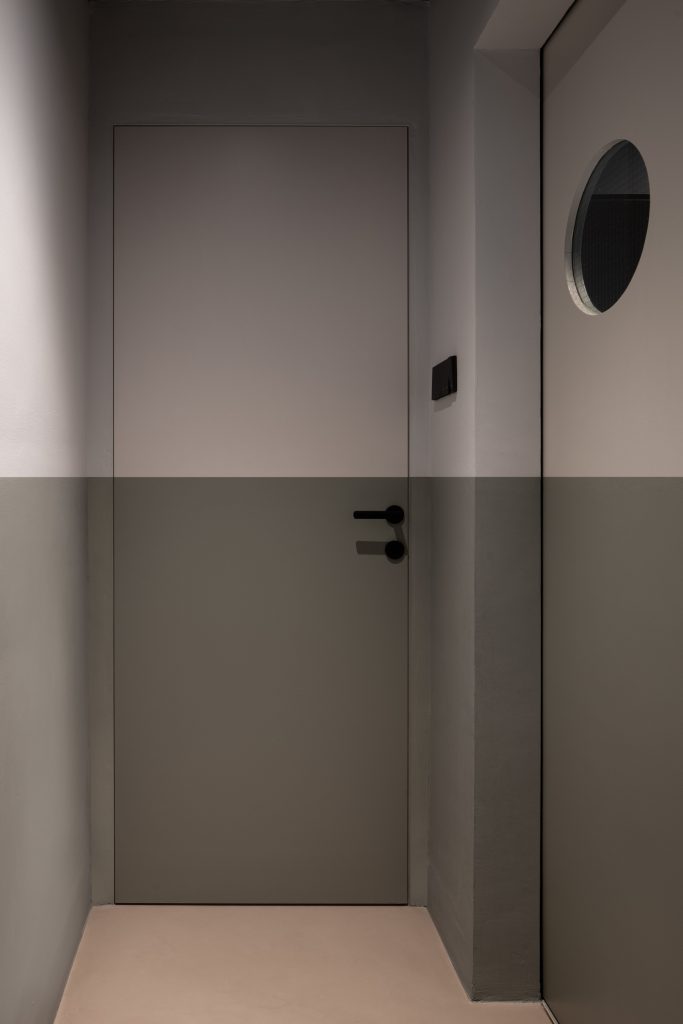
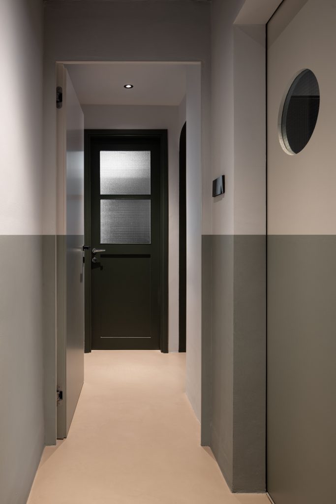
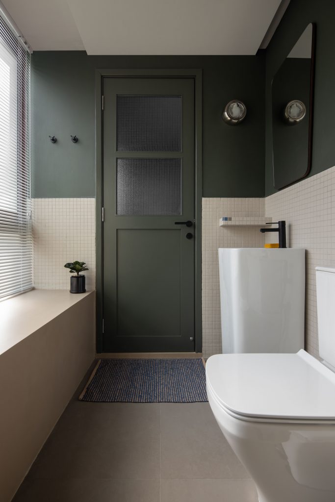
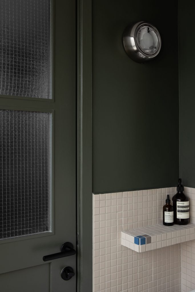
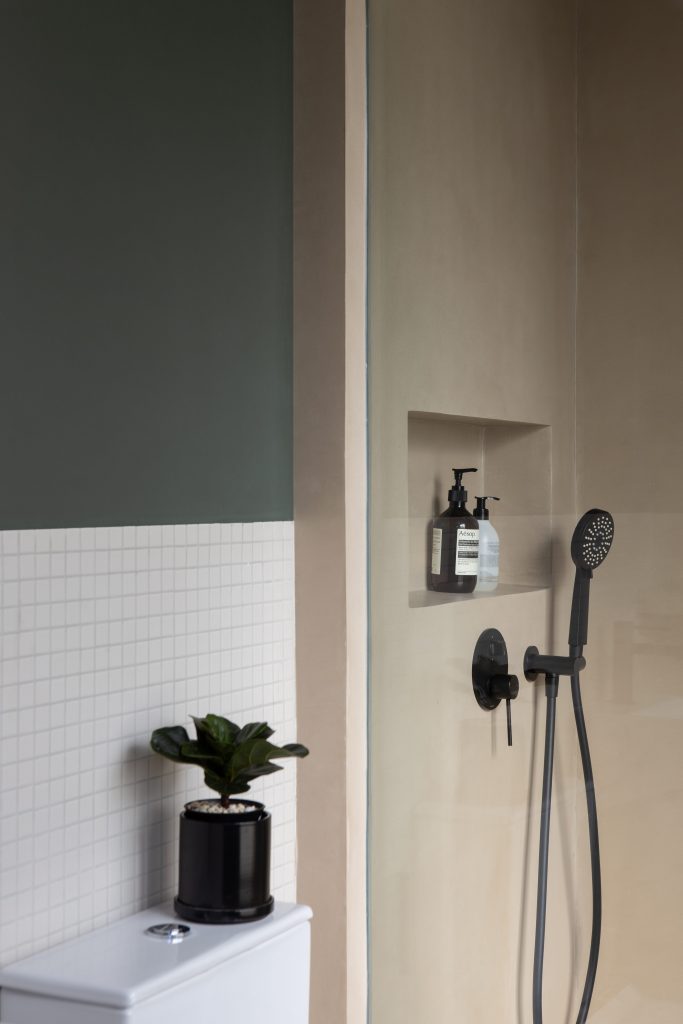
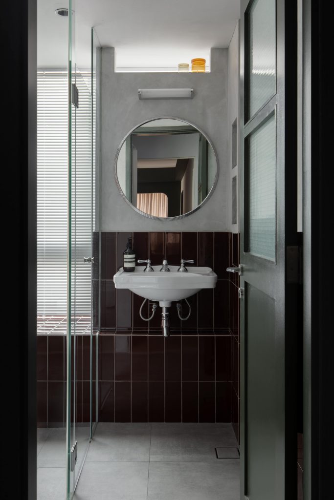
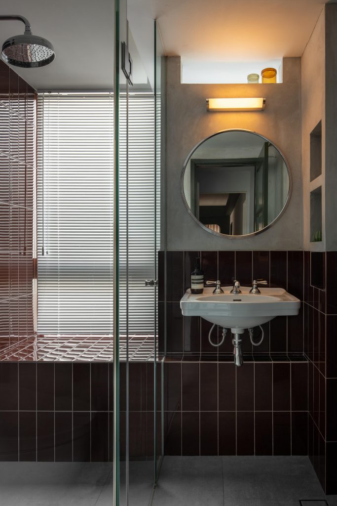
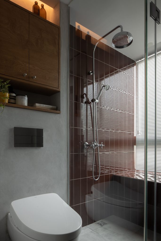
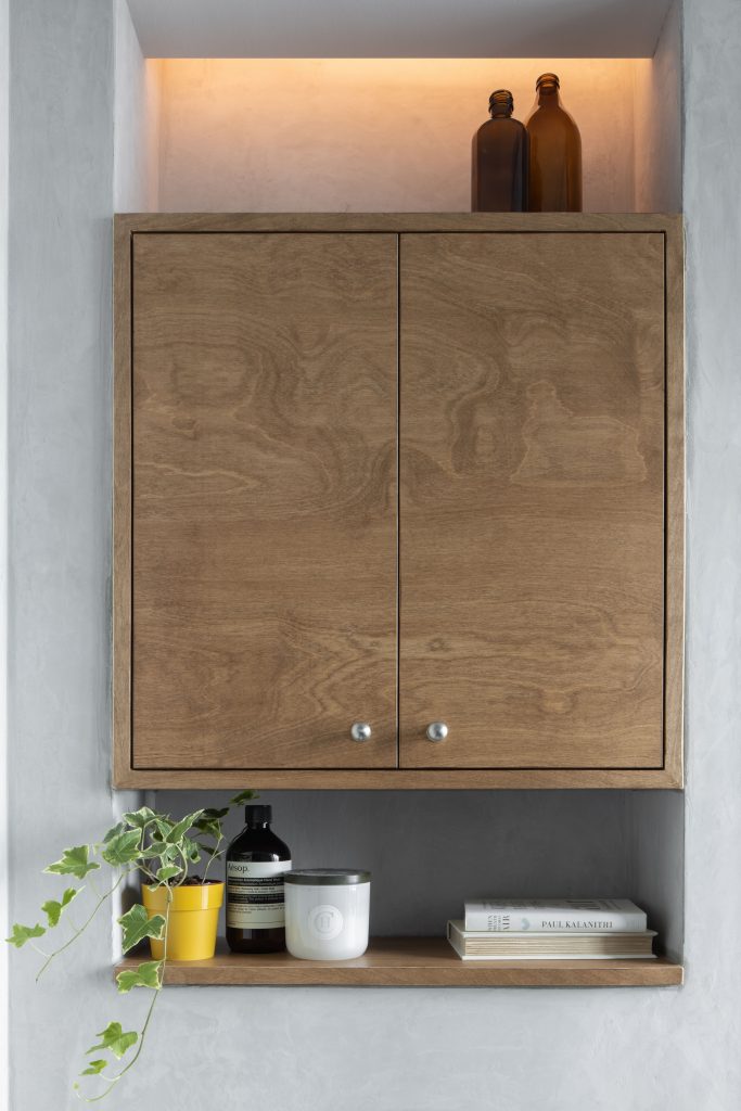
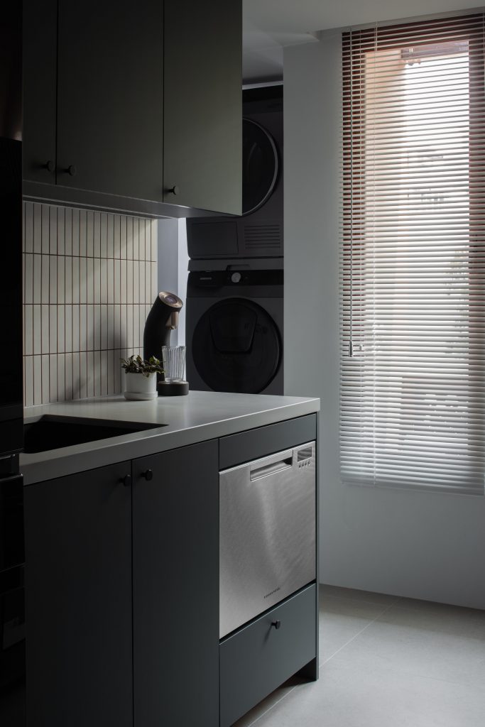
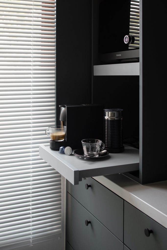
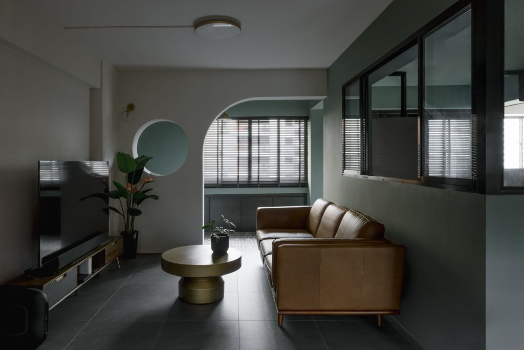
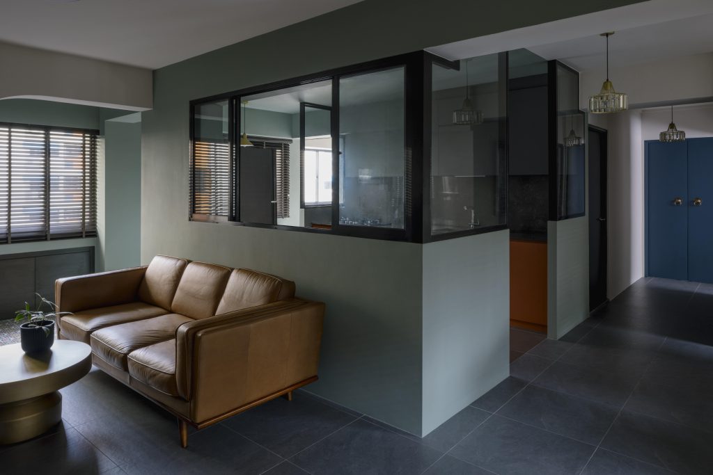
Tired of the commonplace colour palette of whites and browns in minimalist modern homes, designers Joy & Jo opted for an unusual autumn-influenced colour palette that evokes both a sense of calm and nostalgia that fits perfectly with this retro-inspired Joo Chiat home.
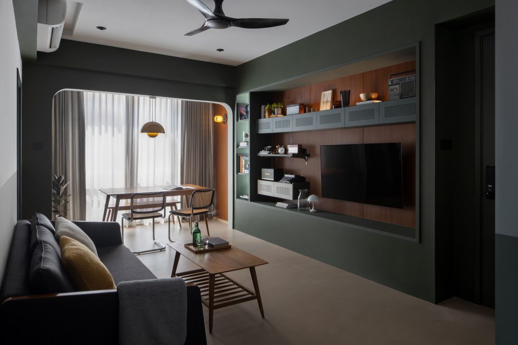
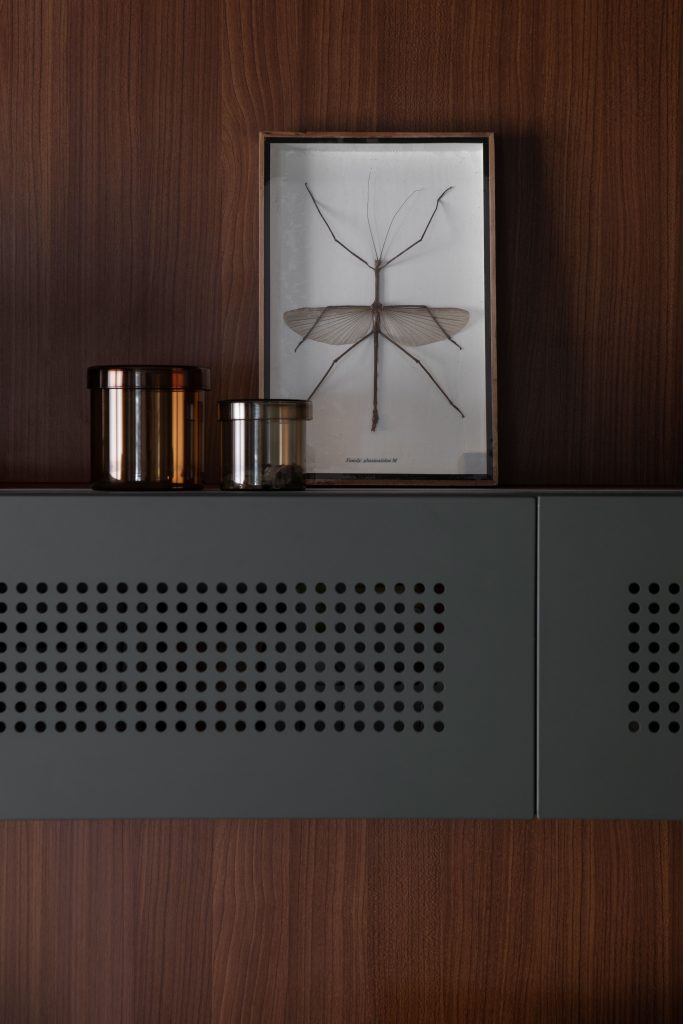
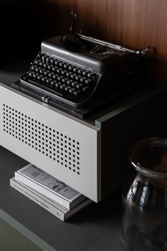
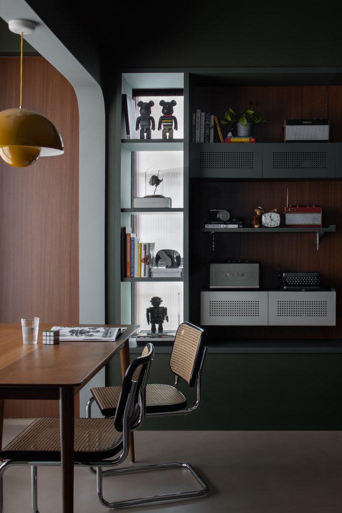
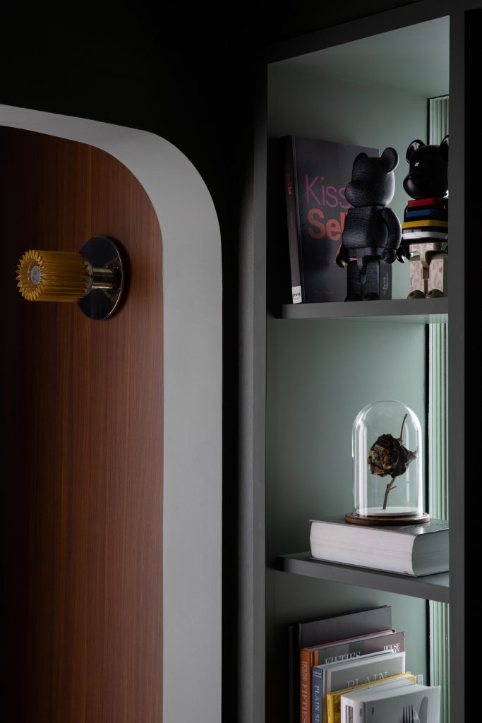
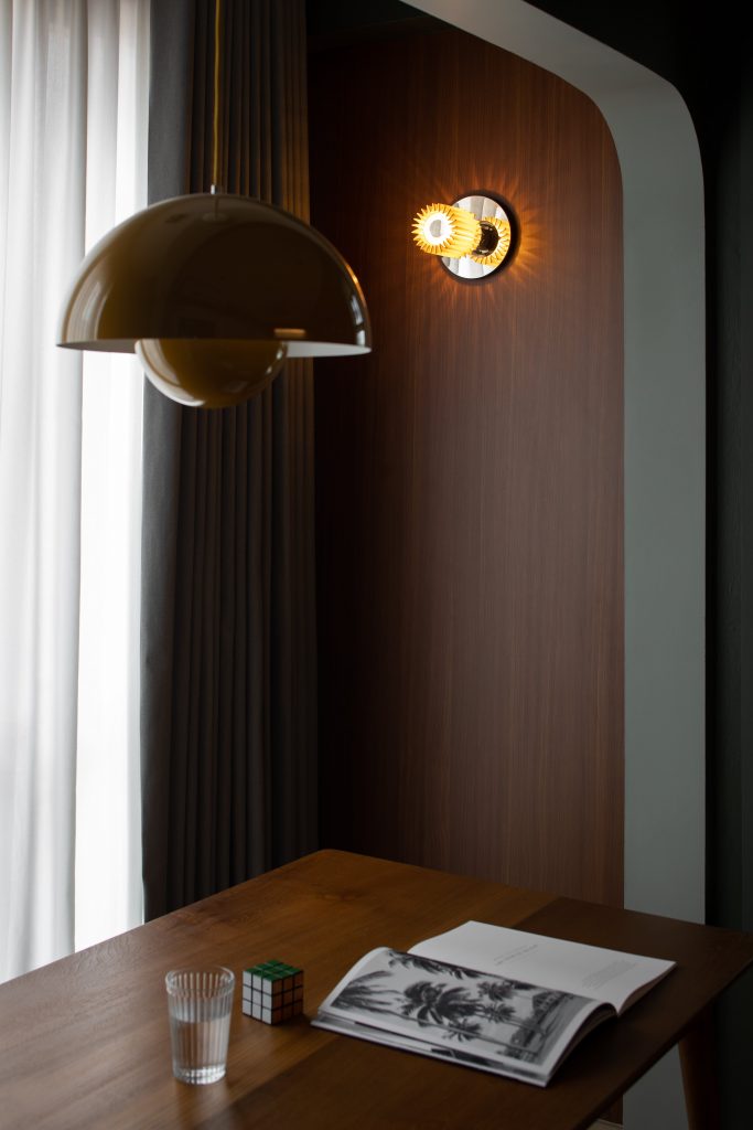
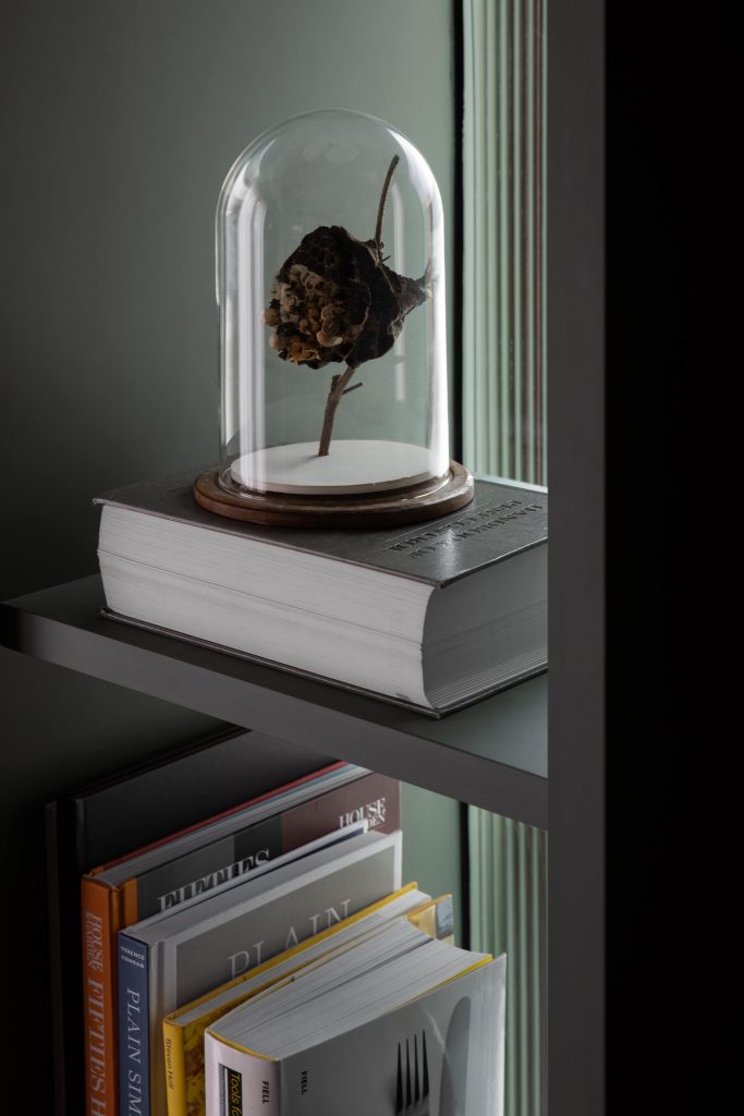
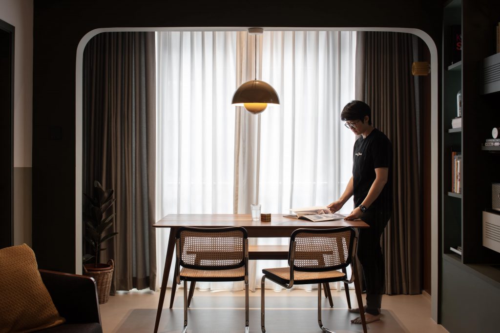
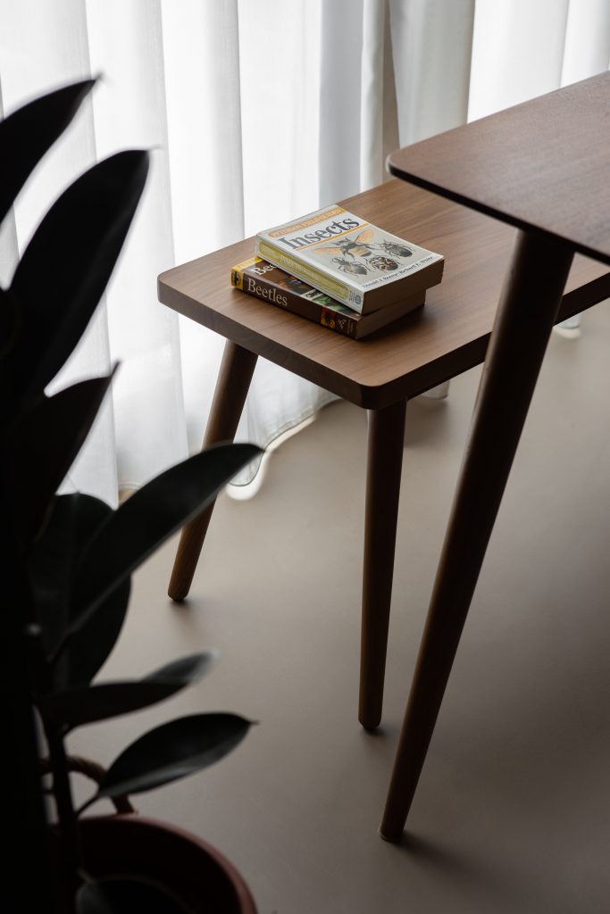
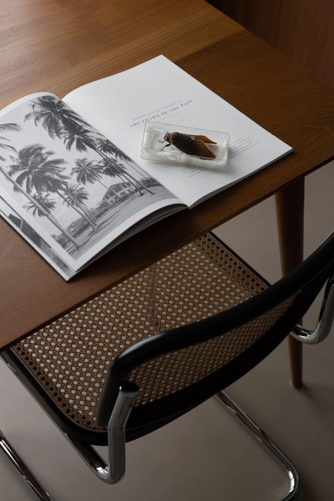
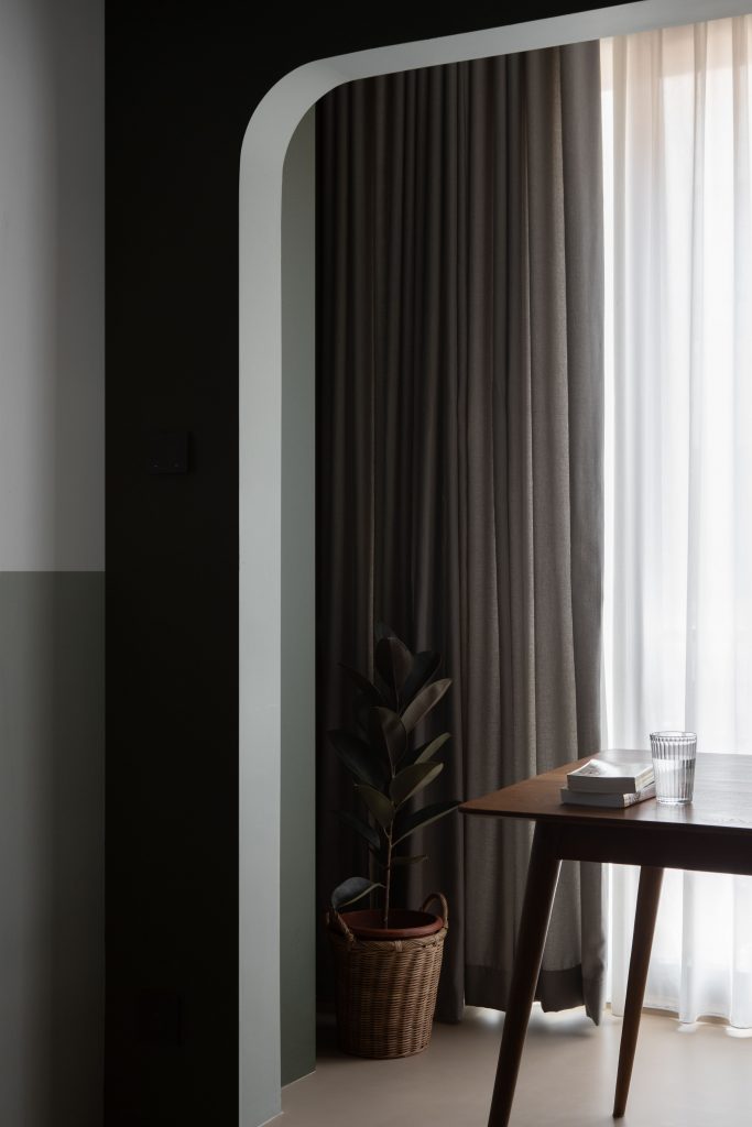
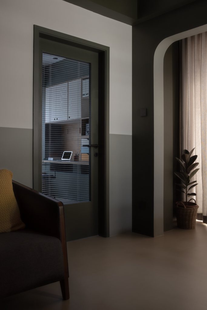
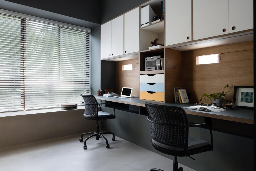
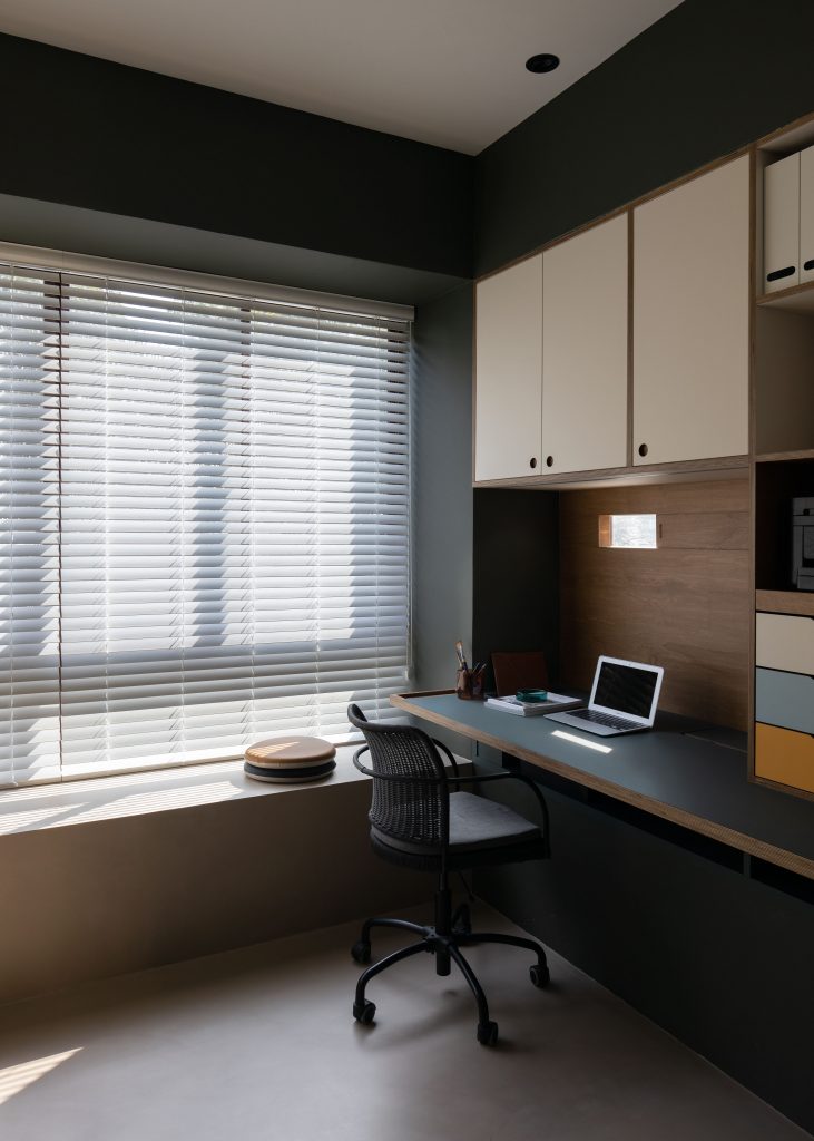
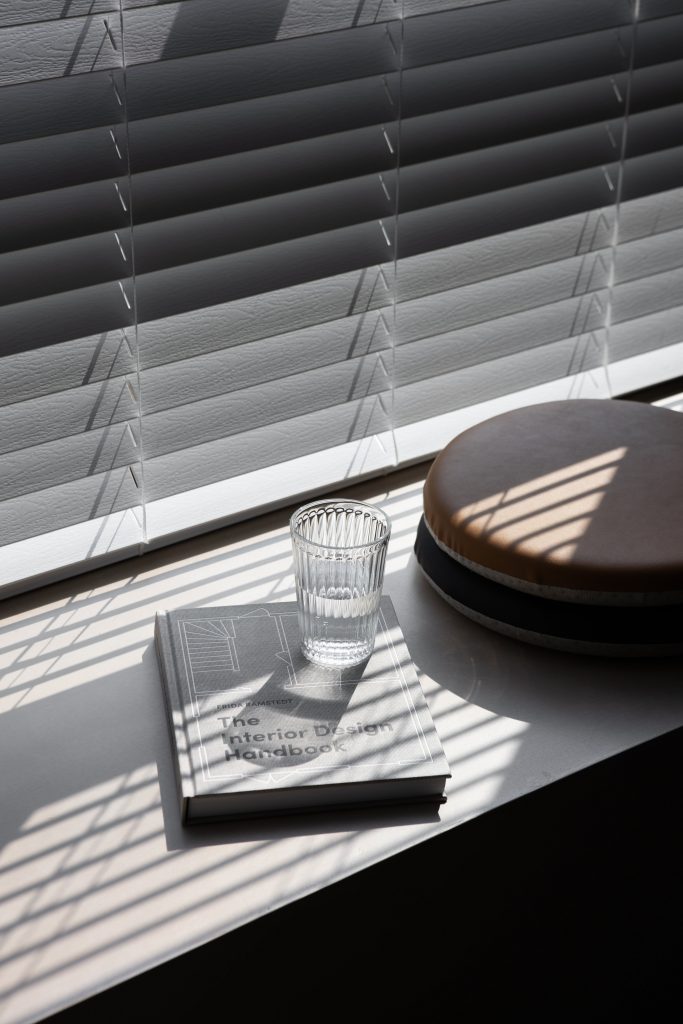
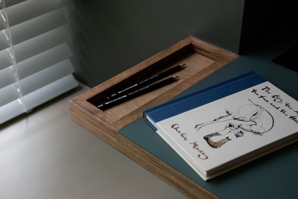
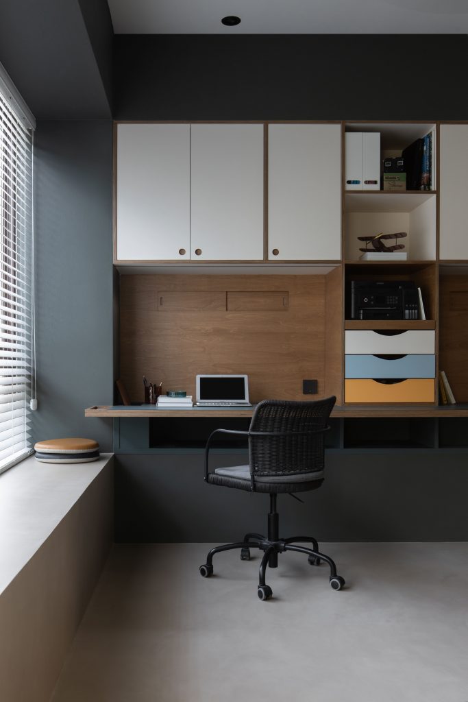
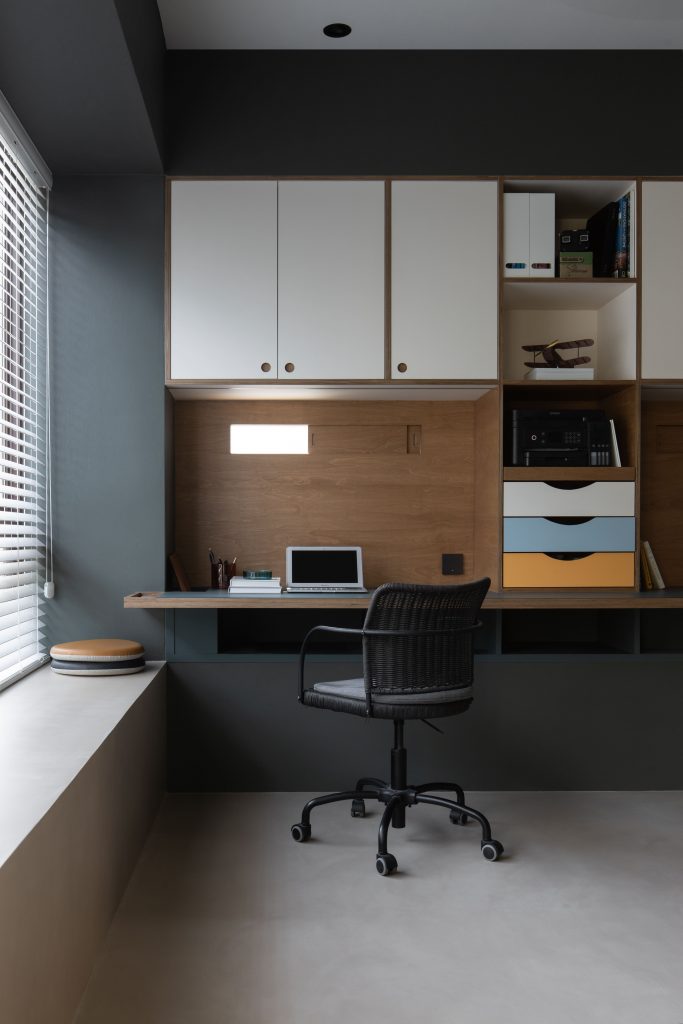
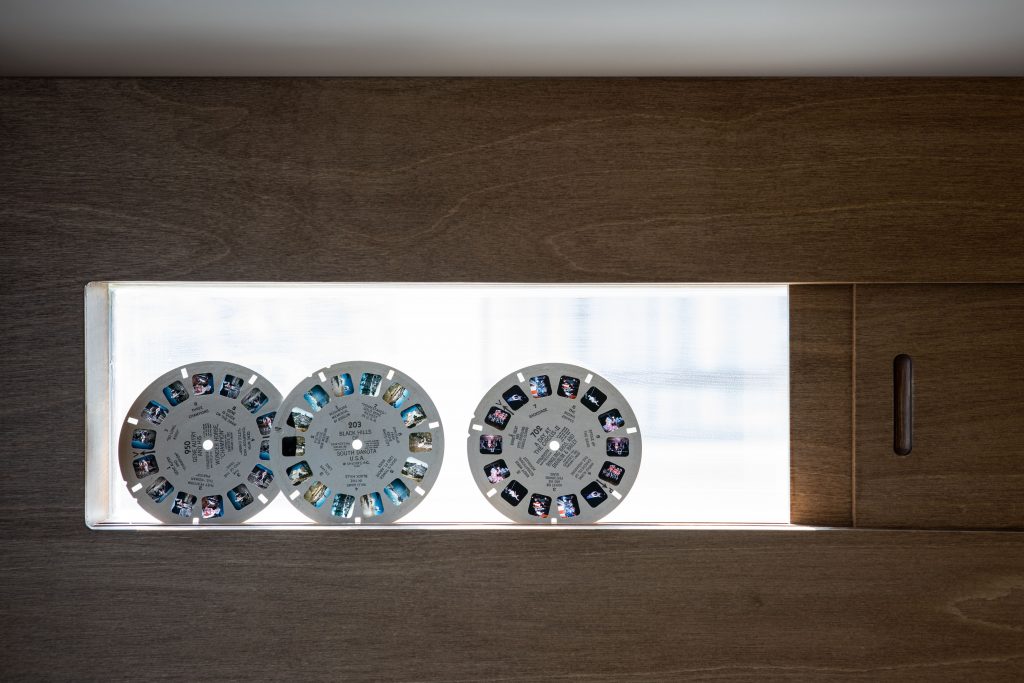
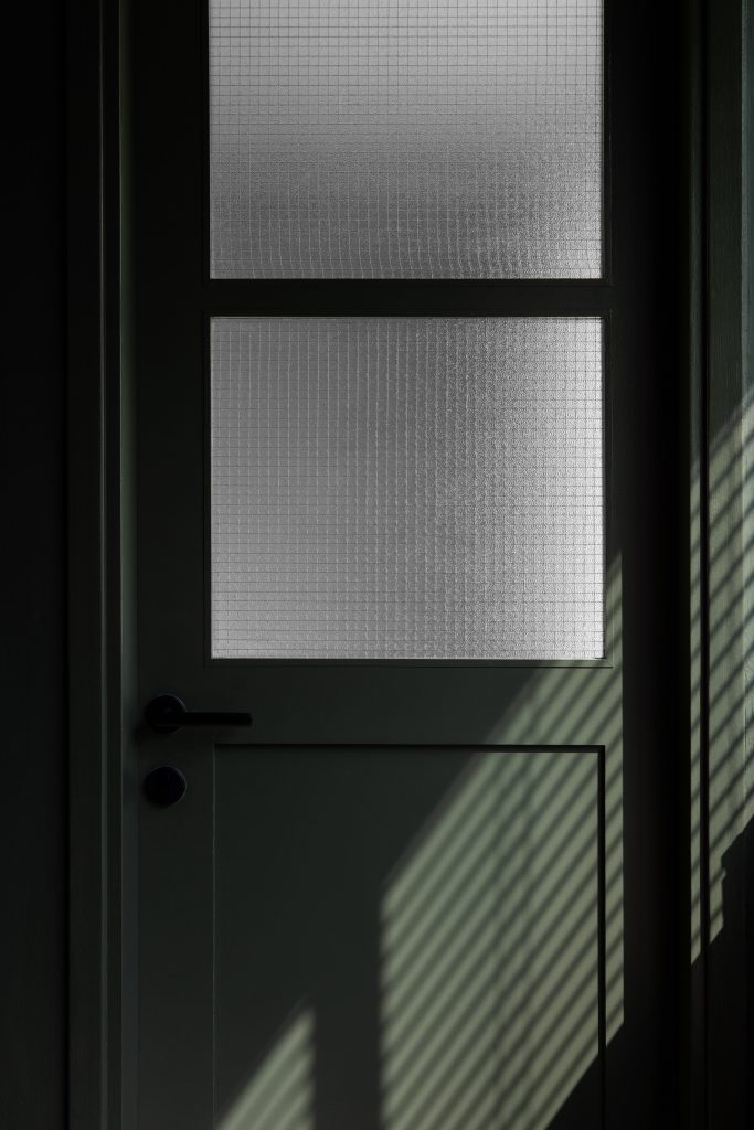
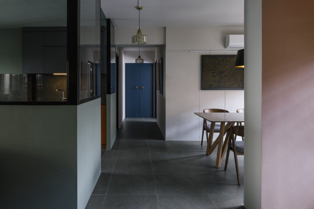
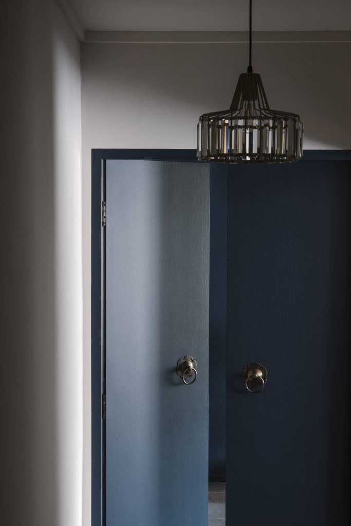
A calming and subdued olive shade sets the tone for most of the home, be it as a full ceiling to floor accent wall in the living room, to the split wall effects along the corridor and bathrooms, with muted blue tones and contrasting sienna oranges and reds that give a light-hearted contrast.
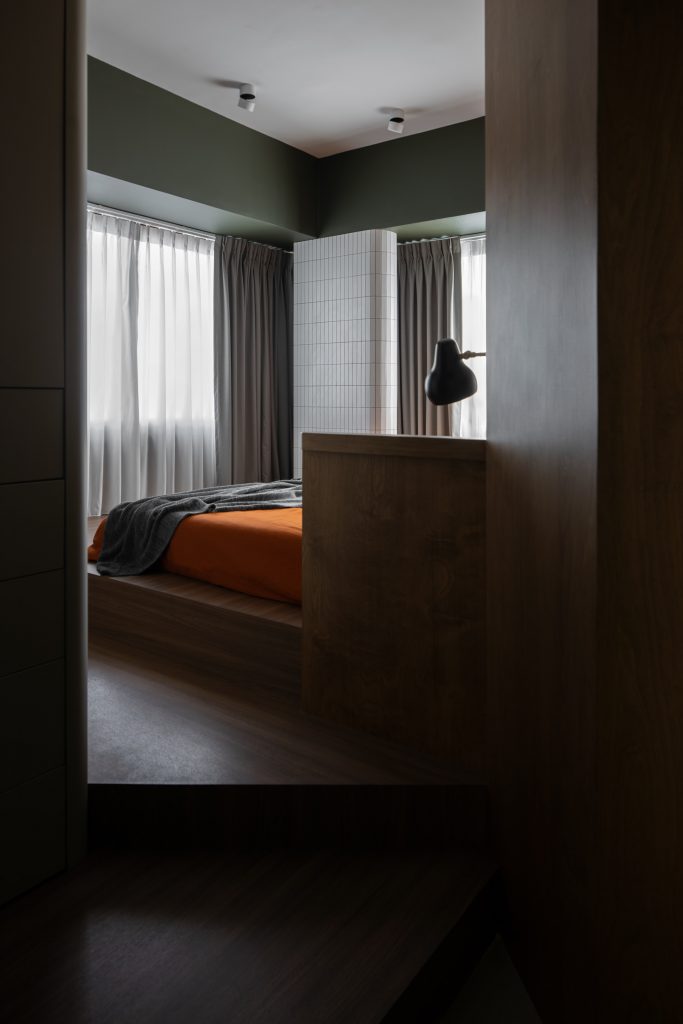
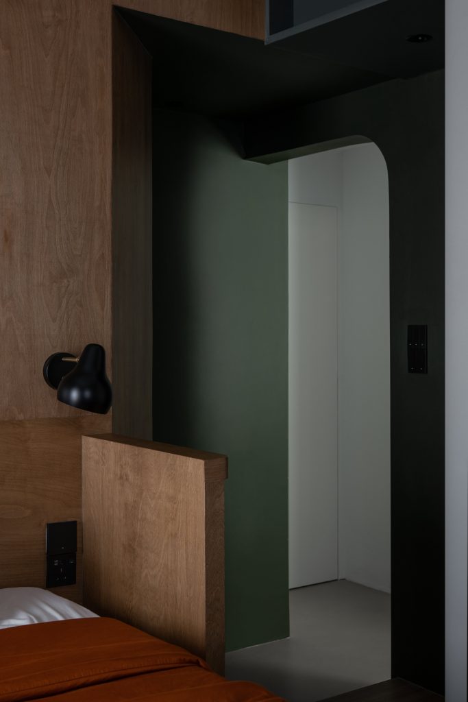
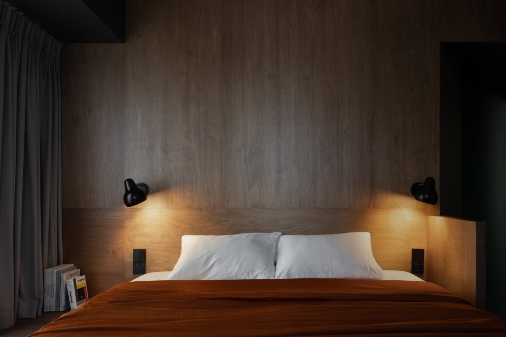
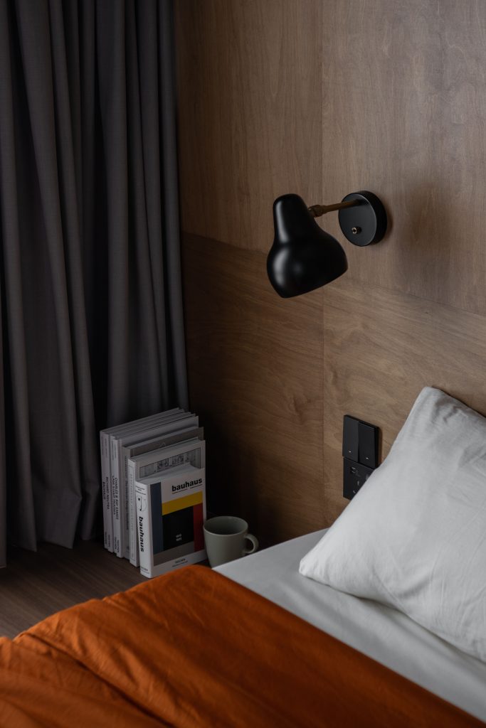
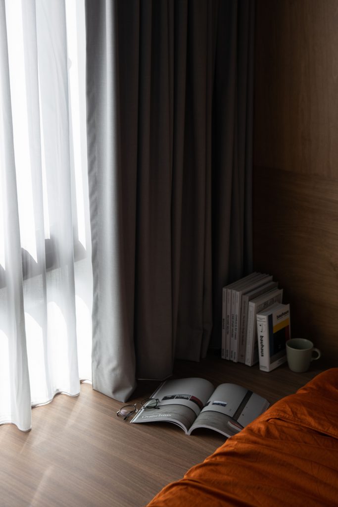
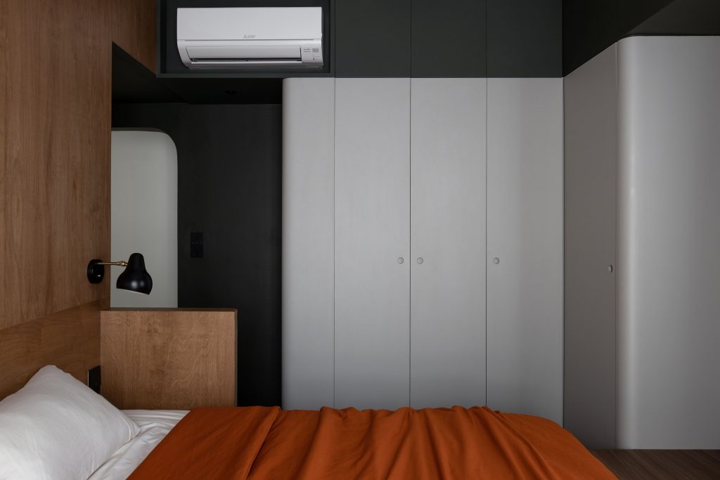
To add even more unique character to the home and as an homage to the style of the eras gone by, fun geometric designs were incorporated both as statement designs like the arched walkway between the living and dining space, and the portholes of the doors, and subtle elements like the variety of tiled mosaic designs in the different rooms.
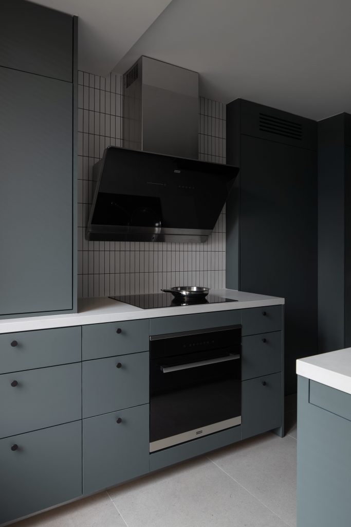
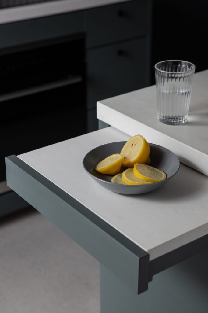
Tampines Greenview by Sheena & Edmund
Going for a bold modern-mid-century look, designers Sheena & Edmund cleverly made use of a daring choice of colours and geometric shapes and patterns to achieve the characteristic aesthetic.
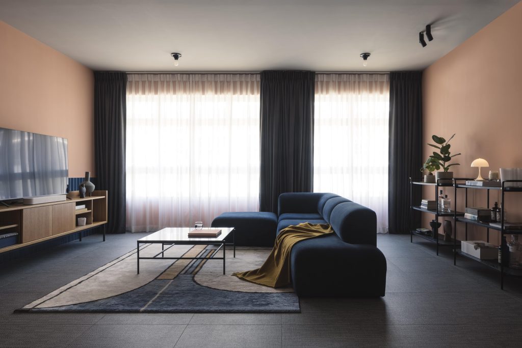
Starting with the living room, the distinctive pairing of peach and navy blue works interestingly well together to create a cosy ambiance, complimented by unique geometric structures like the circular wall light, retro lamps, the circular dining table, angular side tables, and more.
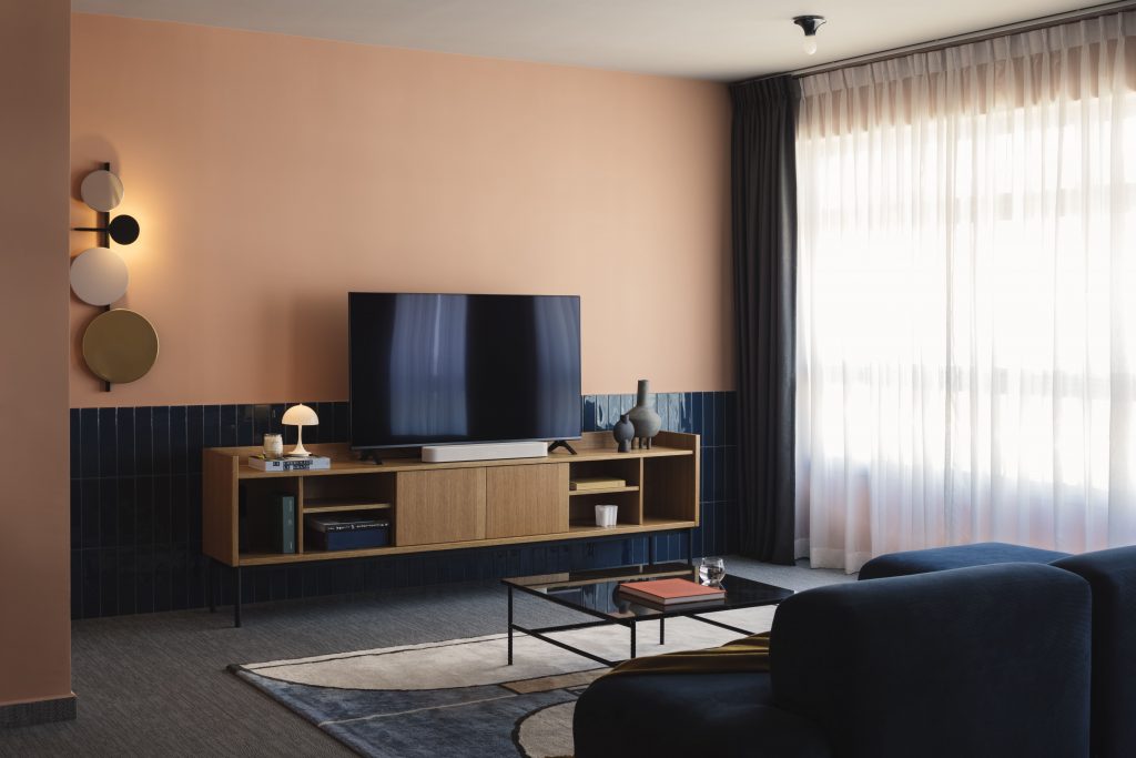
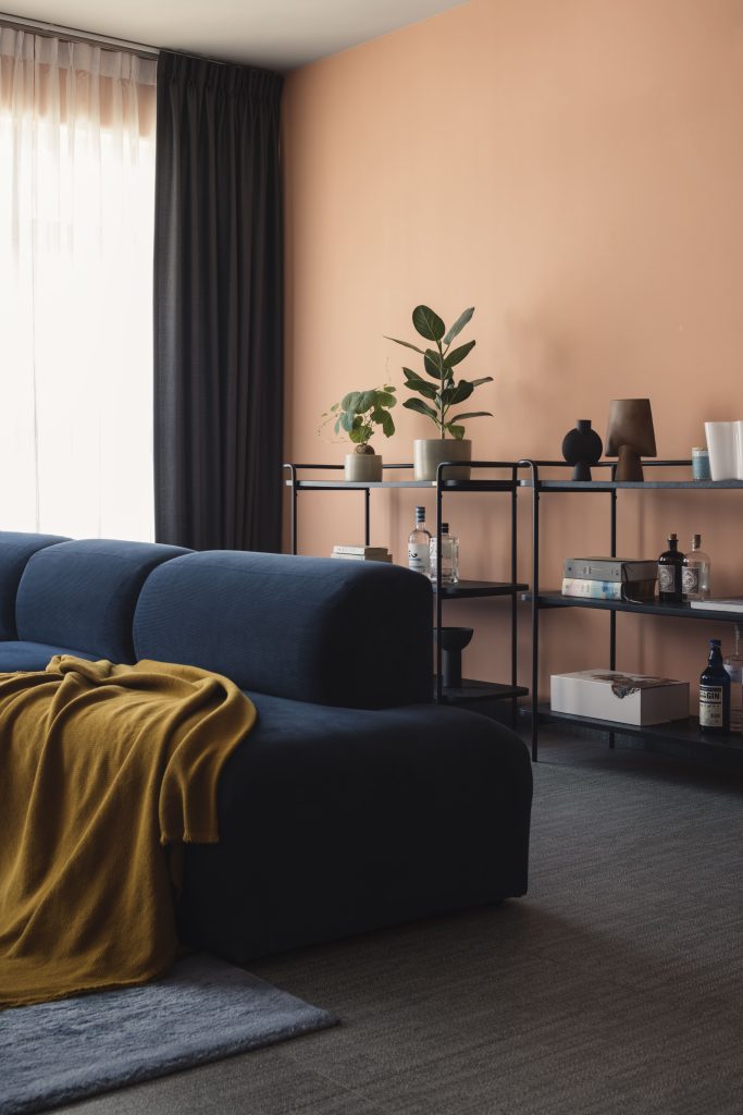
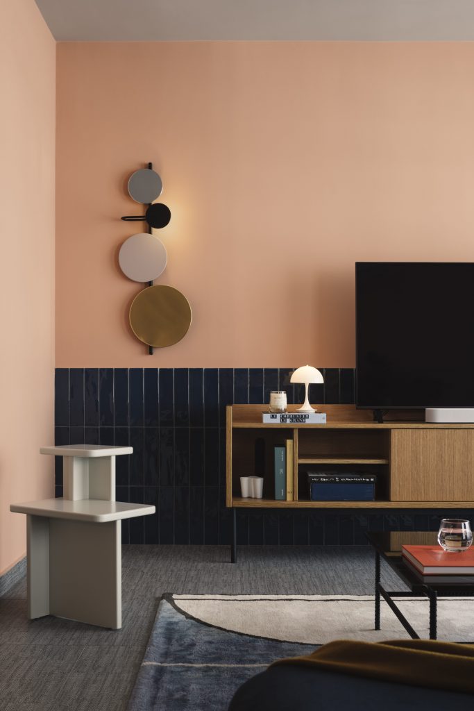
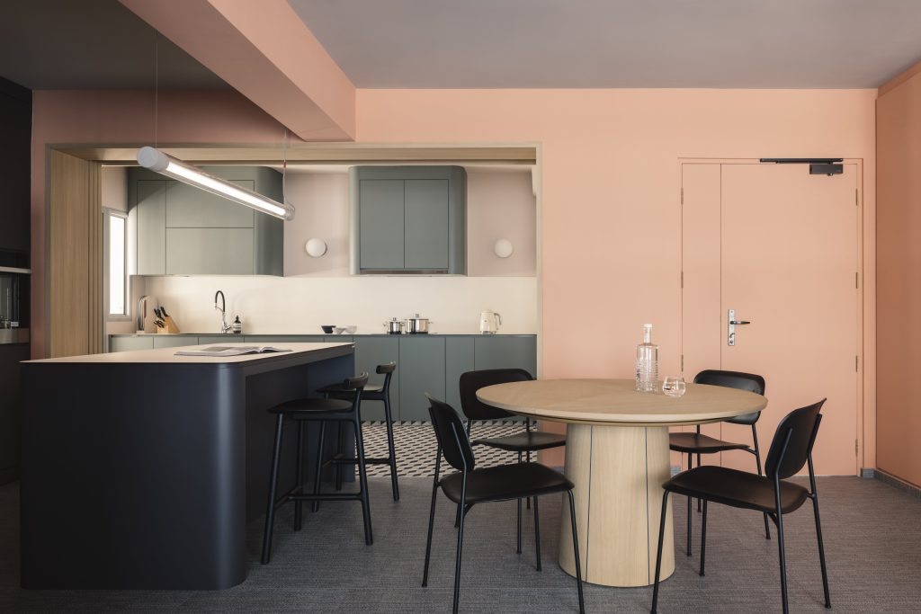
Further inside, the kitchen, with its unusual choice of olive-green laminates with curved cabinet edges for a striking look and a dizzying array of three-toned diamond-shaped tiles, takes things to the next level.
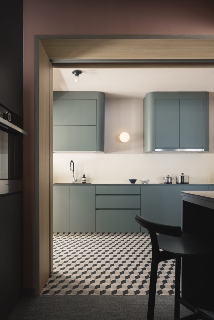
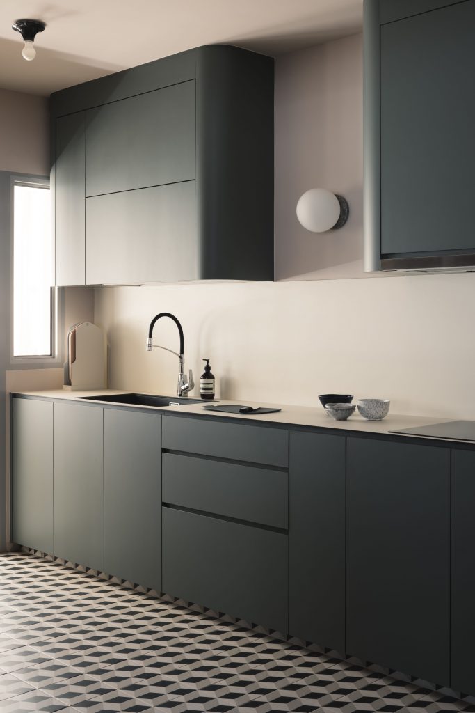
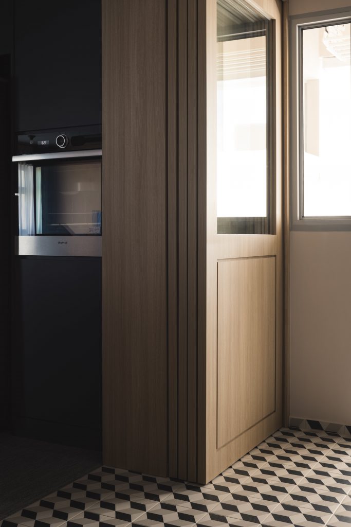
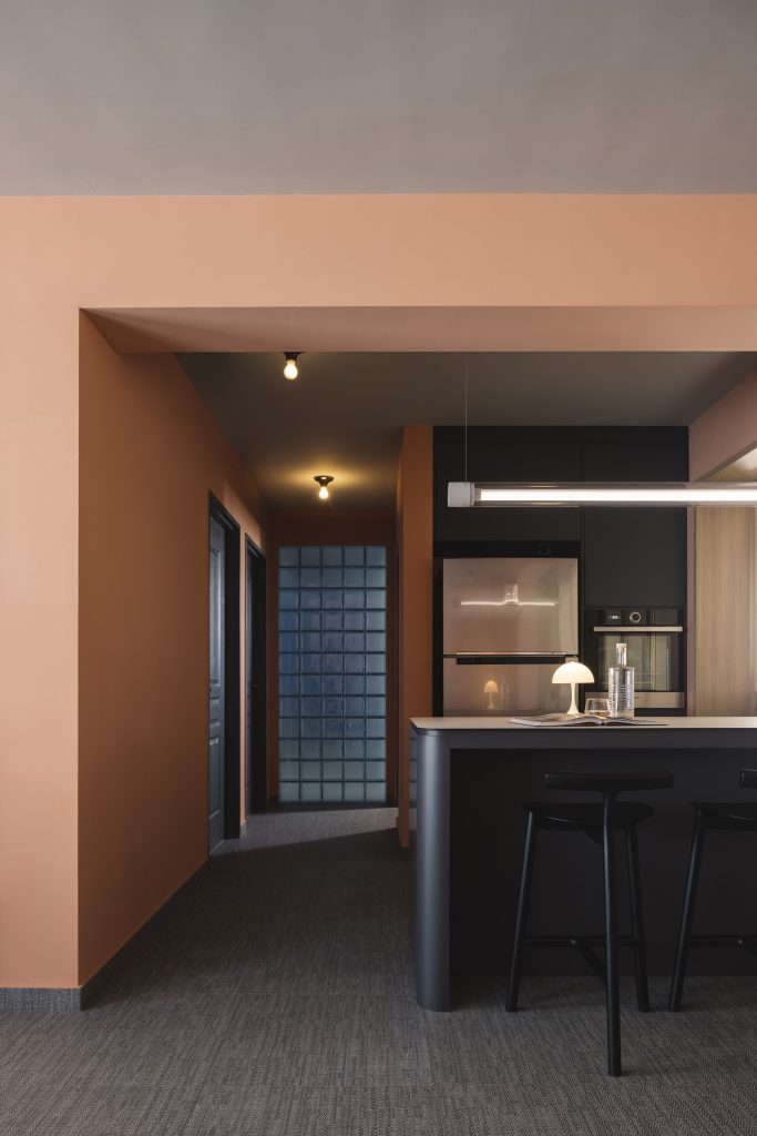
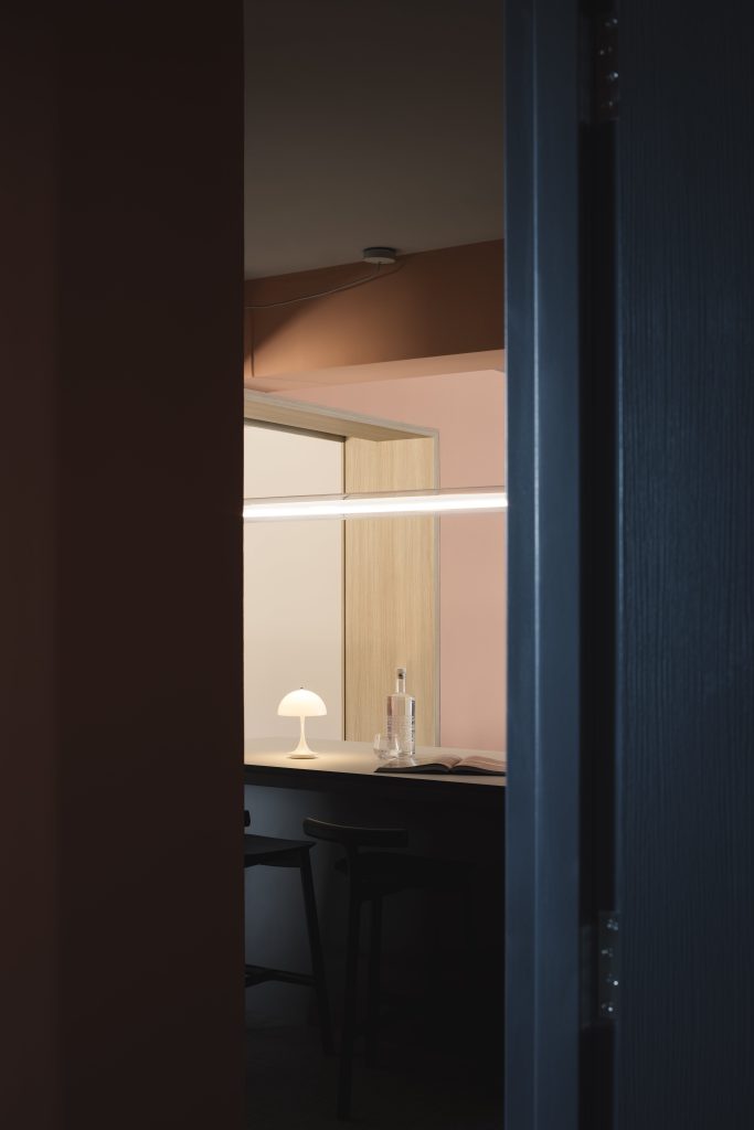
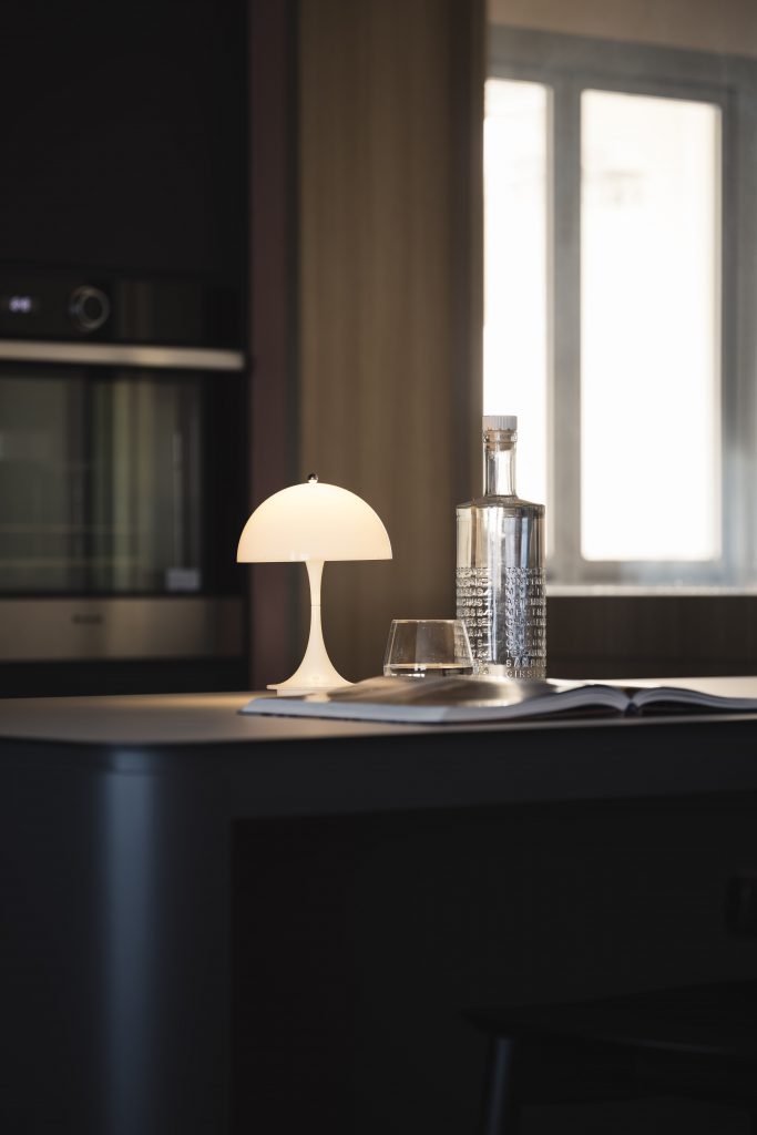
Yet another statement piece not to be missed, is the glass brick wall (a retro interior design staple in the 80s and 90s) that demarcates the public and private spaces, that creates an illusion of space with its translucent effect.
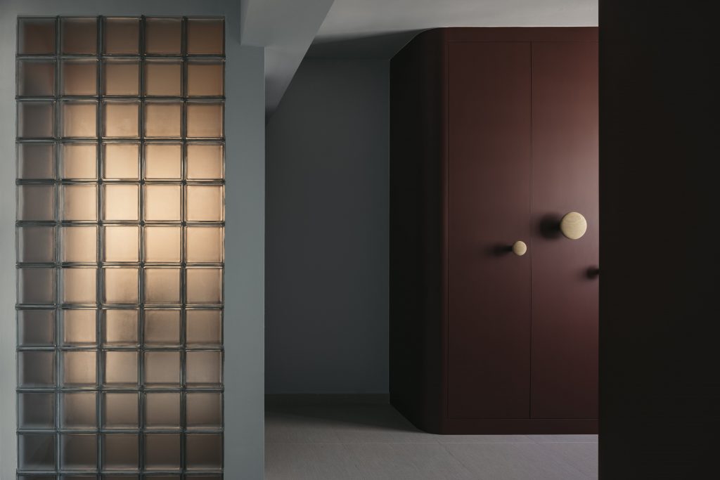
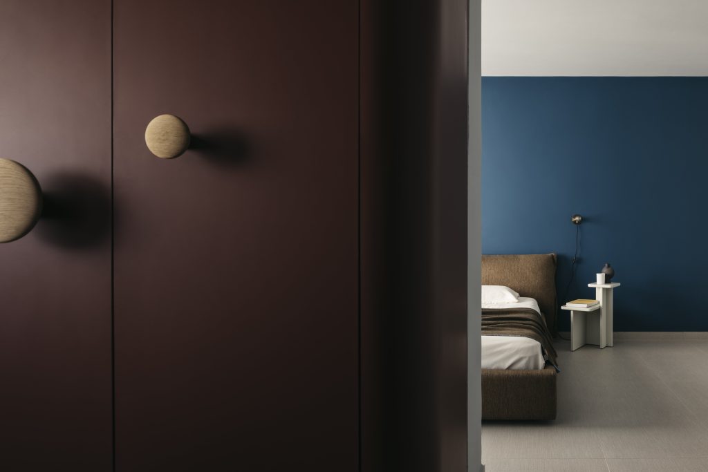
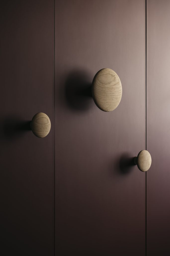
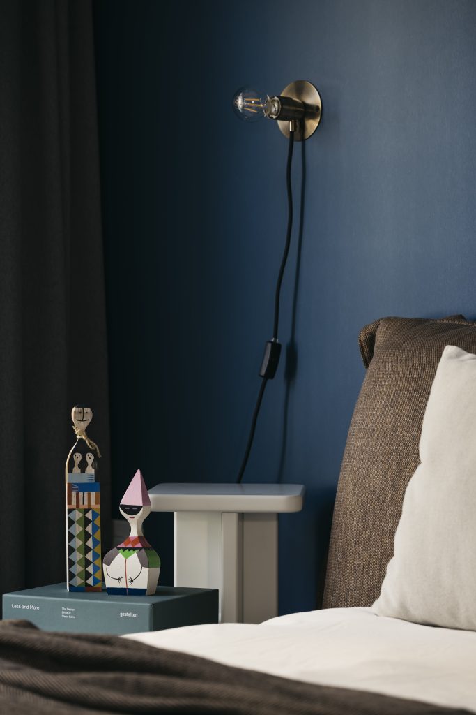
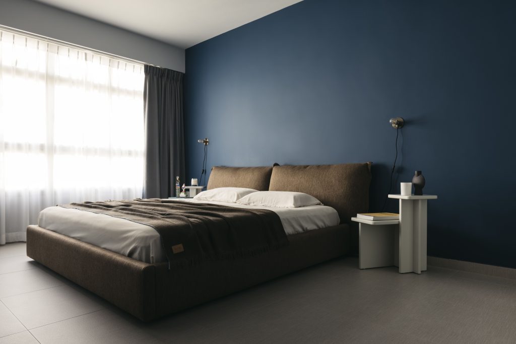
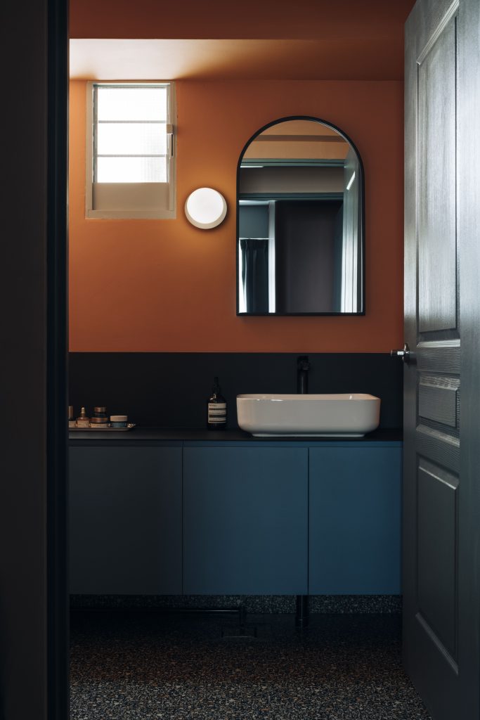
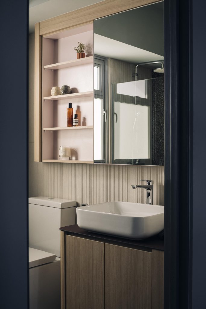
When one thinks of HDB flats, one always associates a typical layout with sharp angular designs that help to maximize space. Tasked to redesign a typical HDB flat, designers Jack & Kai thought of some unique solutions to help soften the overall boxy nature of a space-maximizing flat, without losing any of its utility.
Right from the get-go, the entryway is laid with distinctive colourful Peranakan-styled floor tiles. This fulfils two functions – one to break the monotony of the small space, and two, to mask any dirt that might accumulate since it’s a high-traffic area.
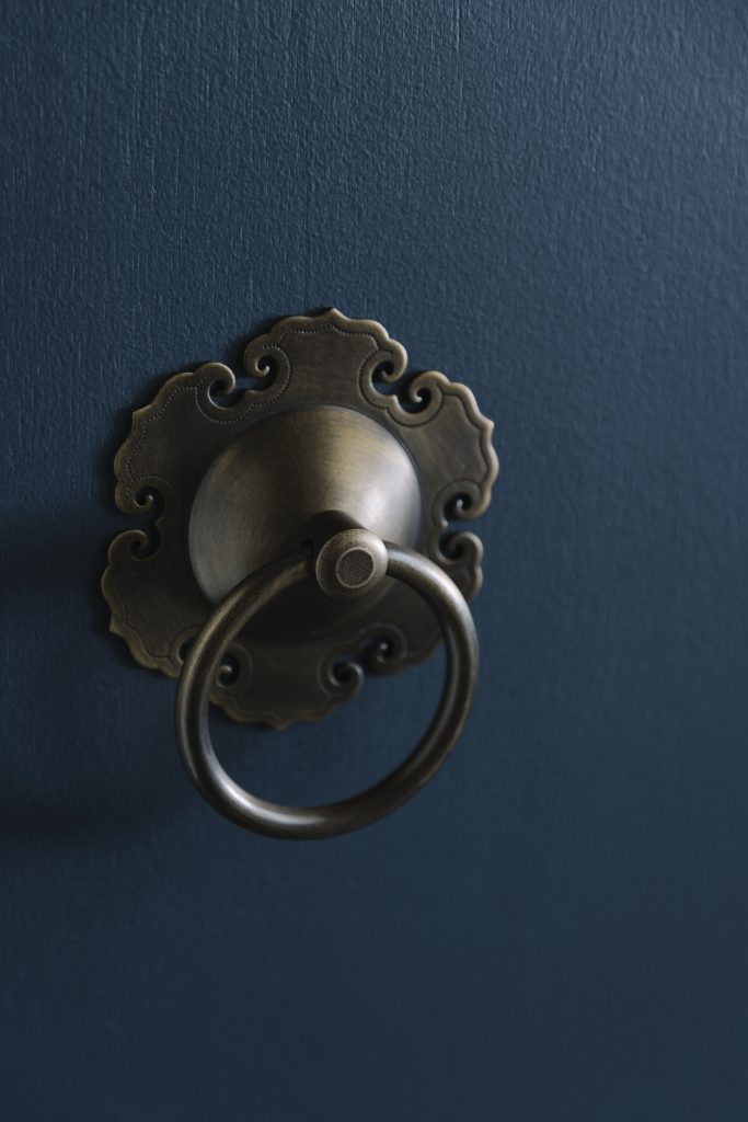
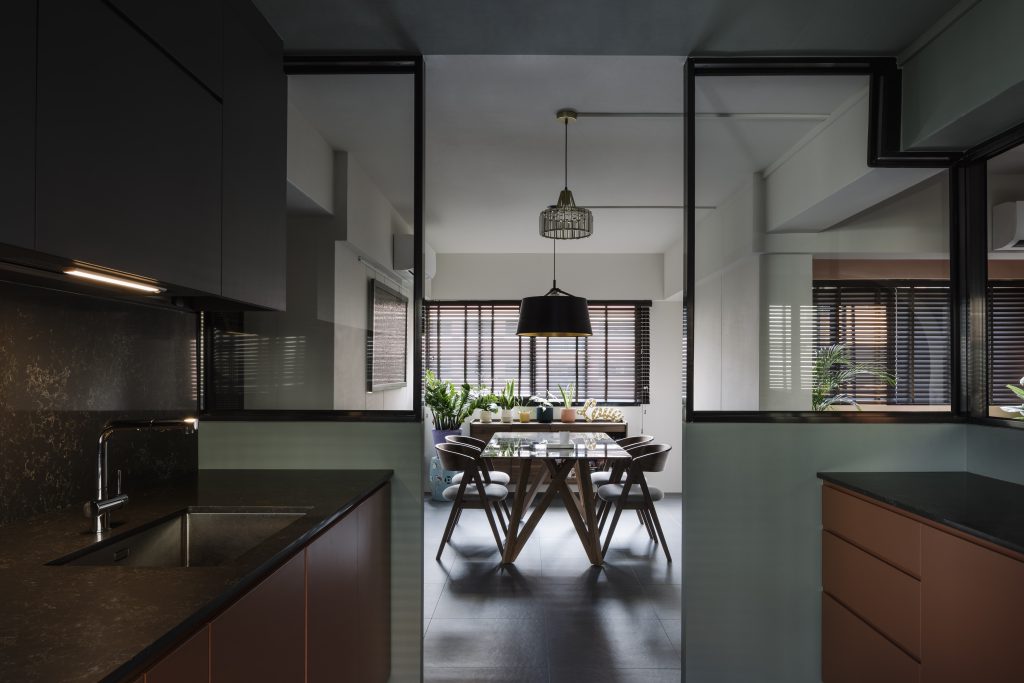
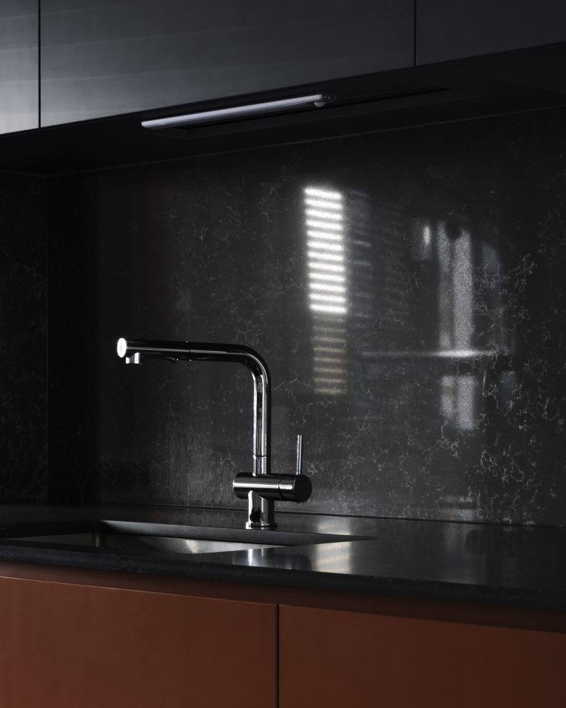
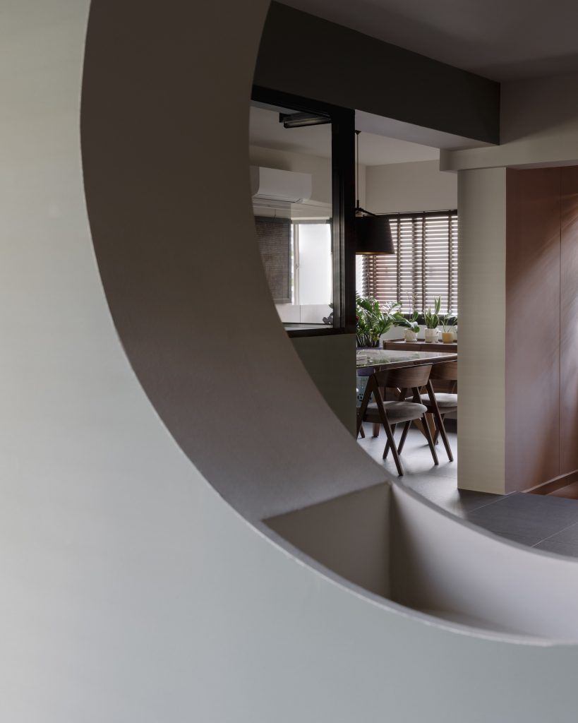
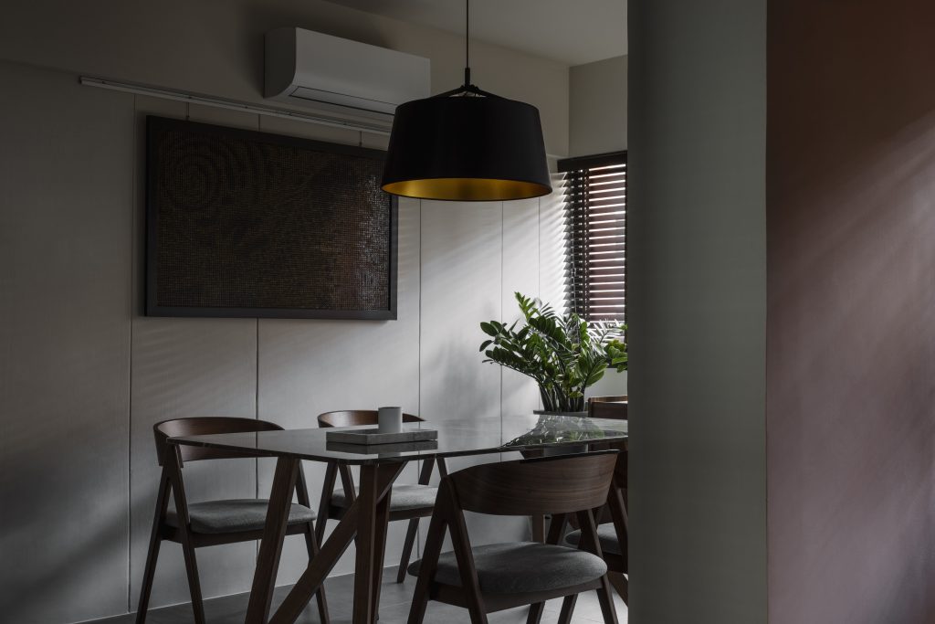
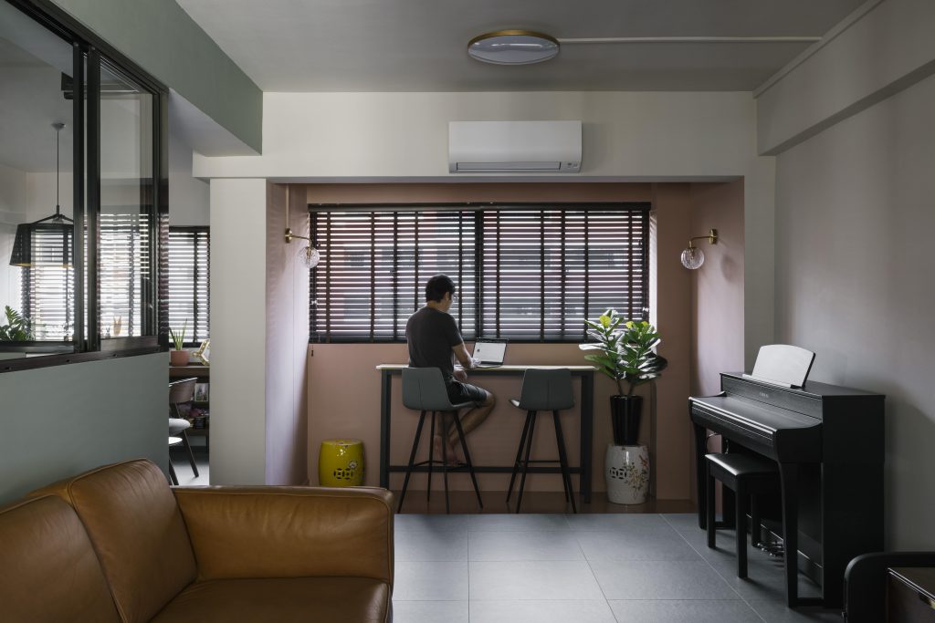
The full wall that used to demarcate the separation of the entryway and the living space was transformed into an archway (that comes with a see-through “port-hole”) to introduce more light into the space, and curves to contrast against the overly angular space.
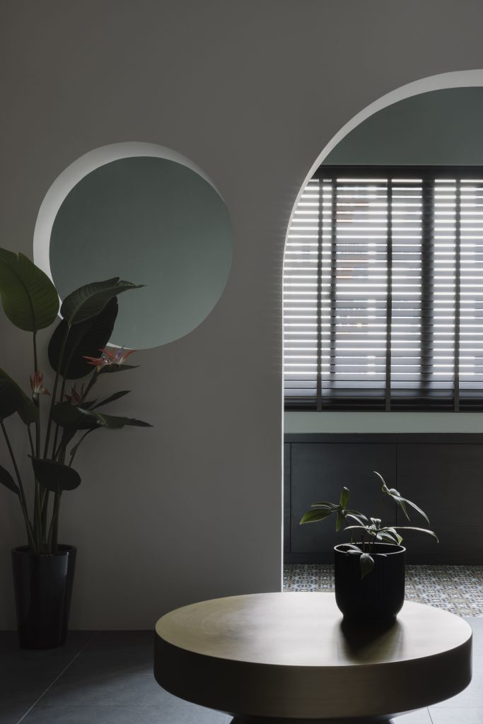
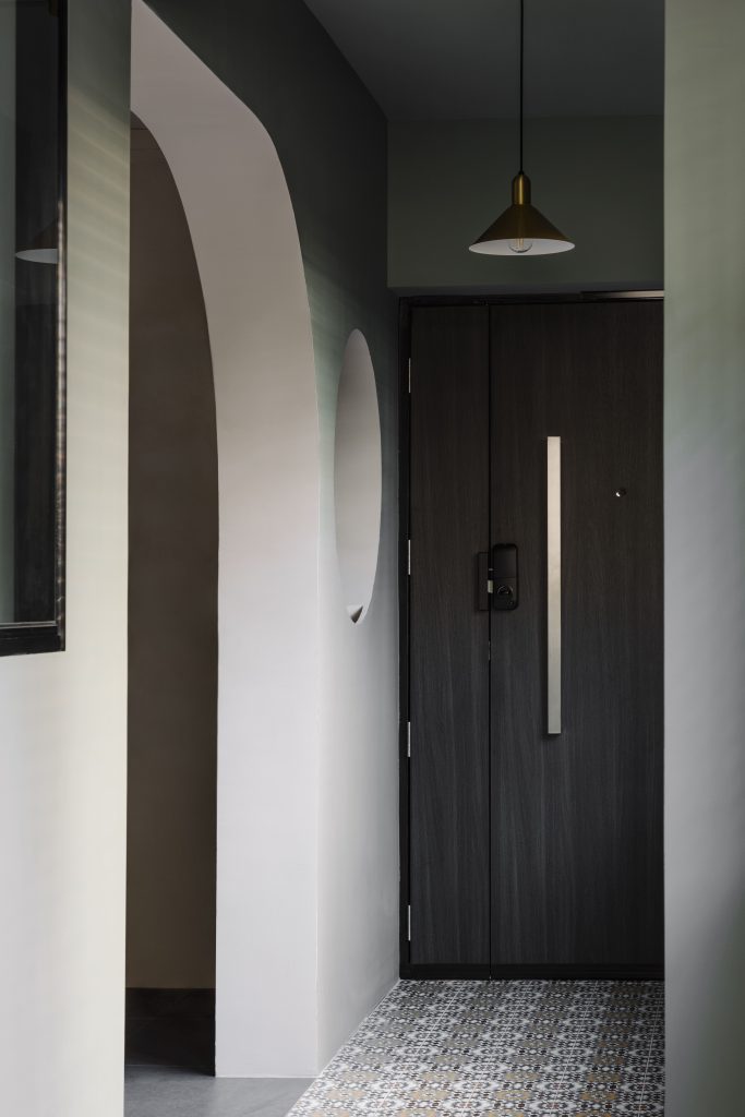
Alkaff Crescent by Eddie & Serene
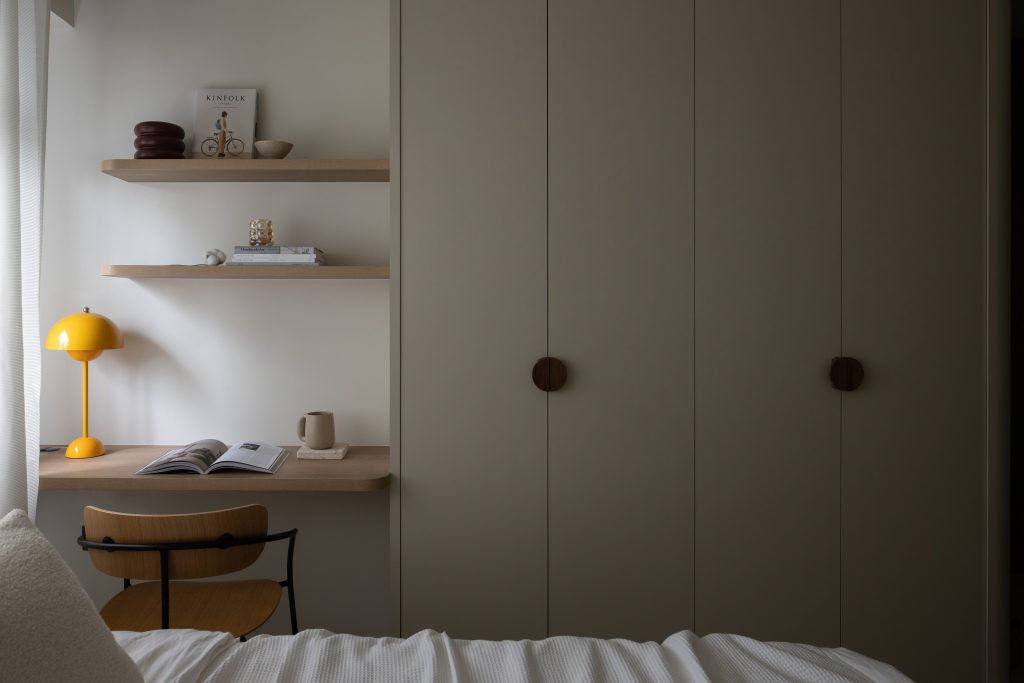
This Alkaff Crescent home is a fascinating mix of two popular design styles – the minimalist Japandi-style with contemporary sensibilities.
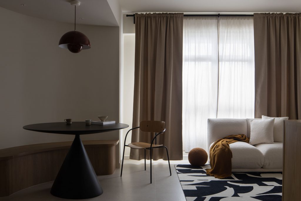
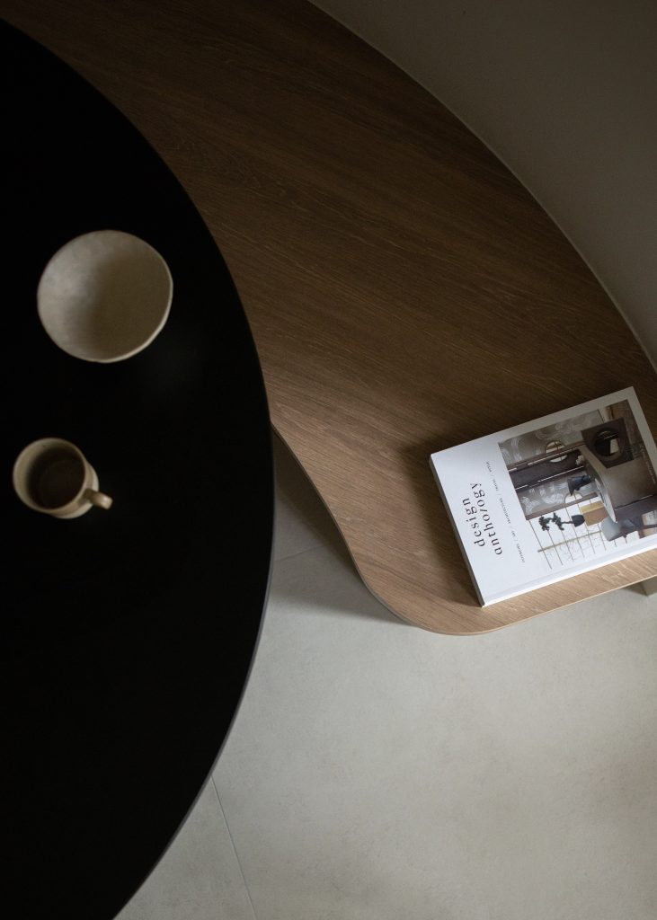
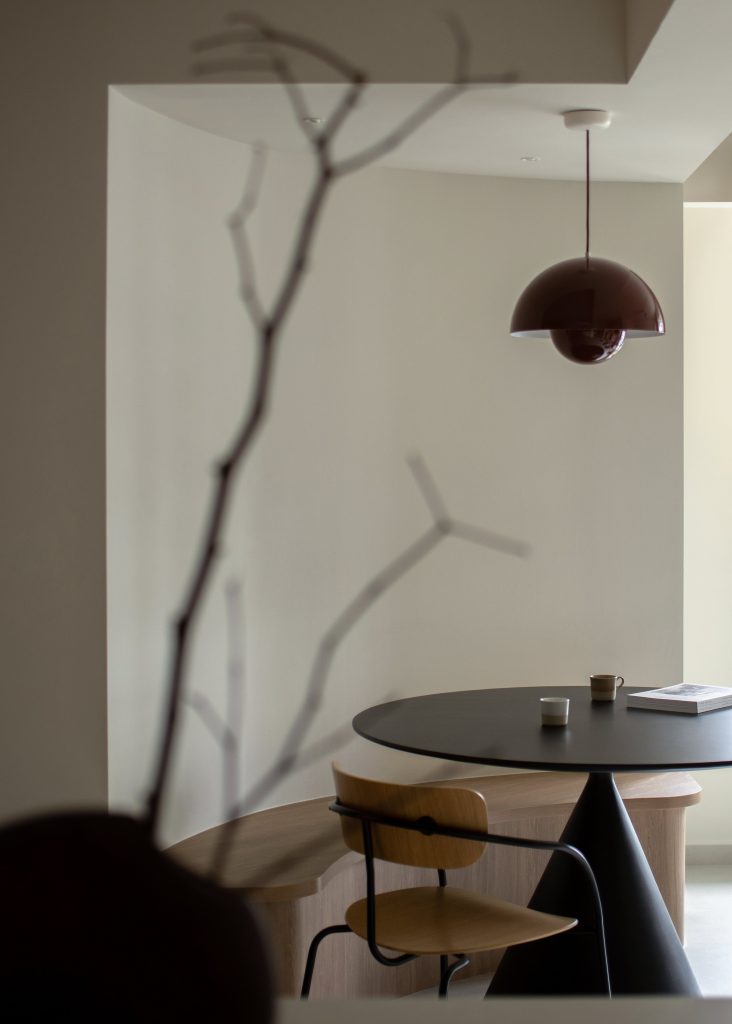
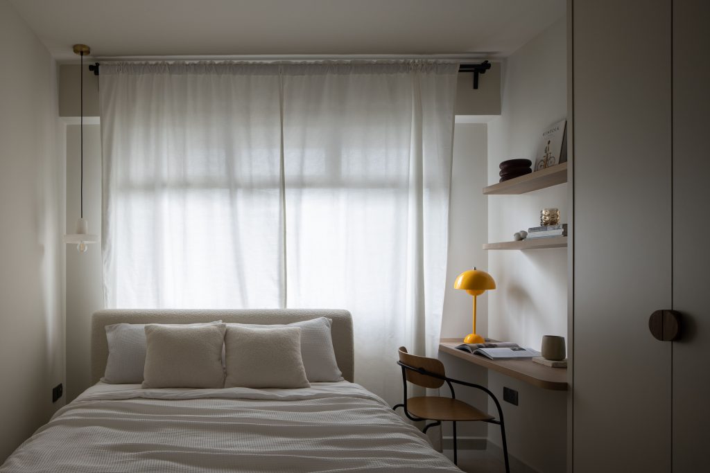
At first glance, the home may seem like it veers towards the first interior design style, what with its neutral and clean palette of whites, browns, and neutrals – save for the occasional pop of bold yellows, that remind us of the second style.
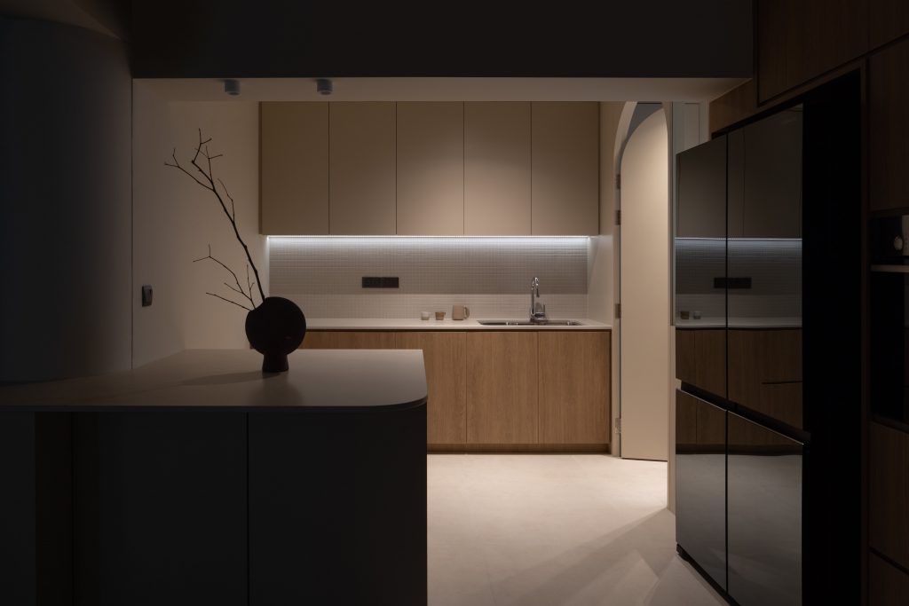
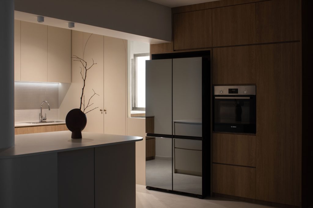
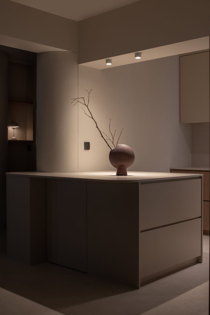
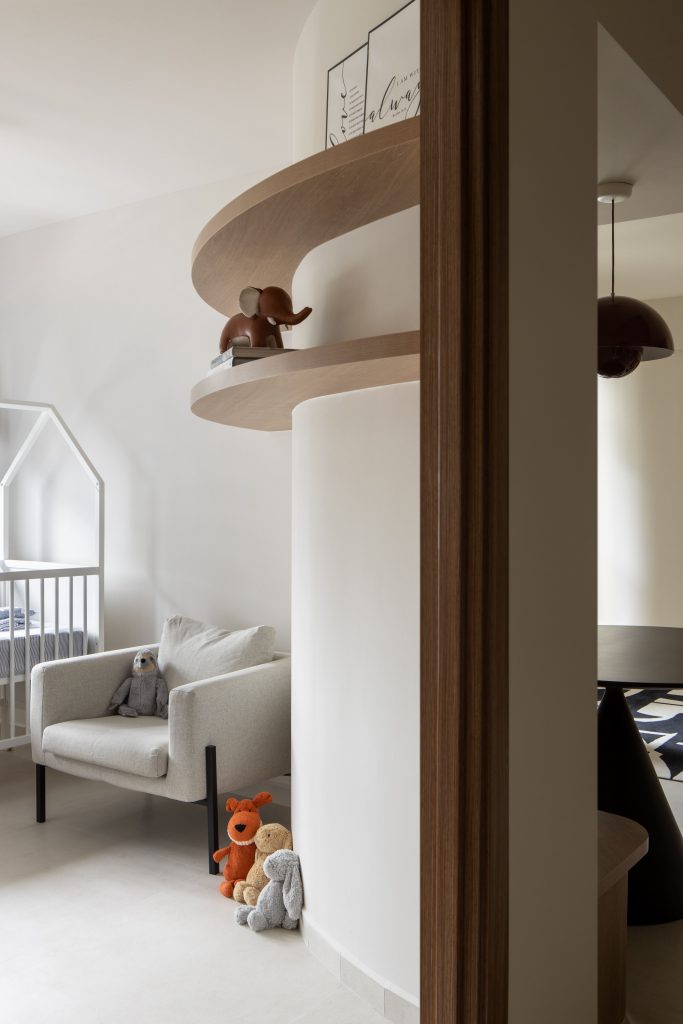
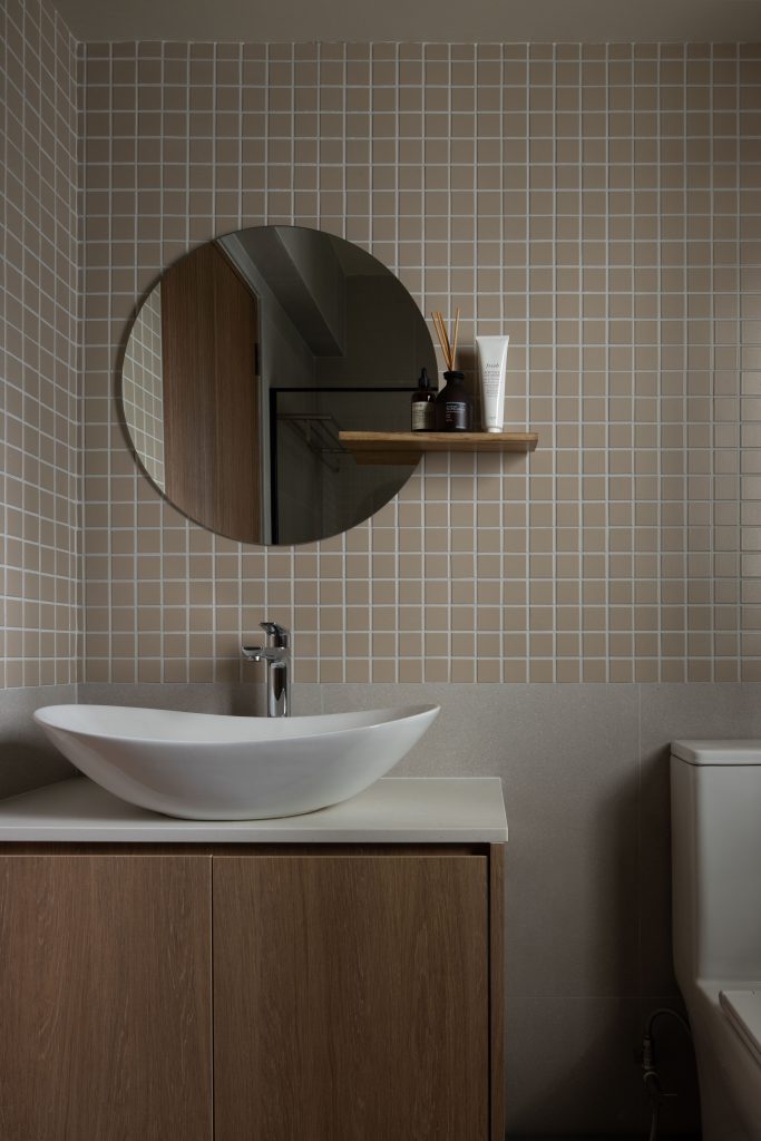
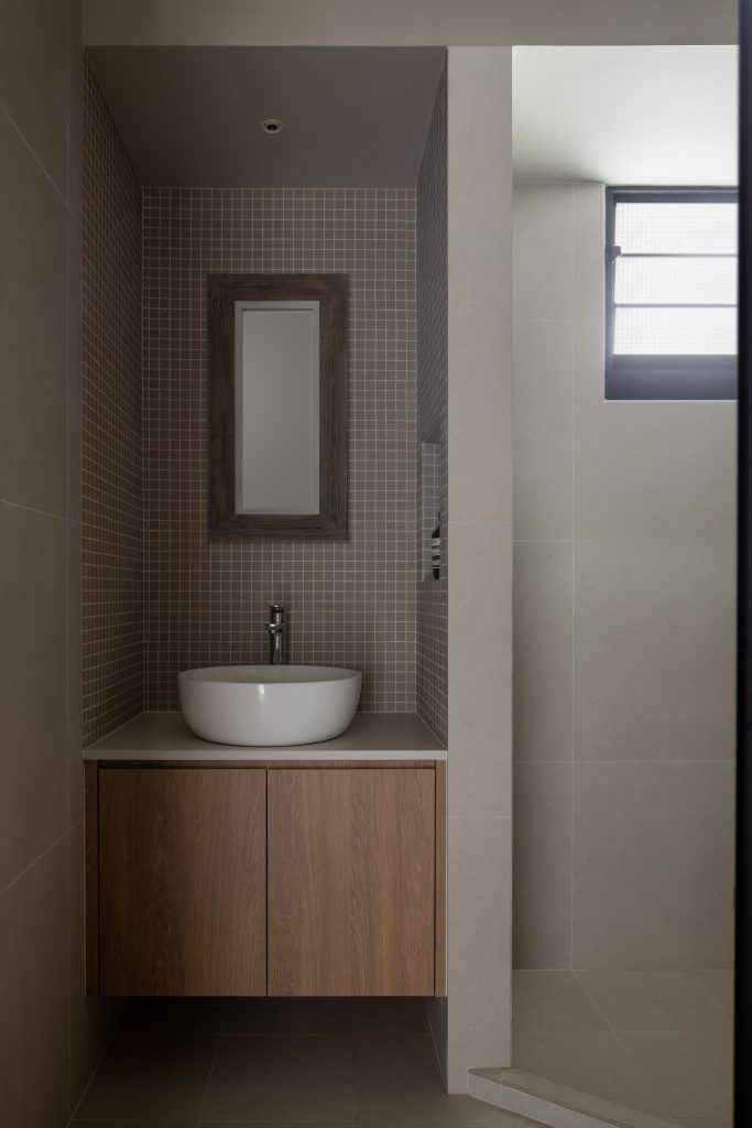
Upon closer look, one will realize that plenty of geometric elements (characteristic of the contemporary style) have been incorporated subtly into the design. From the mod-style overhanging lighting fixtures, circular mod-style dining table, tiled backsplashes in the kitchen and bathrooms, geometric-patterned rug, arched doorways, and curved pillars to the organic-shaped bathroom sink and more, geometry is all in the details.
You will receive a personal login only after you have
submitted a designers shortlist.

