Free Consultation with no strings attached
Connect Directly to the Designer of your choice
with All Shortlisted Designers
Known commonly as the heart and centre of a home, the kitchen is truly one of the most important spaces in a modern home. Considering that it is the space where you cook, start your morning routine, and entertain friends and family amongst many other things, it is important to create a kitchen space that allows you to do all that and more.
From open-concept kitchens to traditional enclosed layouts, and modern contemporary designs to minimalist Japanese influences, here are 5 distinctly different interpretations of a beautiful yet functional kitchen for the modern household to spark your inspiration.
In a home where entertaining friends and family is part and parcel of the homeowners’ weekly weekend routine, the space inevitably needs to be designed accordingly to accommodate that.
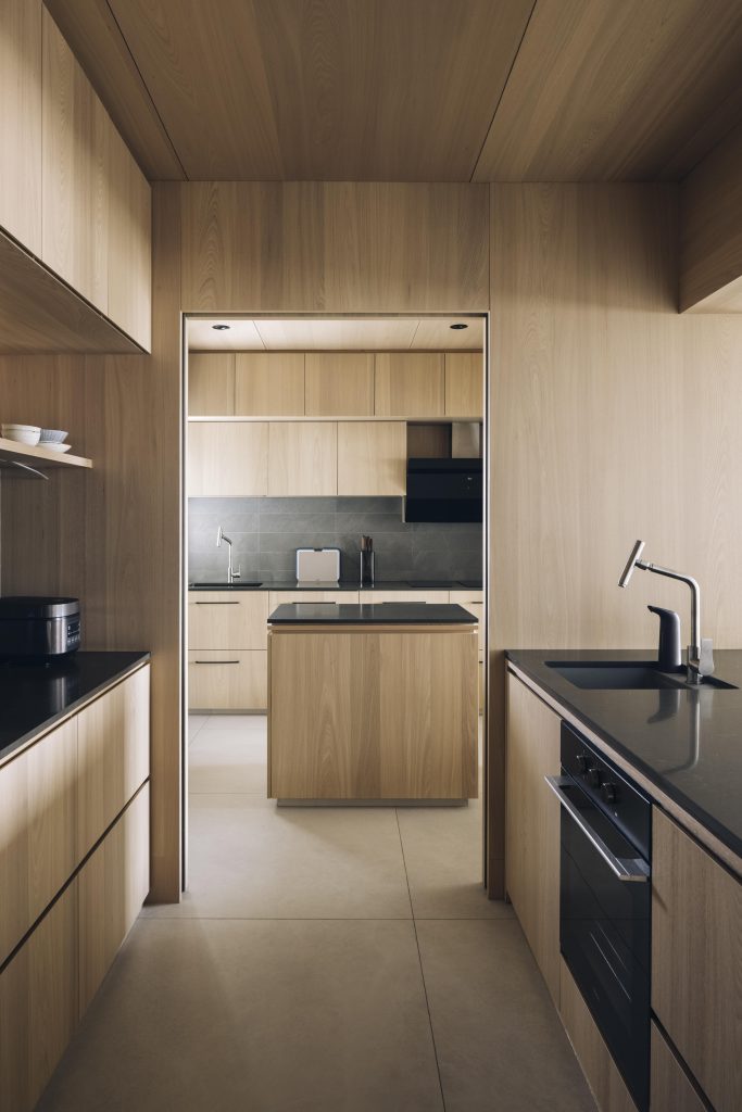
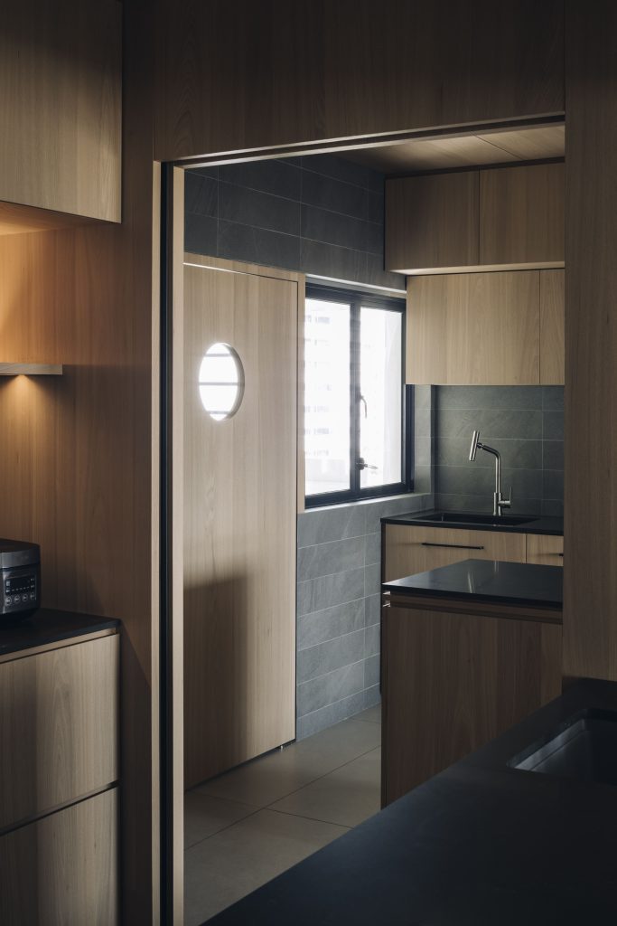
The kitchen design in this 633 Hougang project by designer Jimmy reflects just that, with the full space designated especially into two zones – an open concept dry area for socializing over the coffee machine and an enclosed wet zone where heavy lifting can happen behind the scenes.
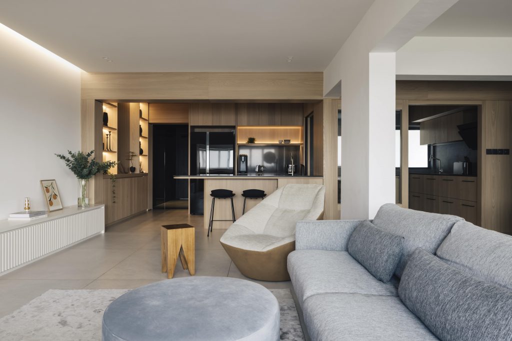
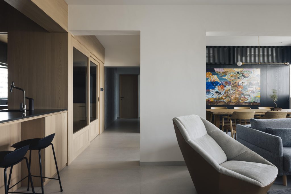
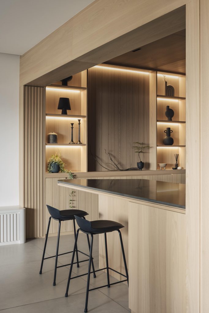
The open-concept dry area seamlessly blends with the open living space, demarcated only by a simple island that can also double up as a spot for quick coffee chats, drinks, or a casual snack.
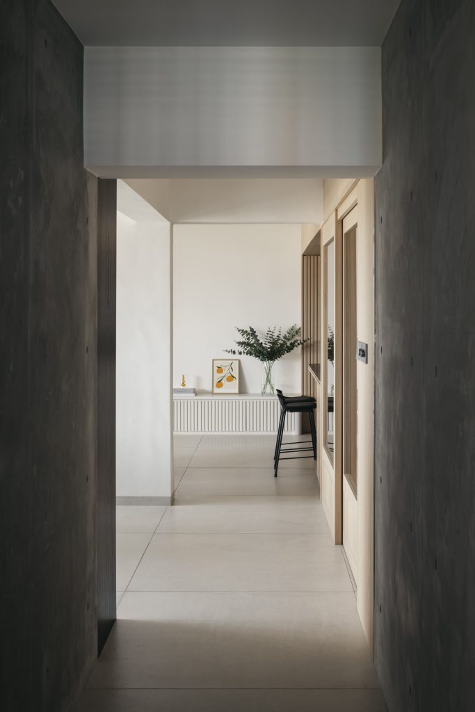
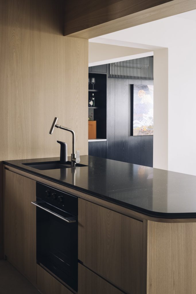
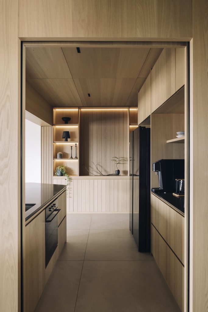
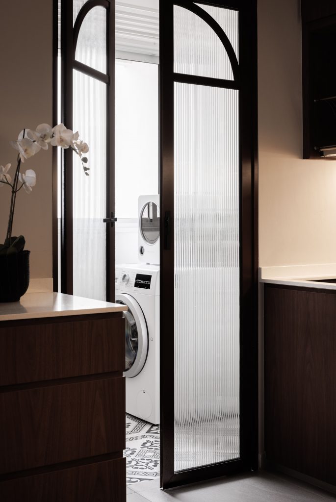
Further inside, tucked away inconspicuously behind dark glass panels, the wet zone is well equipped with plenty of storage space (both top and bottom) with an island for additional countertop space to boot – perfect for prepping large meals for social gatherings.
The Metropolitan by Sheena & Edmund
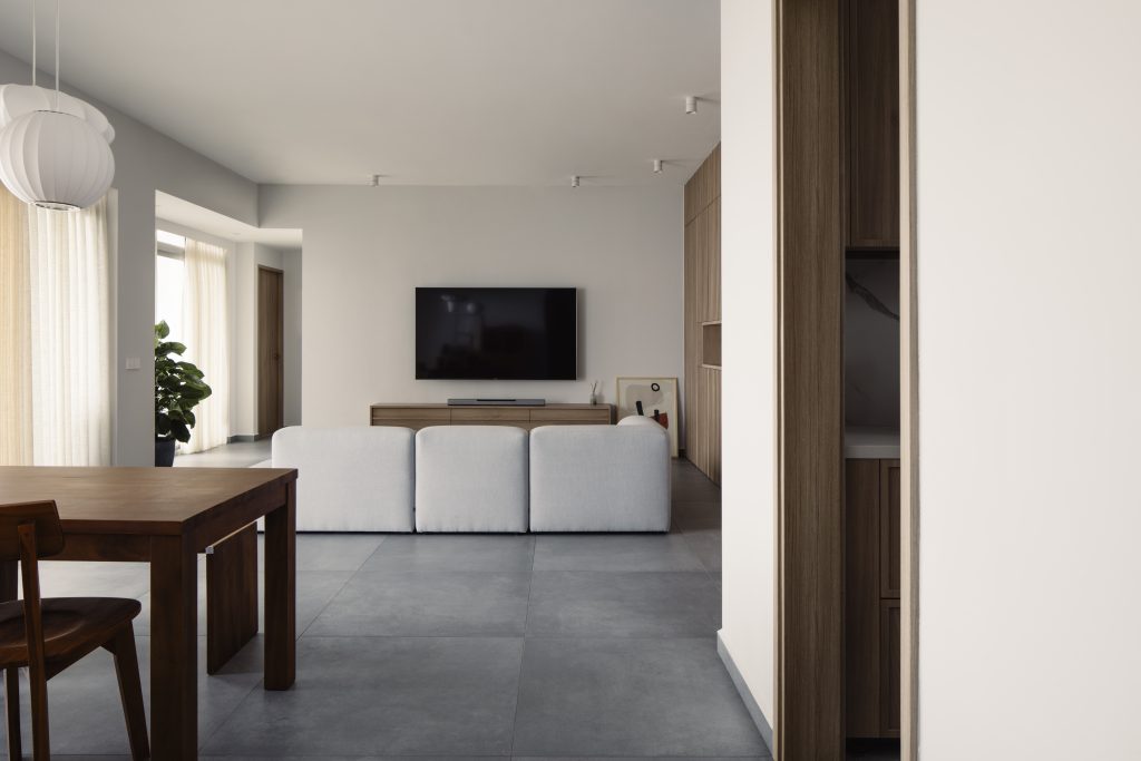
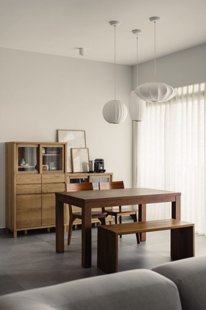
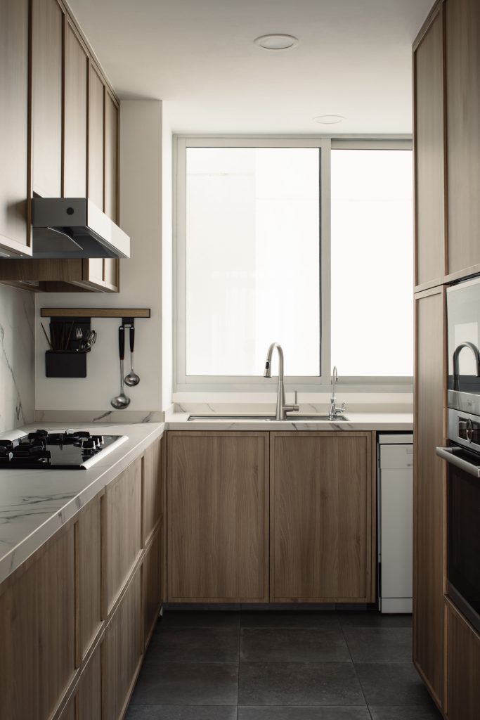
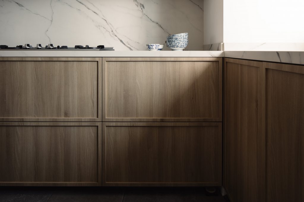
Keeping with the overall minimalist style of this Japandi-styled home, the enclosed kitchen area very much sticks to the overall wood and white theme running through the space, except for the darker choice of wide non-slip floor tiles for easy upkeeping.
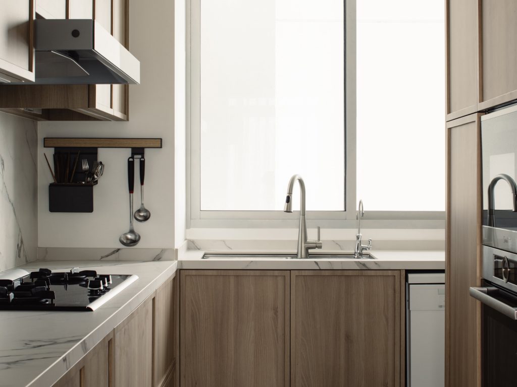
When deciding between a modern open-concept kitchen or a traditional enclosed layout for this Metropolitan project, designers Sheena & Edmund opted for the latter due to the homeowners’ habit of cooking frequently.
To combat the trappings of a small, enclosed space, designers Sheena & Edmund smartly tapped on design principles like vertical lines (of the wooden grains of the carpentry laminates) and bright white walls, a light marble countertop, and large windows, to lengthen and brighten up the space respectively – creating the illusion of a roomier kitchen to work in.
Also, to allow for more room to work around the kitchen, large and bulky appliances like the dishwasher, and ovens were all built to fit seamlessly within custom cabinetry, tucked away and allowing more floor space.
Cavenagh Gardens by Eddie & Serene
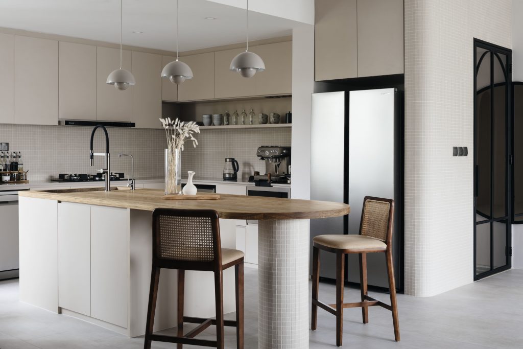
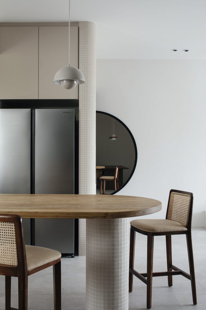
As can be seen in this modern art deco home in Cavenagh Gardens, designers Eddie & Serene are heavily influenced by the art deco style – with arches and curves permeating every nook and cranny of the space – including the kitchen.
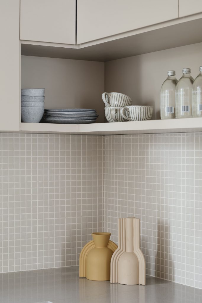
With an open-concept kitchen layout, the designers choose to keep to an unconventional palette of neutral and light colours to blend seamlessly with the connected living space. From beige mosaic tiles as backsplash, light-coloured tan laminates for cabinetry, light grey curved pendant lighting fixtures, and more, the light colour palette creates an overall bright and inviting ambiance for the space.
As a nice contrast, the main kitchen island table is fitted with a warm timber countertop slab and paired with rattan highchairs that act as the perfect foil against the soft and gentle backdrop – a stunning centrepiece.
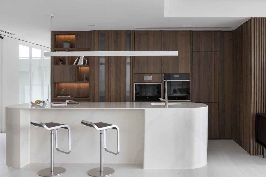
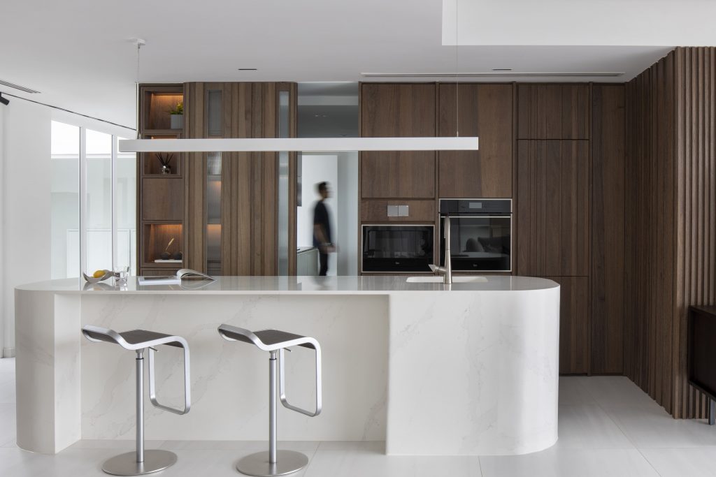
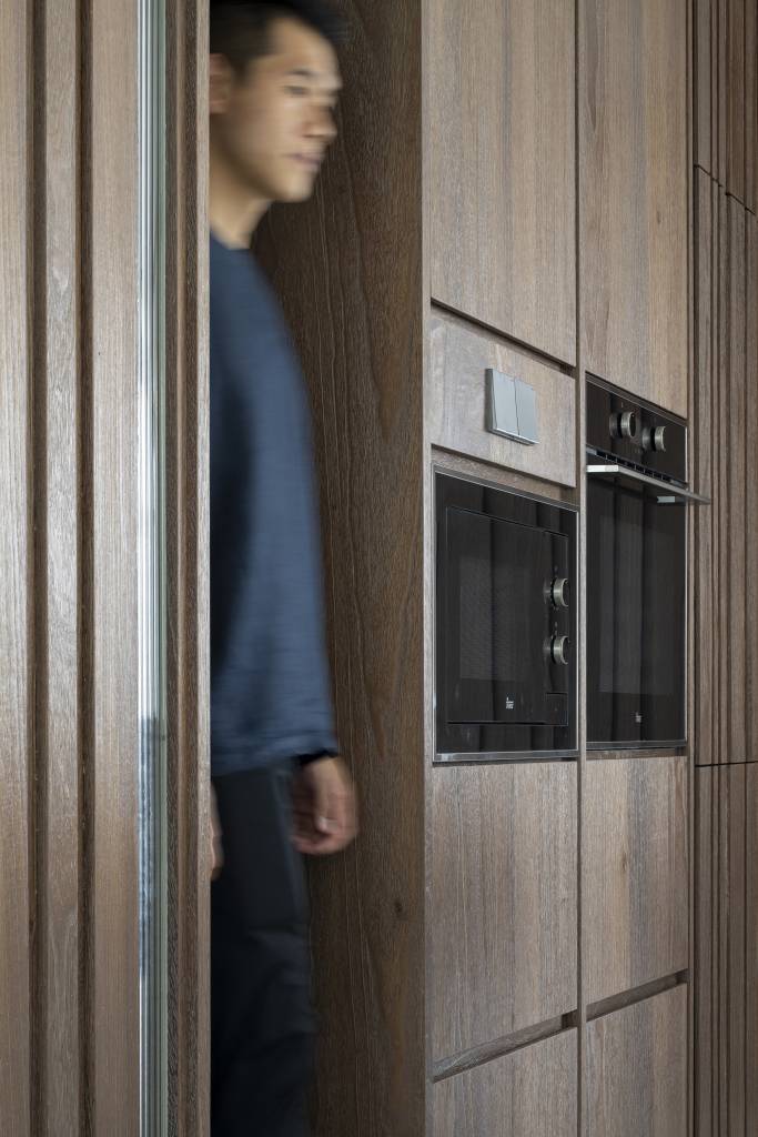
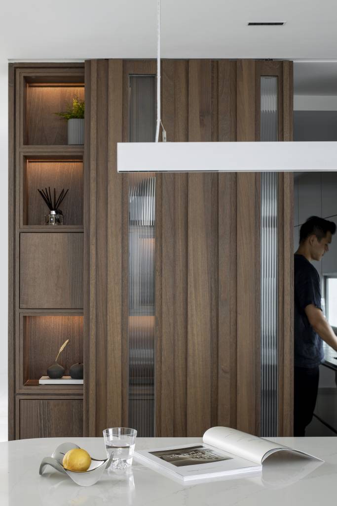
With the open-concept dry kitchen, the designer created a space that blends perfectly with the backdrop that you might not even notice if you weren’t looking for it. By creatively using the same veneers for the dry kitchen storage cabinetry as the adjoining tv feature wall, the dry kitchen seems just like a natural extension of the living room.
The only clue that it is part of a dry kitchen? A long island table with light-coloured stone wrapping and accompanying high bar stools melds effortlessly with the light-coloured flooring.
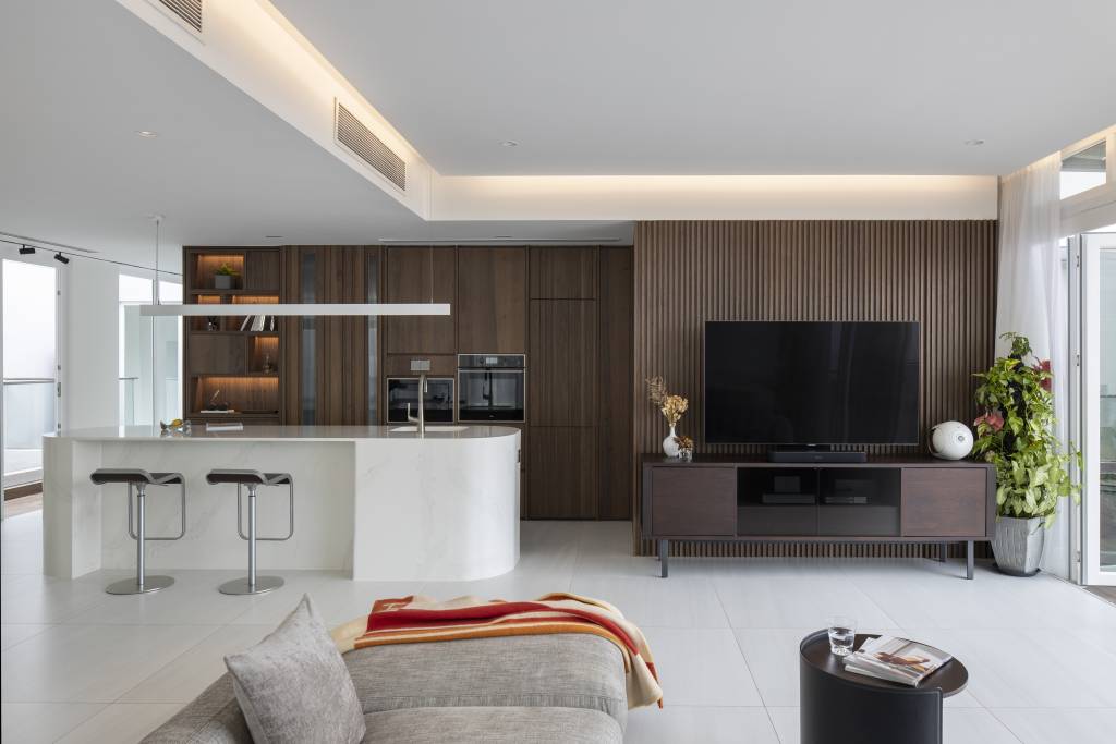
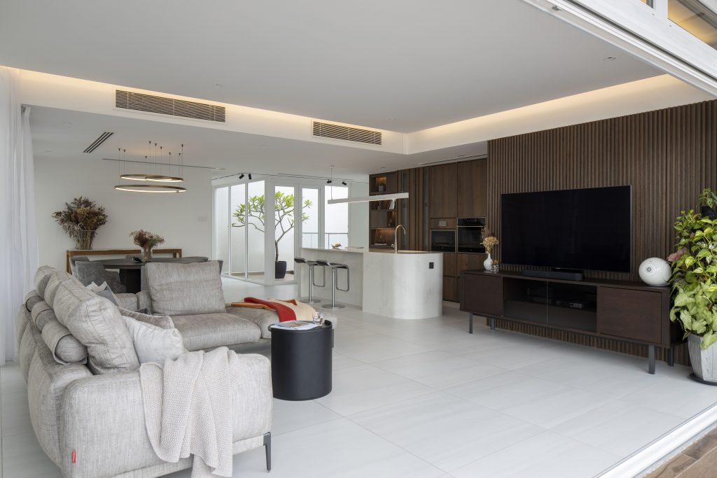
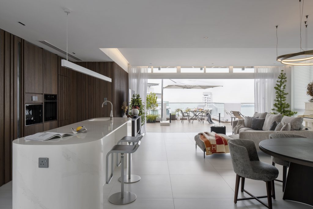
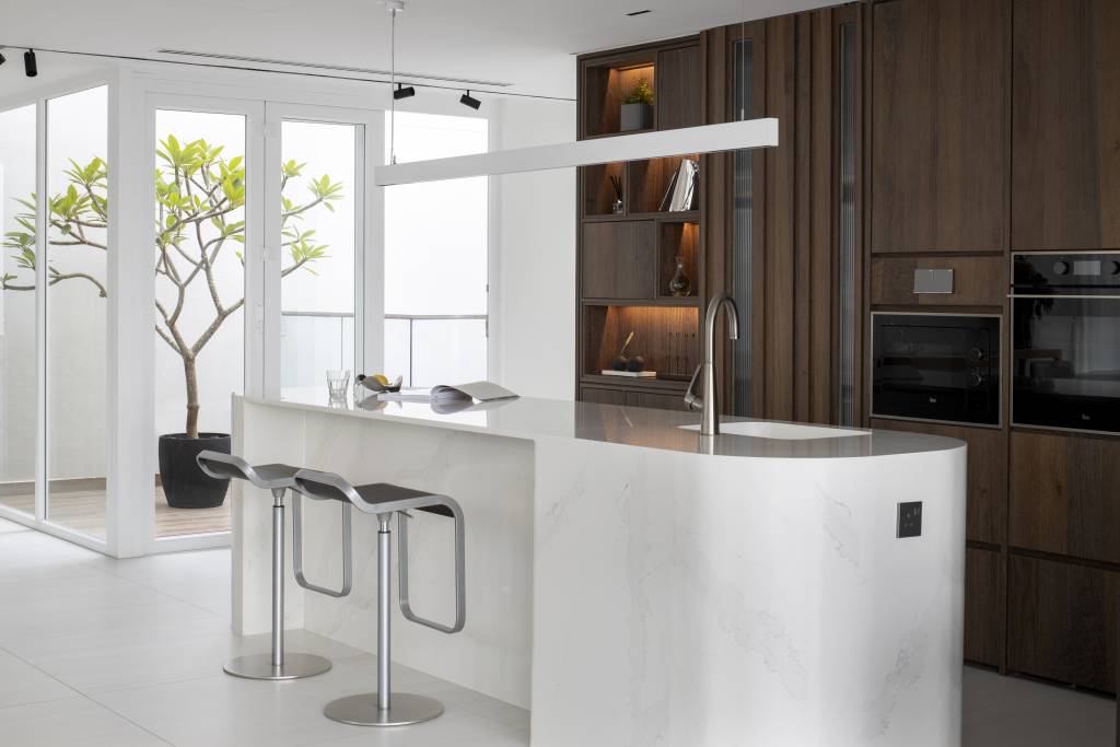
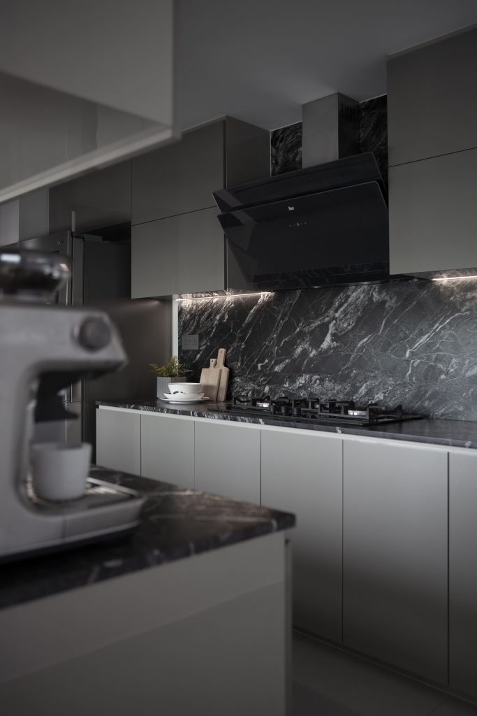
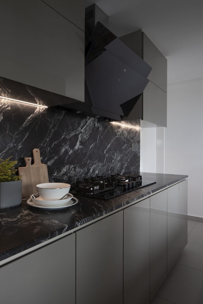
That’s not all, to keep the heavy lifting in the wet kitchen hidden away from sight, the entryway is hidden behind the dry kitchen’s wall. The designer Bing opted for a completely different colour scheme to demarcate the areas clearly – choosing a dark colour scheme with marble patterned backsplashes and countertops for easy maintenance.
In this retro-inspired mid-century modern design home, designer Debbie is not afraid to mix and match organic and geometric shapes with this classical design.
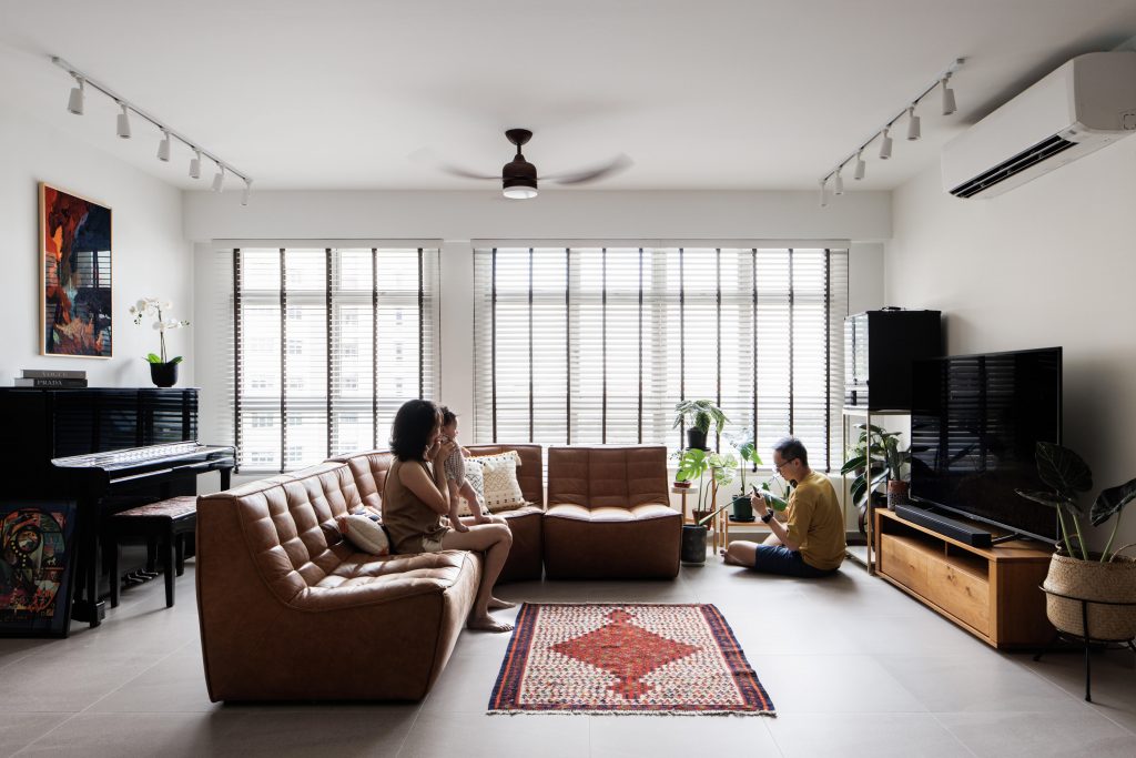
Due to space constraints, the designer opted to merge the kitchen and dining space into one with an open-concept layout that works amazingly well.
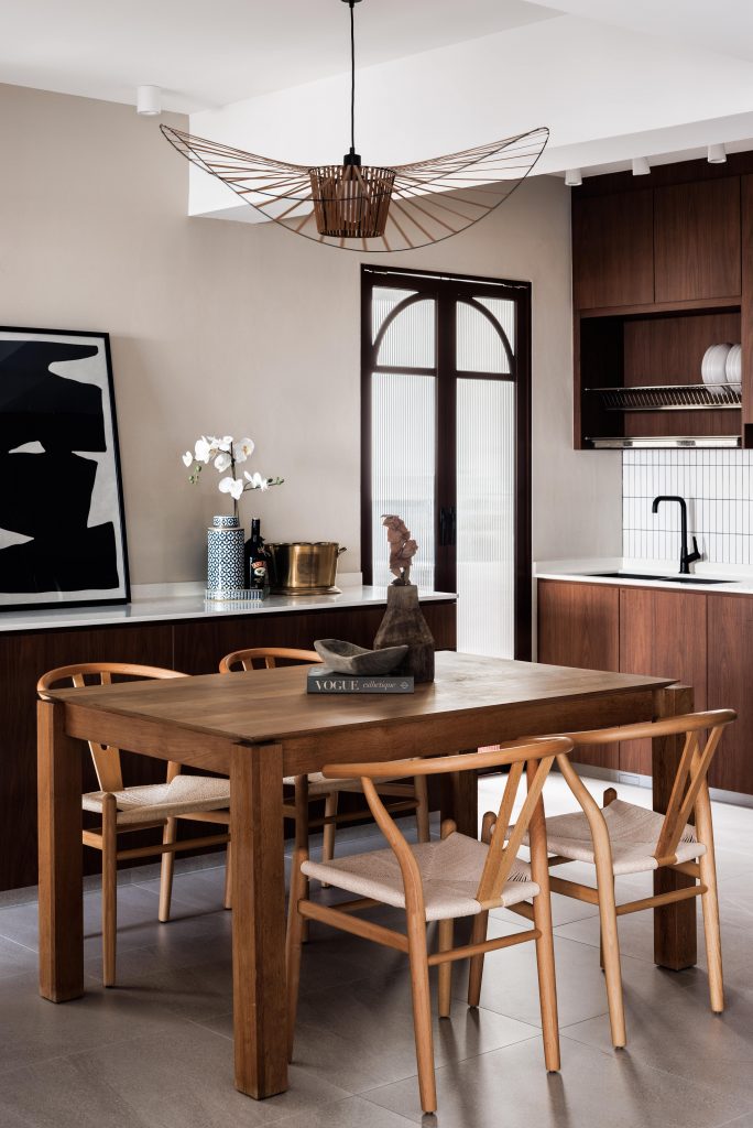
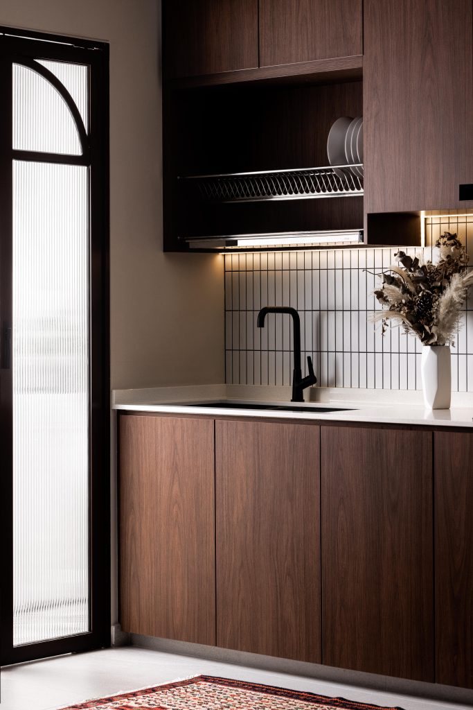
With a simple and clean L-shape cabinetry configuration, designer Debbie not only created plenty of space for storage to keep the messy stuff tucked away while allowing space for aesthetic displays. The choice of dark wood for the cabinetry laminates is a practical one for maintenance while keeping in with the overall wooden theme in the home. White narrow tiles used as a backsplash provide a much-needed contrast to help brighten up the space, in conjunction with the white spotlights.
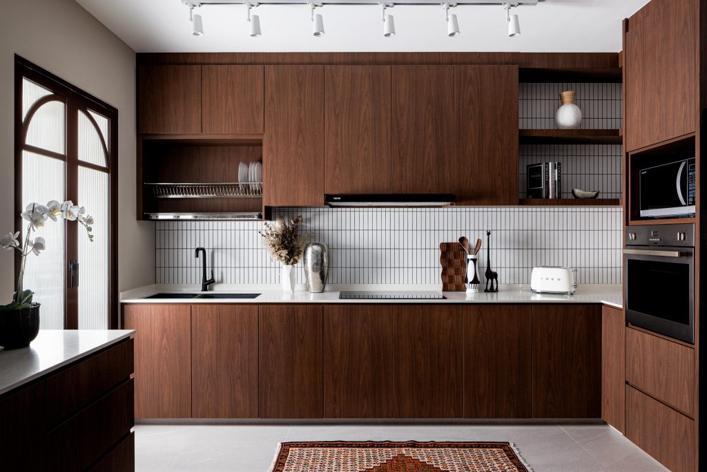
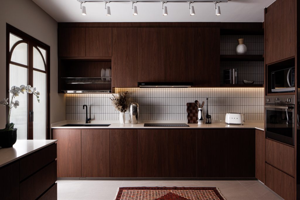
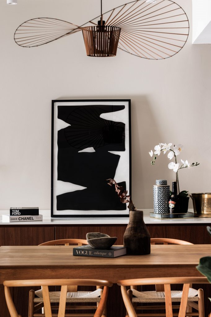
In the adjoining space, a simple wooden dining set, together with a quaint overhanging light fixture and simple display cabinet, create a cosy dining space conveniently located next to the kitchen space.
You will receive a personal login only after you have
submitted a designers shortlist.

